Teaching:TUW - UE InfoVis WS 2007/08 - Gruppe 01 - Aufgabe 2
Jump to navigation
Jump to search
Aufgabenstellung
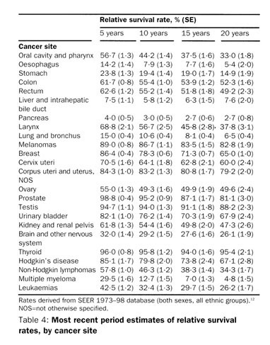
Zu beurteilende Tabelle
Kritik
- White space is well used here to direct the readers' eye to scan down the rows.
- White space between the 10 and 15 years is slightly wider than between 5 and 10, and 15 and 20 years, which is good if it conveys some meaning.
- Sometimes white space occurs because of long text in the row header, thus suggesting that the table is grouped, which is not the case. This also disturbs scanning across rows. Therefore, the row header should be made wider.
- When using rules, lines should be kept as thin and light as possible. The rules in the table are too thick and heavy.
- Rules work best with light shades of gray to keep them subtle in comparison to data.
- The ruler on the top of the table seems useless and should be removed (although this depends on the context of use: when objects must be placed close to the table, it is okay to to form a boundary using rules)
- Because of the effective use of white space it is easy to scan down the rows. However, scanning across the rows could be made easier by filling alternating rows with e.g. a light shade of gray.
- The table does contain only 4 subdivisions of survival rates and a far larger number of cancer sites, therefore the rows and columns are wisely arranged. The fact, that we naturally think of time as moving from left to right, rather than top to bottom supports this arrangement.
- The row sequence seems random (to me, at least) and should be arranged in a natural order that conveys meaning to the reader (at least sort alphabetically ascending by cancer site).
- Cancer sites could be grouped in a meaningful way, by simply adding white space between groups.
- Numbers are properly aligned right and text is aligned left, which is good. The decimal point, however, looks odd.
- Column headers should be right aligned, when the column's data is right aligned, thereby informing readers how to scan the data. However, it may also be seen as a 'spanning header' because the columns really consists of 2 sub-columns with omitted header and should therefore be centered. The (quite unusual) descriptive, spanning header 'Relative survival rate, % (SE)' should, according to this rule, also be centered.
- As the rulers form a boundary between the data- and support components the row header 'Cancer' should be pulled outside the table body, above the ruler.
- Percentage signs should appear immediately to the right of every percentage value because it's easy to forget that you're looking at percentages when reading down long columns of numbers. However, I don't think that this rule applies here and the advantage of reducing visual clutter far outweighs the (minimal) risk of forgetting that the numbers are actually percentage.
- The precision of the numbers seems reasonable and are correctly presented with a consistent number of decimals.
- Summary values are completely missing. Row and column summaries could be added, possibly containing average values.
- I don't know what SE is, but let's assume that it is intended to be compared with the corresponding relative survival rate, and therefore the arrangement is alright. However, comparing with the SEs from other columns could be made easier by:
- Removing the parenthesis, thus reducing visual noise which adds no information but complicates cognition.
- Group the SE values by applying the Gestalt principle of similarity and e.g. make the SE values gray (in contrast to the black survival rate value) as it seems less important.
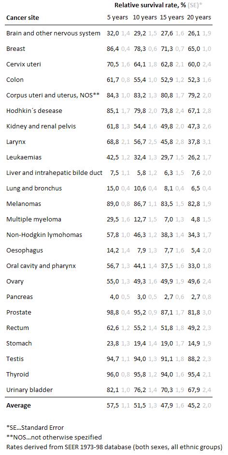
New table
Modifications
- White spaces used to scan horizontaly
- More space between the lines
- Less space between SE and '%' values
- Identical space between every year
- Thin rules
- Spanning header centered
- Row sequence sorted alphabetically
- Average value added
- Removed parenthesis form SE
- SE values in light gray, let it look less important
- References at the bottom of the table
Improvements
- The readers are directed to the rows, to see the changing values over the years
- There are no special links between the cancer sites
- The SE values consume less space and don´t distract any more
- Cancer sites seem to be more regulated
- It is easier to read and the relevant information is obtained much faster

