Teaching:TUW - UE InfoVis WS 2006/07 - Gruppe 08 - Aufgabe 3 - Prototype
Perspective Wall[edit]
Author[edit]
Matej Durco
Project description[edit]
We set out to implement a specific type of bifocal display called "Perspective Wall" [MayKinlay et al., 1991] using the comprehensive prefuse toolkit. Prefuse provides extensive methods for visualising data. While its main focus is implementing graphs it is also possible to implement time-based visualisation methods.
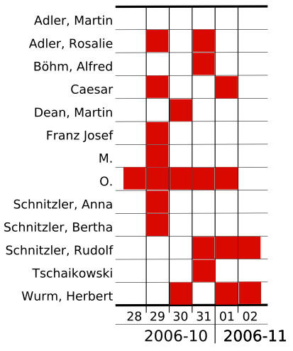
Our solution was originally meant to use a person's diary or, more specifically, records of other people the person met as its data source. The rows would represent individual people while the x-axis would represent time units as identified in the data. It should be possible to move backwards and forwards in time while at the same time zooming into a specific area of interest.
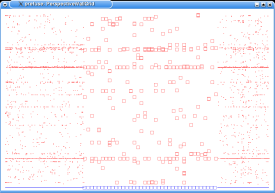
The actual implementation used the provided GridLayout class for positioning the individual data points. Prefuse's GridLayout ensures that one specific person will always be positioned in the same row. For the desired interaction prefuse's BifocalDistortion class was used (with distortion set only to horizontal direction). It handles expanding and compressing the displayed data interactively.
First we tried to use LabelRenderer for the datapoints, but it turned out useless because with more data the labels were overlapping massively. Therefore we switched to ShapeRenderer - ie each datapoint is represented by a tiny square (or other shape) - and the desired information (which person is behind the datapoint) shows up as ToolTip on hover. The datapoints partly still overlap, but one can view the individual information.
Screenshot[edit]
Further Development[edit]
Existing solution is really very rudimentary. There would be a lot to do, to make it better:
Labeling[edit]

The solution with ToolTip is a rather unsatisfying as only information for one datapoint can be viewed at one time and even this access is rather slow (ToolTip does not appear immediately). A natural alternative is employing AxisLabels. There is even a class - AxisLabelLayout - which seems suited for this. It would have to be extended to:
- allow more rows on the x-Axis (day and year in separate rows)
- position the y-Axis on the edge of the focus-view of the BifocalDistortion
Linking[edit]
Allow direct access to the place in the original text (provided the data is extracted eg from a diary). This could be implemented as an external link and text displayed in a browser or there could be another viewport integrated in the Visualisation.
Aggregation[edit]
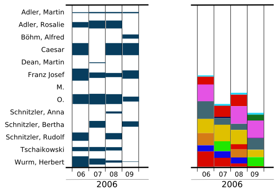
At present only the basic data is displayed, ie every row is visualized as a datapoint. For larger datasets a feature to aggregate over time would be important. We propose an entity TimeUnit with its property aggregationInterval defined in number of days (ie a month is a TimeUnit with aggregationInterval=30). Datapoints would represent the number of occurrences pro TimeUnit and could be displayed as vertically scaled rectangle. There are 2 ways to arrange the datapoints vertically:
- leaving them aligned in a grid where every person has its own line (picture)
- StackedChart - where the scaled rectangles are scaled atop of each other.
StackedChart has the positive side-effect of also visualizing the overall amount of occurrences, but the drawback of difficult labeling. Individual persons would have to be encoded in different colors and the color-assignement put in a legend which means additional lookup.
If we imagine the slice for one TimeUnit in the StackedChart very thin (think of integral calculus) we get actually a ThemeRiver which better expresses the continuity and also allows for almost direct positioning of labels (in or around the chart if necessary linked to the appropriate color-area by an arrow) but would be even more difficult to implement.

Multiple Views[edit]
Integrating all the previously mentioned propositions we propose as an optimal solution a multiple-view visualization with:
- StackedChart or ThemeRiver for the aggregated context-view
- GridLayout for the focus-view
- browser for the source-text
where 1. and 2. could be either arranged
- in a sophisticated form of the BifocalDistortion, which would provide different Layouts in context and focus or
- in independent viewports (which wouldn't make a PerspectiveWall anymore, but we are actually primarily not interested in PerspectiveWall, but in visualizing the data)
The focus-view would display one TimeUnit of the context-view by default (although this could be parametrized).
References[edit]
- Description of Bifocal Display in infovis-wiki
- [Mackinlay et al., 1991] Mackinlay, J. D., Robertson, G. G., and Card, S. K.: The Perspective Wall: Detail and Context Smoothly Integrated. In Proceedings of ACM Conference on Human Factors in Computing Systems (CHI91), Information Visualization, pages 173–179, 1991. http://ieg.ifs.tuwien.ac.at/~aigner/teaching/infovis_ue/papers/p173-mackinlay_perspective_wall.pdf
- Prefuse Toolkit http://prefuse.org/
