Teaching:TUW - UE InfoVis WS 2006/07 - Gruppe 08 - Aufgabe 2
Jump to navigation
Jump to search
Poor Graphic

Criticism
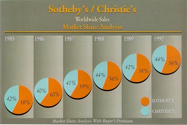
- Chartjunk: The columns are filled with distracting gradients.
- Data-Ink ratio: Much of the graphic is filled with useless patterns. The actual (overly large) pie charts occupy only a fraction of the graphic.
- Data Density: One pie chart per year seems a bit excessive for the amount of information they provide.
- Friendly Data Graphic: This graphic relies heavily on colours, rendering it all but useless if converted to grayscale or viewed by colour-blind persons.
- The individual pie charts are virtually indistinguishable, making pie charts a rather poor choice in this context.
- The pie charts are arranged diagonally without any meaning (except for the growing years)
- The position of the pie charts suggests an increase on the y-axis which doesn't have any function or labels.
- There are four graph labels in different fonts with redundant information.
- The labels are not anywhere near the pie charts and have to be found to derive any meaning from the charts.
Improved Graphic
Improvements
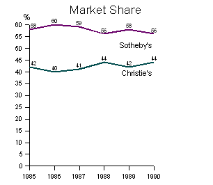
- The market share changes are visible over the years.
- Removed confusing and unnecessary backgrounds.
- The data-ink ratio has been increased.
- The labels are clearly visible next to the lines.
- The difference between market shares is easy to determine. One can immediately see that Sotheby's is always ahead of Christie's by roughly the same margin.
Variation
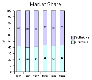
This alternative design is useful for gauging how much of the total market can be attributed to each of the two companies. This representation shows the entirety of this particular market instead of just part of it, thus keeping the idea of the original pie charts. The drawback is that it is more difficult to see that Sotheby's is ahead of Christie's every single year by roughly the same margin. It also violates the Data-Ink rule.

