Teaching:TUW - UE InfoVis WS 2005/06 - Gruppe G8 - Aufgabe 2
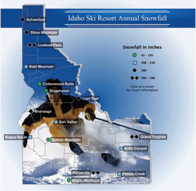
Poor Graphic

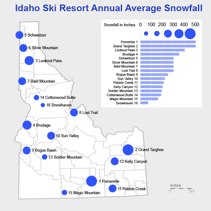
Resulting Graphic

[Seyfang, Fritz, Schnabl, 2005]
Comparison
| Element | Poor Graphic | Worked Graphic |
|---|---|---|
| legend | The legend is inconsistent in its symbols and in its ranges (not continuous). | The symbols are continuous and follow the rules for representing non-metric but ordinary classes of ranges [1][Miksch, 2005] Moreover the ranges which are represented by the symbols were made to descend into one another. |
| legend (symbols) | The root version, even though its symbols are inconsitent in shape and color, gives a rough impression where snow can be expected in a major amount. It provides the user with some sort of a rough overview about Idaho and the snowfall. This is information we thought is very useful. | The symbols now give a good impression where high amounts of snowfall can be expected. They are kept simple and easy to read [6] [Muster et. al., 2005]. |
| legend (background) | The legend has no explicit bakground. | The background of the legend is in white, keeping it seperated from the grey overall bacground and maximizing the contrast to the symbols and the text in the legend. We have also tried some backgrounds giving the shape of the country, or color coding, but we choose the simplest one [6] [Muster et. al., 2005]. |
| background (map, the image) | Keeps no information (for the data of snowfall) | Was exchanged by a satellite view of Idaho, giving just the outer bounds of the state and the inner borders of the different districts. By that we reached a higher data ink ration [3] [Schwarz et. al., 2005]. |
| background (radial gradient) | Is distracting the viewer, keeps no additional information. | Was changed to a very light gray background to keep a contrast between the shape of the land (which is white in large parts as well). Helps to raise the data ink ratio as well [3] [Schwarz et. al., 2005] |
| spot indicators (color) | The spot indicators are all of a different color, which can not at all be related to the amount of snow it should represent. | The color keeps no informations, so all symbols are of one color. Due to the rules of preattentive processing we used a color which has a very high amount of contrast but still is not distorting the viewer [5] [Kargl et. al.,2005]. We chose blue for the symbols. |
| spot indicators (form) | Are inconsistent and the fourth one does not give a good idea where the center actually is (asymetric). | The new symbol has a clear center point, representing the spot on the map where the viewer can expect the place named. This goes in common with the location hat-rack from the five-hat-racks. [4] [Kargl et.al.,2005] |
| spot description (text) | The text is in white, which has a too low contrast most of the time due to the irregular color of the background image. | The text is written in simple black color [6] [Muster et. al., 2005]. |
[1] [Miksch, 2005] Basic Understanding of Information Visualisation, Course Transparencies, p.29, Retrieved at: October 2005.
http://www.ifs.tuwien.ac.at/~silvia/wien/vu-infovis/PDF-Files/InfoVis-0-Defs.pdf
[2] [Miksch, 2005] Focus + Kontext, Course Transparencies, p.5 ff, Retrieved at: October 2005.
http://www.ifs.tuwien.ac.at/~silvia/wien/vu-infovis/PDF-Files/InfoVis-1.pdf
[3] [Schwarz et. al., 2005] Harald Schwarz, Simon Ledinek, Thomas Gamper, Gerold Mosizer, Data Ink Ratio, Created at: 10.10.2005, Retrieved at: 10.11.2005, http://www.infovis-wiki.net/index.php/Teaching:TUW_-_UE_InfoVis_WS_2005/06_-_Gruppe_01_-_Aufgabe_1_-_Data-Ink_Ratio
[4] [Kargl et.al., 2005] Horst Kargl, Muhammad Suhaib Karim, Andreas Rainer, Ali Akcaglayan, The Five Hat Racks, Created at: 10.10.2005, Retrieved at: 10.11.2005, http://www.infovis-wiki.net/index.php/Teaching:TUW_-_UE_InfoVis_WS_2005/06_-_Gruppe_G3_-_Aufgabe_1_-_Five_Hat_Racks
[4] [Kargl et.al., 2005] Horst Kargl, Muhammad Suhaib Karim, Andreas Rainer, Ali Akcaglayan, Preattentive Processing, Created at: 10.10.2005, Retrieved at: 10.11.2005, http://www.infovis-wiki.net/index.php/Teaching:TUW_-_UE_InfoVis_WS_2005/06_-_Gruppe_G3_-_Aufgabe_1_-_Preattentive_Processing
[6] [Muster et. al., 2005] Anna Muster, Jürgen Puchts, Christian Rainer, Christoph Sölder, The Principle of Simplicity, Created at: 10.10.2005, Retrieved at: 10.11.2005, http://www.infovis-wiki.net/index.php/Teaching:TUW_-_UE_InfoVis_WS_2005/06_-_Gruppe_G4_-_Aufgabe_1_-_Ockham%27s_Razor_/_Occam%27s_Razor_/_Principle_of_Simplicity