Teaching:TUW - UE InfoVis WS 2005/06 - Gruppe G4 - Zusatzaufgabe
Information Murals
Basics
In case of displaying very large information spaces traditional information visualizations reach their limits rather fast, often right from the design or planning stage. Without specific techniques and tools respectively the considered information is often useless. The primary goal is to provide effective display and access mechanisms. According to the vast number of data in large information spaces it is a real challenge to create effective presentations using only the limited number of pixels on a screen.
The Information Mural technique is a possibility for 2D visual representation even if the number of data-elements greatly rises above the available screen-pixels. This technique was invented by John Stasko and Dean Jerding at the 'Georgia Institute of Technology'. Other current procedures for depicting large information spaces normally apply abstraction, sampling or overplotting to produce the aspired view of a vast space. Some kind of loss of information that might be useful to the observer is accepted. Unlike to these used techniques Information Murals follow different approaches.
Goals of the Information Mural technique:
- Create a representation of an entire (large) information space that fits completely within a display window or screen.
- Mimic what the original visual representation of the information would look like if it could be viewed in its entirety, ie. containing the same visual patterns.
- Minimize the loss of information in the compressed view. [Jerding et al., 1996]
The generated visualization consists of contextual information and supports analytical as well as navigational tasks for a better user-interaction with the informational display. Jerding and Stasko give several different types of information spaces which could be represented using their new technique:
- A text file or document usually does not fit entirely on the screen, because its vertical dimension far exceeds its horizontal dimension. Typically, a text editor displays only a portion of the file being edited.
- Graphs of data often require some compression technique to fit on the screen. Scaling and rounding of data values is often necessary to draw the entire graph. Other alternatives are to display an average of the data values, or only a subset of the data.
- Program visualizations often span many computer screens if laid out completely. This is especially true for those views where one dimension corresponds to time.
- Images might be represented using Information Murals. Although an image usually fits on a screen, it is often desirable to change the size of the image. As an image is shrunk, information in the image is inevitably lost. [Jerding et al., 1996]
Used Technique
The Information Mural tries to fit a large information space in some area of i x j pixels by scaling the position of each information element to fit into the available space. For each element at a certain pixel different amounts of 'ink' are saved according to the correspondent element-value . While 'drawing' each element, the amount of ink will build up at certain pixel-positions, depending on the grade of overlap of the appending elements.
A final Information Mural is generated by mapping the amount of ink at each pixel (the information density) to some visual attribute.
Visual attributes might be:
- Grayscale Mural: the shade of each pixel corresponds proportionally to the amount of ink saved for each element.
- Colourscale Mural: uses an equalized intensity variation over the entire color scale.
- 'Raindrop' Mural: the amount of ink at each position makes a 'puddle' centered around that pixel. In that case pixels with 'more' ink will appear larger. In addition to that color can be added to the mural to highlight other attributes of the informational elements, while still preserving the density mapping.
The Basic Algorithm
The initial point for the basic algorithm is an input-image (of M x N elements) which is scaled into a mural of I x J pixels. On the one hand the algorithm needs the data structures which store the information, on the other hand it requires an I x J array of floats.
1) for each i,j set mural_array[i][j] to zero
 2) for each element m,n of information
    a) compute x = m / M * I, y = n / N * J
    b) determine the proportion of this point that lies in each of
       the four surrounding mural_array entries (totals to 1.0):
              mural_array[floor(x)][floor(y)]
              mural_array[floor(x)][ceil(y)]
              mural_array[ceil(x)][floor(y)]
              mural_array[ceil(x)][ceil(y)]
    c) add each of the proportions determined in the previous step to the
       existing values of each corresponding mural_array entry
       i) update max_mural_array_value to keep track of the
          maximum mural_array[][] value
 3) for each i,j in the mural_array
    a) map the value mural_array[i][j] / max_mural_array_value
       to a grayscale or color intensity varying scale, or to pixel size,
       depending on the type of mural being created
    b) color and draw the pixel at i,j of the mural based on mapping
       computed in the previous step
[Jerding et al., 1996]
The rather simple basic algorithm for creating Information Murals listed above will not be explained further because it would blast the scope of this summary.
Examples
Sun Spots
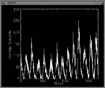
The number of sun spots have been recorded since the 1700s by Astronomers. Because of the vast dataset, it is typically plotted by showing the monthly averages. The figure below shows a plot of the average number of sun spots per month recorded from 1850-1993 at the Carnegie Mellon University.
Figure 1: Plot of average number of sun spots recorded per month, 1850-1993. [Jerding et al., 1996]
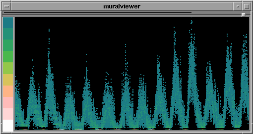
There is no concern about the size of the dataset using the Information Mural technique. The figure below shows an anti-aliased mural of the number of sun spots recorded daily from 1850-1993, over 52,000 readings. Instead of using grayscale to depict density, a colourscale is used to highlight outliers. The scale goes from dark blue (lowest data density) to bright white (highest data density).
Figure 2: Mural of the number of sun spots recorded daily, 1850-1993. [Jerding et al., 1996]
Earthlight-Information as 'Realmural'
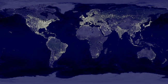
Following image is a panoramic view of the world from a space station. This picture was taken on a perfect night with no obscuring atmospheric conditions. It is a night photo with the lights clearly indicating the populated areas. Light just adds up perfectly. This picture 'highlights' the principles of th Information Mural Technique in an elemental way.
Figure 3: 'Realmural', s.a.: http://antwrp.gsfc.nasa.gov/apod/ap001127.html [NASA, 2000]
References
[BYTE-Magazine, 1993] BYTE-Magazine, State of the Art, April 1993, page 120-147
[Jerding et al., 1996] Dean F. Jerding, John T. Stasko, The Information Mural - Overview Article, created at: March 1996, retrieved at: 22.01.2006, http://www.cc.gatech.edu/gvu/softviz/infoviz/information_mural.html
[NASA, 2000] NASA, APOD-Astronomy Picture of the Day, C. Mayhew, R. Simmon, created at: 27.11.2000, retrieved at: 22.01.2006, http://antwrp.gsfc.nasa.gov/apod/ap001127.html


