Teaching:TUW - UE InfoVis WS 2005/06 - Gruppe G4 - Aufgabe 2
Poor Graphic

Analysis of the Graphic
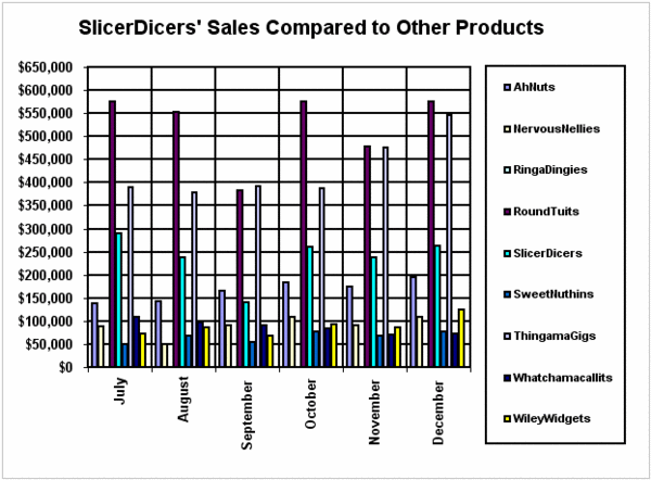
Here we have got an example for a low data-ink ratio. The data-ink ratio is the proportion of the ink that is used to present actual data, without redundancy, compared to the total amount of ink used in the entire display. The goal is to receive the highest possible data-ink ratio (a value close to 1.0 or 100%).
The data-ink ratio is defined as the percentage: (100*data-ink)/(total ink used on the graph) [Tufte, 1983]
First off all we have to distinguish between data-ink and non-data-ink:
- data-ink is the essential non-erasable ink used to present the data
- non-data-ink is the redundant ink used to elaborate or decorate the graph [Hunt, 1997]
To enhance the data-ink ratio we have to
- remove unnecessary non-data-ink
- regularize the remaining non-data-ink and
- emphasize the most important data-ink. [Few, 2004]
How much of the ink in our example is completely unnecessary and could be removed?
- the border around the legend
- the border around the plot area
- the grid
- the black borders around the bars, because they have no value
- the repetition of the dollar-sign for each revenue value is redundant. It would be better to replace them by simply adding the label "U.S. $" to the vertical axis.
Correction of the Graphic
Modifications:
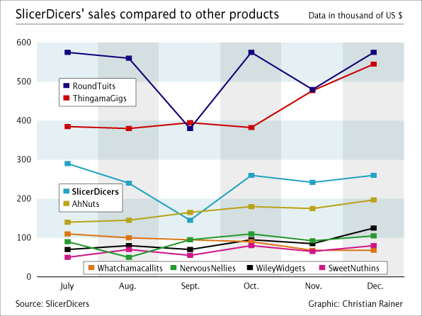
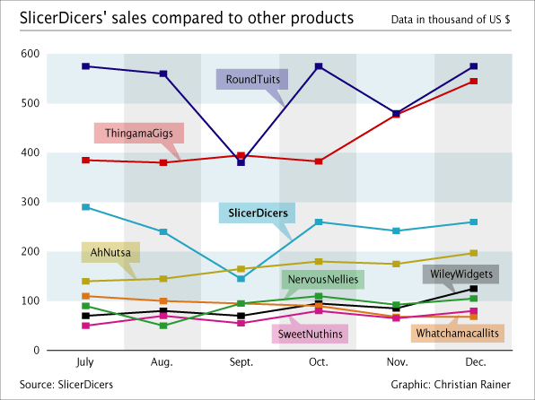
- used a line graph instead of a bar graph
- + The amount of change over the months is now properly visualized.
- + The data/ink ratio is highly improved.
- used visual attributes to highlight certain data.
- + "SlicerDicers'" is displayed bold to accent it compared to the other products, which is corresponding to the visualized data.
- exchanged the gridlines with a grid consisting of a group of slightly coloured fields
- + Structuring is reduced but a visual aid for reading the graph still remains.
- changed the step size of the values on the y-axis.
- + Unnecessary Structure is removed, which leads to a better data/ink ratio.
- changed the style and format of the legend in two different ways.
- + In both versions we improved the explanation of the data.
- + In Version 1 we used a split legend to show the information near the corresponding graph.
- + In Version 2 we placed the labels directly at the corresponding graph.
- changed the colours of the graphs using the full colour-spectrum.
- + Graphs are now much easier to distinguish.
- + Overall contrast is improved.
- changed the text to proper upper- and lowercase.
- + Text is now spelled correctly.
- changed all text to horizontal alignment.
- + The readability of the information is improved.
- removed redundant text from the graphic.
- + Results in a better data/ink ratio.
- removed all unnecessary lines.
- + Results in a better data/ink ratio.
- + The readability of the graphic is improved.
- removed unnecessary data.
- + Since the graphic shows a comparison of overall sales, and "RingaDingies" never have a value higher than zero, we removed it from our graphic.
- + Improves the data/ink ratio.
- + Improves the readability of the graphic.
- added the source and the author of the graphic.
- + Is important for further use.
Updated Graphics:

SlicerDicers' sales compared to other products (Version 1)

SlicerDicers' sales compared to other products (Version 2)
References:
[Few, 2004] Stephen Few, Elegance through simplicity, Faculty of Information and Media Studies at the University of Western Ontario, Last updated: October 16, 2004, Retrieved at: October 30, 2005, http://www.intelligententerprise.com/showArticle.jhtml;jsessionid=N2ATDQWY5VYKSQSNDBGCKHSCJUMEKJVN?articleID=49400920
[Tufte, 1983] Tufte, Edward. The Visual Display of Quantitative Information. Graphics Press, Cheshire, 1983.
[Hunt, 1997] Neville Hunt, Data Ink. Created at: 1997. Retrieved at: October 30, 2005. http://home.ched.coventry.ac.uk/Volume/contents.htm.