Teaching:TUW - UE InfoVis WS 2005/06 - Gruppe G3 - Aufgabe 2
Poor Graphic
Drawbacks / Critical analysis
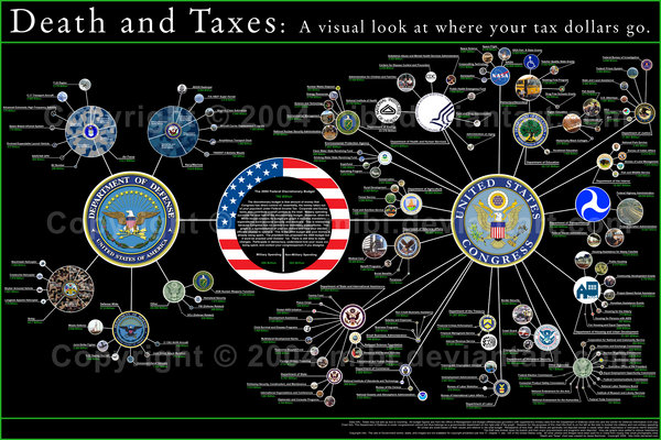
Before designing visualization for the “Death and Taxes”, it is important to find what is wrong with the existing one, analyze the missing or wrongly applied essential design principles. Then we will be in a better position to make corrections, and come up with an improved visualization.
“Tasks that can be performed on large multi-element displays in 200 milliseconds or less are considered preattentive [Healey et al., 2005]”. These tasks can be performed without the need of focused attention.
- From the given visualization displayed on a 17” display what we can perceive instantly is that the budget is allocated to a number of departments and further allocated to various sub-departments within those. However, the display is so cluttered that we are unable to perceive more than that.
- Lengthy description in the biggest circle and as a part of legend can’t be treated with preattentive processing.
- The proportionate sizes of circles help a lot in finding instantly which department has the highest or lowest budget.
There are five ways to organize information: category (similarity relatedness), time (chronological sequence), location (geographical or spatial references), alphabet (alphabetical sequence), and continuum (magnitude; highest to lowest, best to worse) [Truong, 2005]”.
- Category (similarity relatedness): Satisfies as far as the depiction of budget in different departments is concerned. But if you see the sub-departments then this aspect is violated.
- Time (chronological sequence): This aspect is not applicable for the given visualization, because this shows the budget for one year only.
- Location (geographical or spatial references): This aspect is also not applicable for the given visualization. Because the visualization does not show the spending of budget in different states. This might be a missing information. Without this information it is assumed that the depicted spending is same across all the states (expenditures on health, education etc.).
- Alphabet (alphabetical sequence): Arrangement is not alphabetical in the given picture. But it is not necessary that the improvement will be made by introducing alphabetical sequences. Rather some more meaningful sequences should be exploited.
- Continuum (magnitude; highest to lowest, best to worse): This aspect is successfully used in the picture. See the sizes of circles which are proportionate with the allocated budget.
“Clutter is the state in which excess items, or their representation or organization, lead to a degradation of performance at some task [Rosenholtz et al., 2005]”.
- It is not possible to visualize all the elements of the given picture on a standard display. There are many circles, and associated descriptions. Perhaps the descriptions can be removed as a default. When user focuses or hovers the mouse, then the circle under focus could be displayed with associated description.
- On the initial screen, the circular sub-departments can be hidden. Those can be displayed under user control when the user focuses on one or a group of the bigger circles.
"The Gestalt approach emphasizes that we perceive objects as well-organized patterns rather than separate component parts [Pedroza, 2004]”. Often used Gestalt principles are Proximity, Similarity, Closure and Good Continuation.
- Proximity: Elements close to each other tend to form groups. This is evident from the picture. The small circles in vicinity of bigger ones tend to form one group. This also reveals the fact that may be the connecting lines were not necessary and are in fact redundant.
- Similarity: Elements that are similar in some way tend to be grouped together. If we see at the color encodings used, then this aspect seems to be violated. For example, blue parts could be perceived as related, but in fact those are not.
- Closure: How items are grouped together if they tend to complete a pattern. It seems that this design aspect is not used in the given picture. Instead the author has used explicit connecting lines which in turn increase visual clutter.
The “Lie Factor” is a value to describe the relation between the size of effect shown in a graphic and the size of effect shown in the data. "The representation of numbers, as physically measured on the surface of the graphic itself, should be directly proportional to the quantities represented [Tufte, 1991]”.
- If you look at the relative sizes of circles and the allocated budgets, this aspect is satisfied.
"The interior decoration of graphics generates a lot of ink which does not tell the viewer anything new. The purpose of the decoration varies - to make the graphic appear more scientific, to enliven the display, to give the designer an opportunity to exercise artistic skill. Regardless of the cause, it is all non-data-ink or redundant data-ink, and it is often chart junk [Tufte, 1991]”.
- The connecting lines between circles are chart junk.
- The descriptions along with meaningful logos are also perhaps chart junk.
- Black background is making it diffciult to focus the eyes on the graphic.
- Percentages might be more helpful for initial overview instead of writing exact amount in dollars.
"A large share of ink on a graphic should present data-information, the ink changing as the data change. Data-ink is the non-erasable core of a graphic, the non-redundant ink arranged in response to variation in the numbers represented [Tufte, 1991].”
- Excessive color is used for the background (all black), which is making it difficult to focus the eyes on the useful data.
- Space is wasted by displaying the complete logos mentioning long redundant texts, for example “United States of America” on many logos. It could be mentioned at a single location that the picture is all about USA.
- The description written inside the biggest circle should be moved away from the graphics. This would also make this circle smaller in size, which is not showing any data.
- The non-data ink which is used to elaborate or decorate the picture is also in excess.
Colors can be used intelligently to encode information in the picture. In the given picture the color encoding is used extensively but it is intermixed and got confused. For example, the circular sections for army, air force and navy all have different colors in spite of the fact that the sections are interrelated, for example R&D, Personnel, Operations etc. Thus principle of consistency is violated.
“The Aesthetic-Usability Effect is a condition whereby users perceive more aesthetically pleasing designs to be easier to use than less aesthetically pleasing designs [markboulton.co.uk]”. Probably, the other design elements also play their part in making a product aesthetic.
- The rule of Golden ratio is apparently violated. This is evident if we look at the proportions of circles to one another. Their sizes are perfectly in proportion to the allocated budget, but their sizes realtive to one another vis-a-vis the rule of Golden Ratio is not observed. Two quantities are said to be in the golden ratio, if "the whole is to the larger as the larger is to the smaller"[Golden ratio].”
- If the black background is removed, then the existing picture is not bad as far as aesthetics are concerned.
According to rules elaborated by William of Ockham in his works [Hoffmann et al., 1997];
- It is futile to do with more what can be done with fewer. Quite meaningful logos are used, but the descriptions of the departments are also mentioned. One of these could be avoided.
- When a proposition comes out true for things, if two things suffice for its truth, it is superfluous to assume a third. It is related with insight, which is missing or is not easily perceivable from the existing picture.
- Plurality should not be assumed without necessity. ???
- No plurality should be assumed unless it can be proved (a) by reason, or (b) by experience, or (c) by some infallible authority. ???
Layout
An efficient layout can be used to interactively visualize a complex visualization. In the given picture, if we use for example grid layout then its usability can be increased. It can be used to provide focus+context at the same time. In one layout window, whole picture can be shown like the existing one. While on another one, the focused part can be shown in a magnified way. However, the initial overview for the division into military and non/military spending is possible instantly.
Hello there from New York!! Now i am bored to death (blank) (blank) in work so I chose to view your blog on my small new iphone4 dnirug lunch break. I really enjoy the data you deliver here and cannot wait to take a look when I get home. I am surprised at how fast your blog site loaded on my cell phone .. I'm not even using Wireless, simply third generation .. Anyway, superb site!
Conclusions and suggestions
Suggestion 1
The Visualization itself is not so bad, but only good for print version. The diameters of the different circles gives a good overview of the dispersion of the budget. The problem is that no one can read the name of the different departments. Only when you zoon in the picture you can read it, but then you loos the overview. One approaches to improve the print version is e.g. to change the background colour.
But to improve the understanding of the picture we suggest a dynamic visualization! The problem of the data set is that there are too many different departments and sub-departments. They can not be displayed in a normal diagram. There are up to 200 departments with nearly the same budget and with a normal diagram e.g. scatter plots there is no chance to distinguish the different departments and there are no specific information which can be derived from that kind of visualization.
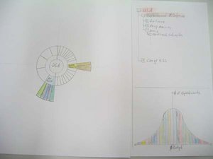
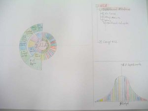
Our approach is to use a SunBurst [SunBurst] like visualization. SunBurst is good to visualize hierarchies with a lot of data. The benefit of this technique is that you can easily compare different departments and sub-departments. The sizes of the different parts represent the budget. The different parts can be labelled with the $ amount or with % from the total budget and/or the Budget of the super-department.
The aim of this visualization is to compare different departments. You can go deeper to one sub-department and then compare two or more of them. It is also possible to get a total overview of all apartments by expanding all of the sub-departments. The drawback of this visualization is that departments with very little budget are nearly invisible in the circle. This disadvantage can be solved by dynamically colour or highlight different parts of the data. Another improvement could be to add a second or third view to the SunBurst visualization. These views could be a simple tree (like the explorer) or a Gaussian distribution of the budget. The data sets are the departments with their budget. With this visualization you can see how many departments have which amount of budget. By selecting a rage of the Gaussian distortion the relevant departments are expanded in the SunBurst and highlited in the explorer-tree. It sould be also possible to show the detail data e.g. name, amount of budger, etc. when you move your mouse over a part of the SunBurst Visualization.
This visualization approach reduces the drawback of the original one where the different departments are not so easy to compare.
Suggestion 2
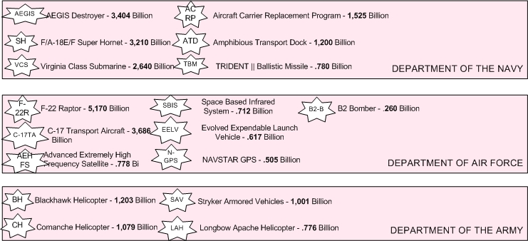
The big horizontal rectangle encapsulates other square/rectangle sub deparment and each of them encapsulates dispersion of the budget in billion dollar. Each of them has different size by its ration. If that visualization should still in the detail, then The visualization in Stern can not readable and drawback of this visualization is that departments with very little budget are nearly invisible in the stern. This disadvantage can be solved by small abbreviations, such as: F-22R for “ F-22 Raptor - 5,170 Billion” and C-17TA for “ C-17 Transport Aircraft - 3,686 Billion”
Suggestion 3
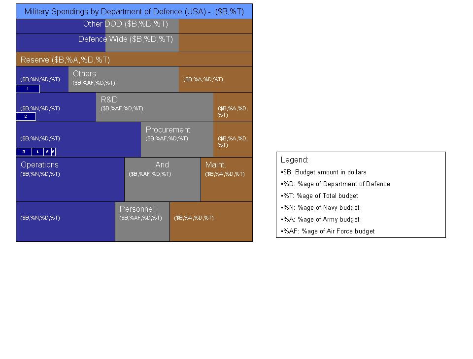
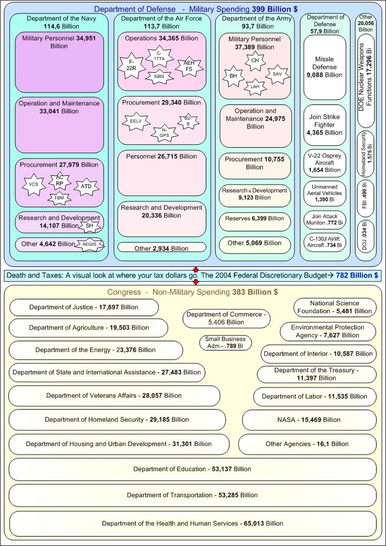
Yet another approach for visualizing the "Budget and Taxes" is as follows. It presents the idea, not the whole graphic with actual figures. It uses the tree map approach.
- The big vertical rectangle encapsulates the directly section wise budget allocations (like R&D, Operations, etc.).
- Standard colors (navy blue for Navy, Grey for Air Force, Brown for Army) are used.
- Each horizonontal section is further proportionately divided between the three forces.
- A few sections which are common and hence equivalent to all the forces are drawn at the top (Others DOD and Defence wide). Since they are assumed to contribute equivalently towards other departments, therefore, all forces Navy, Army and Air Force are equally spaced there.
- Within each rectangular block of a force, further small blocks are made for showing small spendings on AEGIS destroyer, Super Hornet etc. Their sizes are also assumed to be proportional to their allocated budget. Due to space limitation, these are given numbers 1,2,3... Upon mouse click these can be further zoomed-in, or their description can be specified in the legend.
- Alongwith actual budget amount, the idea to show it in terms of different percentages, is employed. People are often interested in these kind of percentages when they are looking at budget.
Based upon this approach, rest of the graphic for military and non-military spendings can also be efficiently represented. Although not the perfect one, however it removes some of the defficiencies of the existing visualization. Now the user has a better and quick overview, with details.
Resources
[Golden ratio] http://www.absoluteastronomy.com/encyclopedia/g/go/golden_ratio.htm
[SunBurst] http://www.cc.gatech.edu/gvu/ii/sunburst/
[Healey et al., 2005] Christopher G. Healey, Kellog S. Booth and James T. Enns - High-Speed Visual Estimation Using Preattentive Processing - The University of British Columbia, June 1996 - Access Date: 24.October.2005. http://www.csc.ncsu.edu/faculty/healey/download/tochi.96.pdf
[Hoffmann et al., 1997] Roald Hoffmann, Vladimir I. Minkin, Barry K. Carpenter, Ockham's Razor and Chemistry, HYLE--International Journal for Philosophy of Chemistry, Vol. 3 (1997), Retrieved at: October 24, 2005, http://www.hyle.org/journal/issues/3/hoffman.htm
[Mark Boulton, March 06, 2005] Journal, Aesthetic-Usability Effect http://www.markboulton.co.uk/journal/comments/aesthetic_usability_effect/
[Pedroza, 2004] Carlos Pedroza, The Encyclopedia of Educational Technology, San Diego State University. Access Date: 21 October 2005, http://coe.sdsu.edu/eet/articles/visualperc1/start.htm
[Rosenholtz et al., 2005] Ruth Rosenholtz, Yuanzhen Li, Jonathan Mansfield, and Zhenlan Jin. Feature Congestion: A Measure of Display Clutter. http://web.mit.edu/rruth/www/Papers/RosenholtzEtAlCHI2005Clutter.pdf
[Truong, 2005] Donny Truong, “Universal Principles of design” Access Date: 21. Oktober 2005 http://www.visualgui.com/index.php?p=1
[Tufte, 1991] Edward Tufte, The Visual Display of Quantitative Information, Second Edition, Graphics Press, USA, 1991.
