Teaching:TUW - UE InfoVis WS 2005/06 - Gruppe 10 - Aufgabe 2
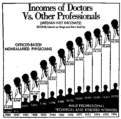
Poor Graphic

Drawbacks
The first step in the process of creating a better version of the provided graphic was the detailed analysis of the graphic and its drawbacks considering the discussed design principles.
Through the very bad Data-Ink-Ratio and lot of Chart Junk the Preattentive Processing [Healey et al., 1996] is heavily affected:
- The embedded bodies/heads of doctors and other professionals distract the viewer's eyes from the main information. Thus it is hard for the first-time viewer to quickly understand the information content of the diagram.
- The descriptions of the both data samples (Office-based nonsalaried physicians versus Male professional technical and kindred workers) are not clearly placed in the graphics and cannot be preattentively associated to the data series.
- Especially the data series of the technical workers is not really presented by clear data bars because of the worker pictures on top using the same color as the bars (both black). Thus the different salary values can optically not clearely be compared against each other.
Edward Tufte states the principle that "The representation of numbers, as physically measured on the surface of the graphic itself, should be directly proportional to the quantities represented" [Tufte, 1991]
This principle is definitly violated in the provided graphic because of the following facts:
- The provided original graphic heavily uses changes in the continuity of the time scale. While in the beginning of the time scale jumps of up to 8-9 years occur between two salary values, the last five salary values differ only by 1 year anymore.
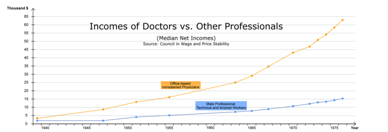
- As seen in the redesigned graphic using a linear time-scale the original graphic uses the Lie Factor to hide the fact that the distributions of the salaries are exponential not nearly linear as the viewer guesses by looking at the original graphic.
- By changing the time scale multiple times within the same diagram, the viewer is confused and is potentially not able to directly discover the lie.
Edward Tufte comments the principle of Chart Junk as follows: "The interior decoration of graphics generates a lot of ink which does not tell the viewer anything new." [Tufte, 1991]
The provided graphic does contain a lot of ink not telling the viewer anything new:
- The embedded stilistic pictures of doctors and other professionals are really unnecessary Chart Junk.
- The time scale is labeled with full year marks. This can be reduced to only using the last two digits as the first two ones don't change over the whole time-scale.
- The black background of the technical workers data series is making it more difficult for the viewer to recognize the presented information.
- A lot of color is used just for separating the two data series from each other.
- As mentioned above, the stilistic pictures of doctors and other professionals add a high amount of ink to the diagram which do not contain much additional information.
- The use of few colors for clearly separating the different data series within the same diagram makes sense. The provided graphic uses black and white for the two data series which results in a graphic with high contrast. The drawback of this approach is that the viewer is distracted from recognizing the main content information to the contrast spots which do not contain the real information.
Donny Truong describes the Aesthetic-Usability Effect as follows: "Aesthetic designs are perceived as easier to use than less-aesthetic designs. Aesthetic designs also foster positive relationships with people, making them more tolerant of problems with a design." [Truong, 2005]
The following comments on the provided graphic affect this effect:
- The heavy use of Chart Junk and the high Lie Factor lead to a diagram with a low usability.
- By using only black & white as "colors", the recognition of the information content is complicated for the viewer and directly degrades the aestetic approach of the graphic.
Improvements
- A linear time scale was used to provide a clear basis for understanding the information content of the diagram to the viewer.
- Through the use of a linear time scale the non-linear but exponential growth of the salaries were presented to the viewer.
- Usage of a line chart leads to a better visualisation of the higher growth of doctors salary.
- Removal of the Chart Junk (mainly the pictures of doctors and other professionals and 4-digit years) which results in a better data-ink-ratio.
- Improval of the Aesthetic-Usability Effect due to usage of two easily distinguishable colors.
Redesigned Graphic

Resources
[Healey et al., 1996] Christopher G. Healey, Kellog S. Booth and James T. Enns. High-Speed Visual Estimation Using Preattentive Processing. The University of British Columbia, June 1996. http://www.csc.ncsu.edu/faculty/healey/download/tochi.96.pdf
[Tufte, 1991] Edward Tufte, The Visual Display of Quantitative Information, Second Edition, Graphics Press, USA, 1991.
[Truong, 2005] Donny Truong, Universal Principles of design. Access Date: 3. November 2005 http://www.visualgui.com/index.php?p=1