Teaching:TUW - UE InfoVis WS 2005/06 - Gruppe 01 - Aufgabe 2
Jump to navigation
Jump to search
bla
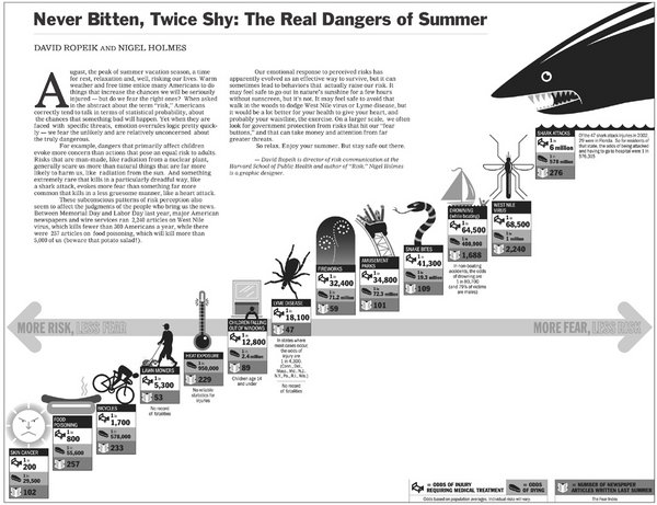
Poor Graphic

Drawback
Before we can redesing above graphic, we should discuss principle design guidelines.
- Lie Factor: The graphic shows more design variation than data variation. The information is not clear and detailed.
- Data-Ink: Data-ink ratio is redundant. The shark illustration is more dominand than rest of queue.
- Color coding: It chart looks a little confuse because a viewer has no overview about relevant information. Background color and foreground color in table are not contrast.
- Aestetic-Usability Effect: All symbols are to big along diagonal axis. Symbols more important than relevant information in tables.
- Layout: The whole layout looks confuse. First of all you see a shark, than rest of chart and written text. This layout shows no relevant information about "The real dangers of summer".
New Graphic

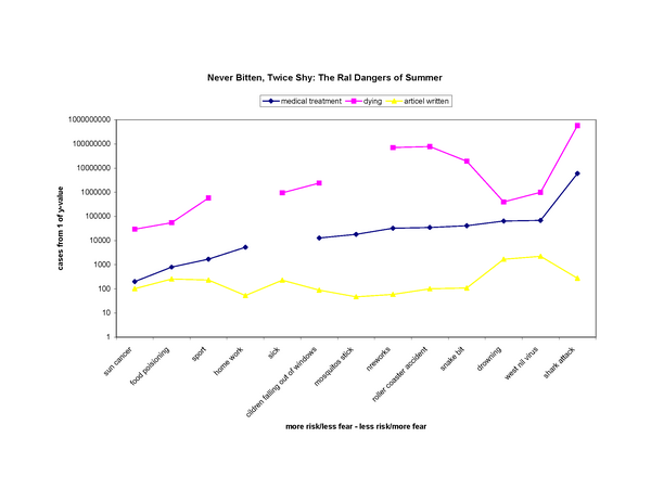
Modified
There are several aspects to remove or modify this graphic.
- Determine the best medium to display. In this case we use a logarithmic graph. A logarithmic graph shows all categories in which a number of cases is different (e.g. shark attack: One of 6 million swimmers).
- Reduce all graphic shapes and tables. Instead use one color graph for every category.
- The data are not complete. The violet and blue line are broken. There are no exist significant data.
- Remove left to right bar and use instead x/y coordination system to get a total overview.
- Relevant information should be emphasize.
Ressources
[Few, 2005] Stephen Few, Elegance Through Simplicity, Creation Date: October 16, 2004, http://www.intelligententerprise.com/showArticle.jhtml;jsessionid=N2ATDQWY5VYKSQSNDBGCKHSCJUMEKJVN?articleID=49400920 [Tufte, 2005] Edward R. Tufte, The Visual Display of Quantitative Information, Creation Date: January 26, 1999, http://ldt.stanford.edu/ldt1999/Students/mizuno/Portfolio/Work/reports/tufte/ed229c-tufte-outline.html