File:Line-Up-Cancer Deaths in Texas.JPG
Original file (1,037 × 200 pixels, file size: 50 KB, MIME type: image/jpeg)
Summary[edit]
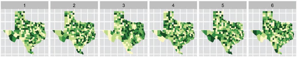
Graphical Inference for InfoVis, Line-up: One of these plots doesn’t belong. These six plots show choropleth maps of cancer deaths in Texas, where darker colors = more deaths. Can you spot which of the six plots is made from a real dataset and not simulated under the null hypothesis of spatial independence? If so, you’ve provided formal statistical evidence that deaths from cancer have spatial dependence. See Section 8 for the answer.
Copyright status[edit]
[Wickham et al., 2010]
Source[edit]
[Wickham et al., 2010] Hadley Wickham, Dianne Cook, Heike Hofmann, and Adreas Buja. Graphical Inference for Infovis. IEEE Transaction on Visualization and Computer Graphics, 16(6):973-979 (Fig.1), November/December 2010
File history
Click on a date/time to view the file as it appeared at that time.
| Date/Time | Thumbnail | Dimensions | User | Comment | |
|---|---|---|---|---|---|
| current | 02:03, 17 November 2010 | 1,037 × 200 (50 KB) | InfoVis1011 9925916 (talk | contribs) | Graphical Inference for InfoVis, Line-up: One of these plots doesn’t belong. These six plots show choropleth maps of cancer deaths in Texas, where darker colors = more deaths. Can you spot which of the six plots is made from a real dataset and not simul |
You cannot overwrite this file.
File usage
The following page uses this file: