Extreme visualization: squeezing a billion records into a million pixels
Authors
Short description
To perform database searches usually query languages like SQL and form fill in templates are used, with results shown in tabular lists.
However, more and more attention is drawn to dynamic queries sliders and other graphical selectors for query specification, with results displayed by information visualization techniques. These filtering techniques have proven to be effective for many tasks in which visual presentations enable discovery of relationships, clusters, outliers, gaps, and other patterns.
The scaling of visual presentations from millions to billions of records will require collaborative research efforts in information visualization and database management to enable rapid aggregation, meaningful coordinated windows, and effective summary graphics.
Current and proposed solutions that facilitate sense-making for interactive visual exploration of billion record data sets are
- atomic,
- aggregated,
- and density plots.
Suitable Datatypes
Information visualizations are designed to deal with multi-dimensional and more importantly multi-variate data.
In addation to
- integer,
- categorical,
- real,
- and nominal
information visualizations often deal with even richer data types.
The four types
- multi-variate,
- time series,
- tree,
- and network
are tied to tasks such as finding clusters, gaps, outliers, trends, and relationships.
Figures
Atomic Visualizations
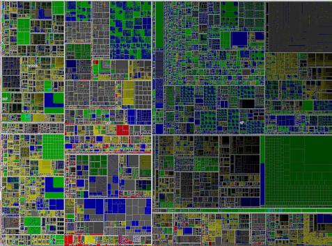
Million node treemap showing the directory structure on a file server. Different colors encode file time, the area encodes the file size. So if zooming is allowed or special algorithms are used to limit drawing of lower level nodes, the visualization of a million nodes on a single display is possible.
Aggregate Visualizations
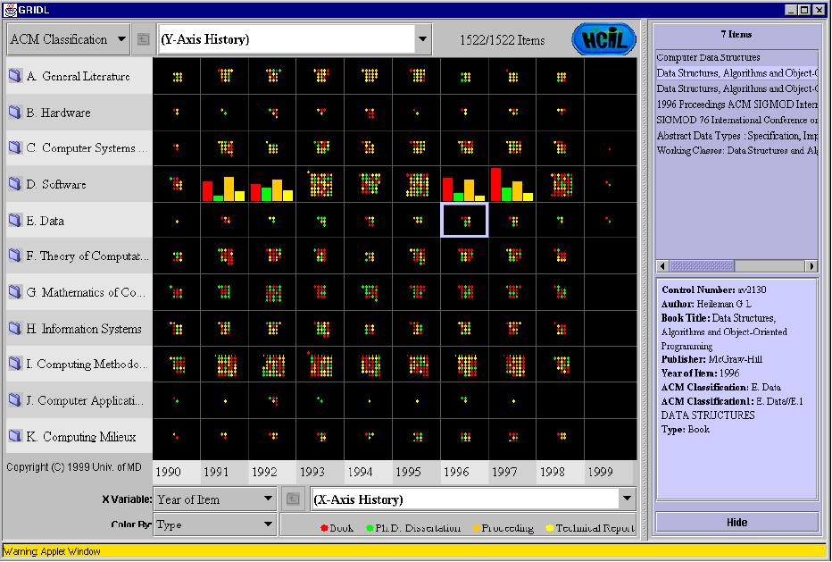
Clicking on a aggregation marker will cause an expansion in place, but it's more effectively to use coordinated windows for displaying the single components. This technique allows the user to study an overview map and then select a region to see more detailed information in the coordinated window.
This Graphical Interface for Digital Libraries offers a scalable approach where each axis is an expandable hierarchy. Each grid cell shows up to 49 colored dots for documents, and shifts to an aggregation marker in the form of a bar chart. Clicking on a grid cell produces a listing of titles in the upper right window. Clicking on a title produces the catalog description in the bottom right window.
Density Plot Visualizations
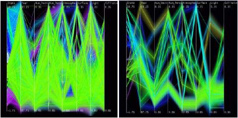
Density Plots show a concentration of markers, which could be interpreted as a two-dimensional histogram. For time series data, density plots can show concentrations of time points.A good model is the work on cluster displays in parallel coordinate views.
Parallel coordinate shows 230,000 records in a fatal accident database on the left. The variable opacity bands show meaningful clusters on the right.
Important citations
Evaluation/Usage
- Spotfire
- Tableau
Handle at least a million records, provide dynamic query filtering and redisplay at interactive rates to support rapid exploration.
- Hyperion
- CrystalReports
Are Online Analytic Processing (OLAP) systems
- Hierarchical Clustering Explorer (HCE)
Implements the strategy of ranking strength of features.
- SpaceTree
- DOITree
Give user control over which nodes are exposed.
- Treemap 4.0
Allows a color coded density plot that shows the number of nodes or aggregate values of node attributes.
References
Extreme visualization: squeezing a billion records into a million pixels
GRIDL - Graphical Interface for Digital Libraries
Web Based Visual Exploration of Patent Information


