2005-07-21: "In The News" - Interactive Visualization of Google News
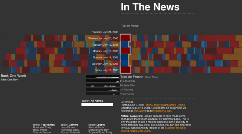
Apart from the well known Newsmap visualization that utilizes Treemaps to present the current distribution of Google News topics, another very interesting visualization exists: In The News is the title of Michal Migurski's interactive Flash application that was posted already a year ago:
In contrast to Newsmap that only shows current news, In The News adds temporal aspects via presenting the history of news topics over time. Thus, it allows for interactive exploration of the development of news topics over time.

[Migurski, 2004] Michal Migurski, In The News. Created at: June 9, 2004. Retrieved at: July 21, 2005. http://news.stamen.com/
- One week worth of news is represented in rows on the display.
- A single news topic is represented as color chip whereas the size of a chip denotes its relative importance on that day.
- Color is used to show whether an item has gained or lost importance relative to the previous day.
- When selecting a news topic, the corresponding color chips are highlighted and a small bar graph showing the topic's performance over the last month is shown below the main visualization.
- If a new topic is selected, another small bar graph is added while keeping the history of the last five selected topics visible and allowing for their comparison.
- Furthermore, news topics can be searched and lists of Top Names, Top Gainers, and Top Losers are provided.
The different views are very well coordinated and smooth transitions are provided, which adds to the coherent picture of the whole application making it an excellent example for a highly interactive exploration tool for time-oriented abstract data. And even nicer, the source code is available and released under a Creative Commons License.
via sendung.de blog
References
[Migurski, 2004] Michal Migurski, In The News. Created at: June 9, 2004. Retrieved at: July 21, 2005. http://news.stamen.com/