Teaching:TUW - UE InfoVis WS 2010/11 - Gruppe 05 - Aufgabe 3
Interactive visualization
Introduction
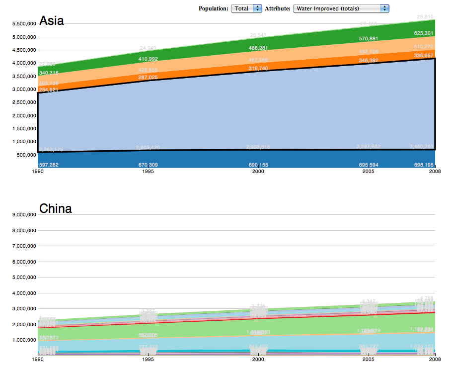
Based on a report [1] of the Unicef, who tries to enable a greater access to drinking-water and sanitation for people all over the world, we made a visualization, which shows the access to these resources in addition to the number of the population. The situation of the urban population is far better developed, in comparison to the rural population. The main reason behind this are the worse living conditions of the rural population.
884 Million people do not use improved sources of drinking - water. 2.6 Billion people do not use improved sanitation, just 61 percent of human civilization have access to improved sanitation. With this in mind a visualization was created which enables the viewer an easy way to view and understand the presented data.
The visualization can be found here:
Analysis of the dataset
The dataset[2] is continuous over the time from 1990 to 2008. In an interval of every 5th year, in each country have been made entries of the (un-) improved sources of drinking water, the sanitation and the people who gained access to it.
Some data instances had missing values. Therefore just complete data instances were used.
The application area is the progress on all datasets, which shows us a multidimensional datastructure.
The main characteristics of the dataset are:
- multivariate
- temporal
- numeric
- hierarchies
- countries < continents
The composition of the data is the following:
- all data (totals)
- urban
- rural
- water
- improved (totals)
- piped
- other improved
- improved (totals)
- sanitation
- unimproved (totals)
- open defecation
- shared
- other
- unimproved (totals)
Analysis of the users
The main audience for the created visualization are people with interest in global politics. But also viewers with a lower background should be able to use the visualization and find the information they need in a fast way. The visualization mainly focuses on showing the viewer the development of the attributes, so that users are able to investigate how the conditions changed over time.
Analysis of the tasks
What do we want to reach with our visualization? We want to show the community the circumstances of the poor civilization. Not just a picture of a point, but all information over the globe in a diagram where you can easily read the information from and compare with other countries. You can see on the first sight, which countries need more assistance to reach better results. Different questions can be saved, like: Are there any dependencies, which affect different countries? Which continent has more access? How much has it been grown in the last few years (max. to 1990)?
Visualization design
The Job Voyager[3] visualization was chosen as basis for the created visualization, to represent the stacked time series of the data. The data which should be shown can be filtered by population and its attributes. A characteristic of the area under the drawn line in the chart is, that it shows us the bigger it is the bigger is it's value. So you are able to see the countries in the chart, which have better prospects. Furthermore the user has a interaction with the visualization by moving his mouse over the chart. So the user has the facility to choose the continent by mouse-over and look at it's countries. In the left upper corner of the site, the actual name of the country gets shown as label, by moving the mouse over the area of this country. The measured values of the different years are not shown just on the y-axis, but also on every point of time in the chart.

advantages
- the ability to extend the chart
- main information on one site
- fluent workflow
- dependencies of different variables
- big dataset, as a smart visualization
disatvantages
- big numbers, hard to represent
- many countries in one chart are confusing sometimes
- details hard to read
- sometimes difficult to find a specific country
Conclusion
The chosen visualization focuses on time oriented data. Main focus was to show the development of the specific attributes over time. Overall the visualization satisfies this purpose in an easy readable way.
References
- [1] [Unicef, 2010] Unicef. Progress on Sanitation and drinking-water: 2010 Update. JMP report - World Health Organization and UNICEF 2010, 1–55, 2010.
- [2] [WHO, Unicef, 2003-2010] WHO - UNICEF. Protovis: Joint Monitoring Programme (JMP) for Water Supply and Sanitation. Created at: 1990. Retrieved at: January 15, 2011. http://www.wssinfo.org/data-estimates/table/.
- [3] [Bostock, Heer, 2009] Michael Bostock and Jeffrey Heer. Protovis: A graphical tool for visualization. Created at: March 31, 2009. Retrieved at: January 15, 2011. http://vis.stanford.edu/protovis/ex/jobs.html.