Teaching:TUW - UE InfoVis WS 2009/10 - Gruppe 13 - Aufgabe 2
Aufgabenstellung
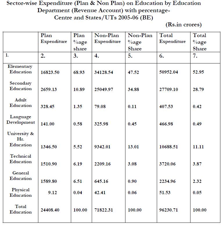
Original table
Critic on original table
Missing unit in expenditure columns.
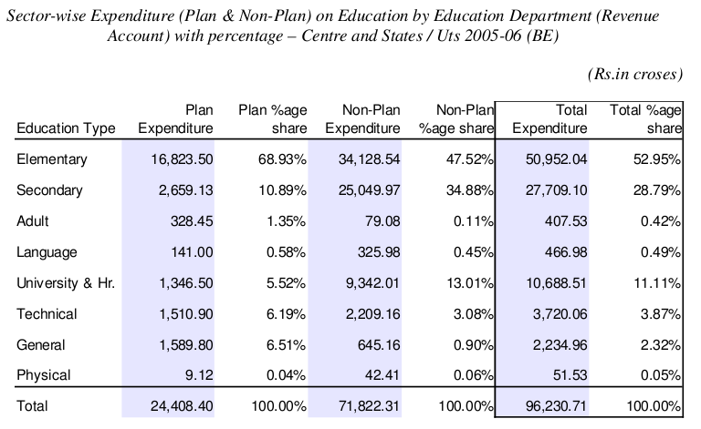
Redesigned table
Changes applied to table
Second row, the one with ordinal numerals had no meaningful function. Because of that we decided to remove it completely from the table.
It is a convention that numbers are aligned to the right. When the numbers in column are displayed with the same precision, i.e. two decimal places like in this table, reader can more easily compare numbers one under another because hundreds are under hundreds, thousands under thousands and so on.
There should be units declared for each column at least in header. However there were no units declared in original table so we cannot say what currency is the amount displayed in. However there was added % sign to each cell in percentage columns. It is a convention too. Reader sees that the number describes percentage without looking into header row.
We changed also a format of the numbers, to make processing and comparing of numbers easier for reader. Comma was placed to the left of every three whole-number digits to divide thousands from millions, millions from billions, etc. Reader can more easily count digits in the number.
Another change we made is addition of "Education type" into header row and removing of word "Education" from each row in first column. Thus the cells are shorter and don't have to be wrapped to two lines because of redundant information.
-to delineate rows, every second line is filled with collor instead -row summary is shown under rule and in bold text -column summary is distinguished from other data by using border area around this summary -there is added white space between education type column and plan expenditure -white space is added also between columns describing plan expenditure and columns describing non-plan expenditure

