Teaching:TUW - UE InfoVis WS 2009/10 - Gruppe 08 - Aufgabe 2
Aufgabenstellung
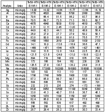
Zu beurteilende Tabelle
Point B : Critics on the given table
1. White space:
This example shows horizontal white space between rows of data but no white space of vertikal data may cause difficulties for the reader of this table.
2. Rules and grids:
As written in the lecture, the delineation of columns and rows is the least effective use of rules and grids. In our example are used thick grids and dots (intermittent lines) without any form what did not even separate the header from body nor any other data. There is a thick line between the body and the header but the problem is that the same thick lines are also used in the body what makes it look like group of data.That reduces the table’s effectiveness.
3. Header:
In the header there is the same title written for each group of data what makes the table full of information and reduces the effectivness.There is also no need for unit´s name to be repeated for each data because it is the same name repeated all the time.
4. Alignment:
Quantitative values in our table are center aligned.Because of the way numbers are written and read, aligning them to the center makes them difficult to interpret and decimels can be easily ignored.
5. Number format:
A comma is not placed to the left of every three whole-number digits.
6. Font:
In our table font is "Bold" what does not make the table legible.
Point C : Suggested revisions
Table 1
Table 2
Point D : Explanation of improvements
Ad Table 1
1. White space:
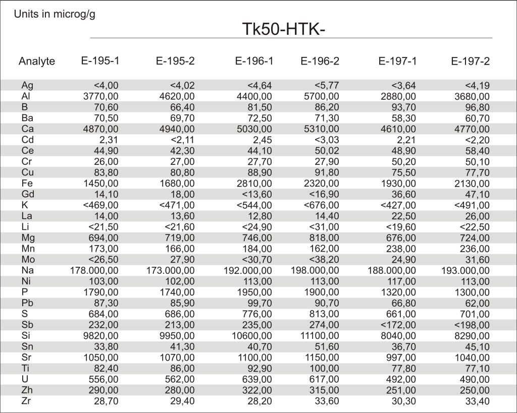
First thing we did was to delete already existing grids and rows and to replace them with white spaces horizontaly.We did that to make our table look more legible and to increase the table effectivness.
2. Rules and grids
We deleted all grids and rules except the header line.That is important for the reader to get the idea of the data he is reading.
3. Header
For better view we deleted all unit names that were repeated for each row and we left only one unit name that values for each one. We did the same thing with the column names and we left only one colum name "Tk50-HTK" written horizonatly and it is easiy to notice that it values for each subgroup.(E-195-1 etc.)
4. Alignment
Because numbers in our table represent quantitative values we aligned them to the right for better legibility.
5. Number format
For better legibility we changed number format and placed comma to the left of every three whole-number digits.
6. Font
We changed the font as well because BOLD makes the data less effective.We chose ariel font.
7. Fill color
Fill colors are less distracting to the eye as it scans across them.Because of that we chose grey grids accros horizontal rows.
Ad Table 2
1. White Space
White space was used between the each of the groups (E-195-/E-196-/E-197-).
2. Rules and grids
Most of the gridlines were dismissed. Only two gridlines stayed remaining.
3. Header
The Header is now consisting of the chemical elements for better comparison of the relevant values in columns instead of in rows.
4. Alignment
Numbers are aligned on the right side. Mass numbers of the elements are aligned on the left and the element names (one row below) in the middle to make it look like the standard chemical notation of elements.
5. Font
Google Docs standard font.
7. Fill color
One fill color is used for the columns in order to help the eyes focus on them.


