Teaching:TUW - UE InfoVis WS 2008/09 - Gruppe 09 - Aufgabe 2
Aufgabenstellung
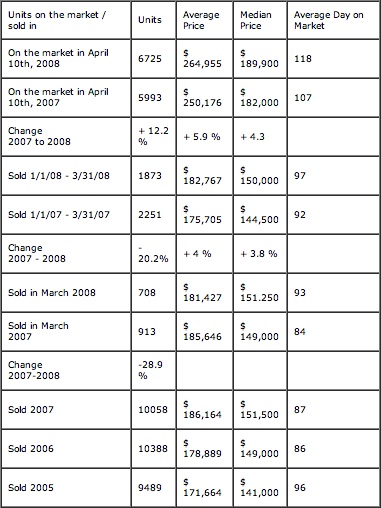
Zu beurteilende Tabelle
Critics on the table
Following the Table Design Guidelines by [Stephen Few, 2004] several design flaws could be found in the table:
- General Table Design
- The Table borders are not necessary since they provide no additional information.
- Since there is no table labeling, the whole statistics is hard to understand.
- The Dimensions of the table columns are not properly assigned. While the last column is far too wide, others are too short.
- Table Row Design
- The Table rows contain different types of information, e.g. "Sold", "On the market" and "Change". This makes it quite hard to read the table and compare table data row-wise.
- Unit Labeling
- The Units (% and $) within the table cells are badly formatted. Those could be extracted and written into the table header.
- Some units are explicitly displayed (% and $), others not even defined (last column).
- The placement of some Units (e.g. %) is not consistent. In some columns those are placed <above>, <next to> or <below> the given data.
- Header Definition
- The header information of the first column is also used in table cells. This is redundant.
- Number Design
- All numbers seem to be aligned left, hence they are hardly comparable and readable.
- The serparator of numbers (in table column "units") is missing.
- The separator itself is not consistent through the whole statistics.
- The precision of numbers is not constistent as well.
- Missing Data
- While all other comparisons between 2007 and 2008 show percentages, none are displayed for the Change from March 2007 to March 2008. These percentages could be easily calculated.
- Table Cell Naming
- The naming of table cells in some parts is very confusing. The row "Change 2007-2008", for example, describes the change from March 2007 to March 2008.
Optimized Table
Improvements
- Restructuring of the (sub-)divisions gives a better overview of the data. Major divisions are now "On the market" and "Sold". Those are arranged into subdivisions which represent different timeslots (e.g. March, April 10th).
- Percentages are no longer in a seperate column, but added to the data cell of 2008.
- Since the main target of the table is to illustrate the changes from 2007 to 2008 we color coded this informtion and rearranged the cells, so that now data of the same type from 2007 and 2008 are adjacent horizontally.
- Swapping the columns and rows gives consitency of the different units. Those are no longer mixed up (e.g. no % and $ in a column)
- The dollar unit definition "$" has been extracted from the cells into a the table row definition.
- The annual sums for 2007, 2006 and 2005 are now explicitely marked (by writing their data cursive) since they dont really fit into the scheme of comparing data from 2007 and 2008.
References
[Stephen Few, 2004] Stephen Few, Show Me the Numbers: Designing Tables and Graphs to Enlighten, Analytics Press, 2004, Chapter 8 - Table Design.

