Teaching:TUW - UE InfoVis WS 2008/09 - Gruppe 08 - Aufgabe 3: Difference between revisions
Jump to navigation
Jump to search
mNo edit summary |
mNo edit summary |
||
| Line 14: | Line 14: | ||
* The lines are to strong, use less satured color, remove shading | * The lines are to strong, use less satured color, remove shading | ||
== Optimized | == Optimized graphic == | ||
Bin gerade dabei die Grafik zu zeichnen.... | |||
=== Improvements === | === Improvements === | ||
Revision as of 12:11, 8 December 2008
Aufgabenstellung
Zu beurteilende Grafik

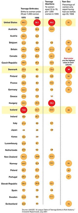
Teenage births in rich nations
Criticism
- The graph has no title. People looking at the graph can not see immediately what the graph is about.[Few 1, 2004]
- Data is not ordered in a meaningfull sequence.[Few 1, 2004]
- Legend describing the meaning of read circles stands inside the table. Put it on top?
- Filled circles increase data ink, use unfilled circles instead?
- The lines are to strong, use less satured color, remove shading
Optimized graphic
Bin gerade dabei die Grafik zu zeichnen....
Improvements
References
- [Few 1, 2004] Stephen Few, Show Me the Numbers: Designing Tables and Graphs to Enlighten. Analytics Press, 2004, Chapter 7 - General Design for Communication.
- [Few 2, 2004] Stephen Few, Elegance Through Simplicity. United Business Media LLC, October 16. 2004, http://www.intelligententerprise.com
- [Stanford, 1999] Yoko Mizuno, Josh Sheldon, and Mun-See Tham, Tufte Design Principles. Stanford University, January 26. 1999, http://ldt.stanford.edu