Teaching:TUW - UE InfoVis WS 2008/09 - Gruppe 07 - Aufgabe 3: Difference between revisions
Jump to navigation
Jump to search
No edit summary |
No edit summary |
||
| Line 19: | Line 19: | ||
labeling of rainforest also not obvious but better because different color and directly on the images | labeling of rainforest also not obvious but better because different color and directly on the images | ||
the drastic change of existing rainforest is not obvious with the pie diagramm (doesn't look much) | the drastic change of existing rainforest is not obvious with the pie diagramm (doesn't look much) | ||
people have good feeling about a lot of food | |||
Revision as of 23:57, 5 December 2008
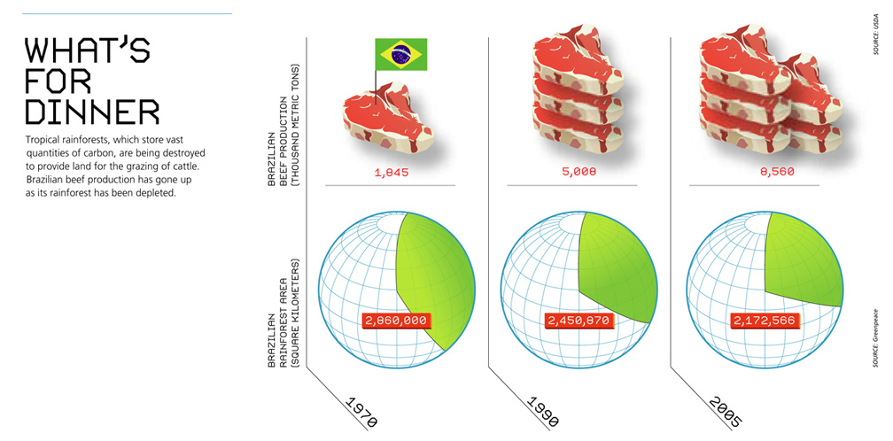
Original Graphic
Critics
mistakes:
too much non-data-ink changing scale (20 years, 15 years) different scales (but not obvious) confusing messages (earth of brazil?) title not significant/meaningful the steaks don't represent the units flag useless you have to read the text to understand the graph to read important labeling you have to turn your head labeling of meat gets lost (small, same color) labeling of rainforest also not obvious but better because different color and directly on the images the drastic change of existing rainforest is not obvious with the pie diagramm (doesn't look much) people have good feeling about a lot of food
- By following [Few, 2004a] we highlight the data through a desing process:
- Reducing the non data ink
- Subtract unnecessary non-data ink:
- De-emphasize and refgularize the data ink:
- Enhancing the data ink
- Subtract unnecessary data ink
- Emphasize the most important data ink
- Reducing the non data ink
Changed Graphic
Resources
- [Few, 2004a]:Stephen Few, Show Me the Numbers: Designing Tables and Graphs to Enlighten, Analytics Press, 2004, Chapter 7 - General Design for Communication.
