Teaching:TUW - UE InfoVis WS 2008/09 - Gruppe 05 - Aufgabe 3: Difference between revisions
Jump to navigation
Jump to search
No edit summary |
No edit summary |
||
| Line 7: | Line 7: | ||
== Critical comments == | == Critical comments == | ||
===Interpreting the Data=== | |||
* In order to interpret the graphic we first wanted to know what kind of information should be compared to each other. We found out that the main statement of the graphic is not perceptible out of the design. There could be two different ways of interpreting the data: | |||
# A comparison of the amount of emission of greenhouse gas between the different kinds of keeping inside a country | |||
# A comparison of the amount of emission of greenhouse gas per keeping between all countries | |||
* Because there are no scales it is hard to estimate how much tons of gas there are emitted there's only mentioned the totaling amount of 150 million tons. | |||
* It is hard to determine which countries are combinded in a region especially in Asia. | |||
* There is no explanation in the legend that tells us what an empty entry in a table means. It could mean that there is no emission because of the absence of the kind of keeping or it could mean that there is no data for this kind of keeping. | |||
* A comparison of the emission of greenhouse gas between the animals is difficult when there are many different animals in a region. | |||
* It is very disturbing for interpreting the data that the tables are placed at a different height. | |||
===Data-Ink Ratio=== | |||
According to E. Tufte the data-ink ratio can be computed as follows: (data-ink) / (all-ink used to print the graphic) = data-ink-ratio. This means that you should only display significant data in a graphic. | |||
* In our opinion it is a decorative idea to use a map of the world for displaying the data but not a good one. This kind of style is disturbing the because it prescinds from the relevant information. | |||
===Visual Clutter=== | |||
====Color==== | |||
* The colors used for the world map are very hard to distinguish and that's why it's hard to determine which countries are related to which table. | |||
* It's difficult to identify the different kinds of animals when there is much data in a table especially when dark blue, blue and green are close together. | |||
====Legend==== | |||
* The legend is scattered all over the graphic which disturbes reading it. | |||
* The largest font size is used to display the headline that draws off the attention. | |||
== Adapted graphic == | == Adapted graphic == | ||
| Line 21: | Line 50: | ||
* [[Teaching:TUW - UE InfoVis WS 2008/09 - Gruppe 05|Gruppe 05]] | * [[Teaching:TUW - UE InfoVis WS 2008/09 - Gruppe 05|Gruppe 05]] | ||
==References== | |||
*[Tufte et al., 1999] E. Tufte Design Principle Project: The Visual Display of Quantitative Information, Retrieved at: December 08, 2008. http://ldt.stanford.edu/ldt1999/Students/mizuno/Portfolio/Work/reports/tufte/ed229c-tufte-outline.html | |||
*[Few, 2004a] Show Me the Numbers: Designing Tables and Graphs to Enlighten, Analytics Press, 2004, Chapter 7 - General Design for Communication. | |||
*[Few, 2004b] Elegance Through Simplicity Article about redesigning graphs . Retrieved at: December 08, 2008. http://www.intelligententerprise.com/showArticle.jhtml;jsessionid=N2ATDQWY5VYKSQSNDBGCKHSCJUMEKJVN?articleID=49400920 | |||
Revision as of 14:13, 8 December 2008
Aufgabenstellung
Zu beurteilende Grafik

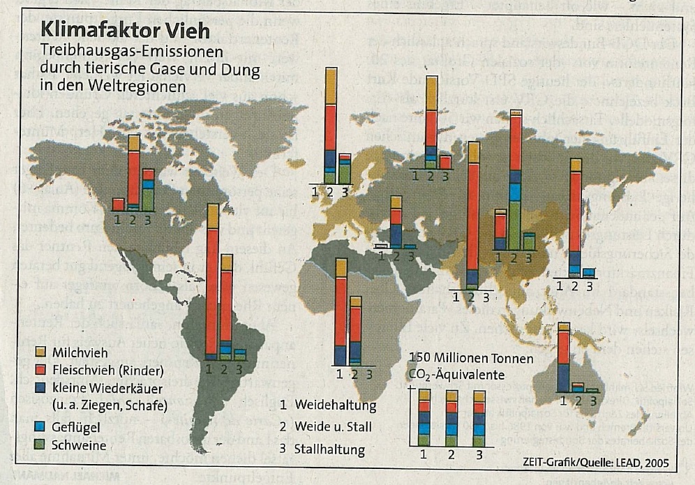
Treibhausgas-Emissionen durch tierische Gase und Dung in den Weltregionen
Critical comments
Interpreting the Data
- In order to interpret the graphic we first wanted to know what kind of information should be compared to each other. We found out that the main statement of the graphic is not perceptible out of the design. There could be two different ways of interpreting the data:
- A comparison of the amount of emission of greenhouse gas between the different kinds of keeping inside a country
- A comparison of the amount of emission of greenhouse gas per keeping between all countries
- Because there are no scales it is hard to estimate how much tons of gas there are emitted there's only mentioned the totaling amount of 150 million tons.
- It is hard to determine which countries are combinded in a region especially in Asia.
- There is no explanation in the legend that tells us what an empty entry in a table means. It could mean that there is no emission because of the absence of the kind of keeping or it could mean that there is no data for this kind of keeping.
- A comparison of the emission of greenhouse gas between the animals is difficult when there are many different animals in a region.
- It is very disturbing for interpreting the data that the tables are placed at a different height.
Data-Ink Ratio
According to E. Tufte the data-ink ratio can be computed as follows: (data-ink) / (all-ink used to print the graphic) = data-ink-ratio. This means that you should only display significant data in a graphic.
- In our opinion it is a decorative idea to use a map of the world for displaying the data but not a good one. This kind of style is disturbing the because it prescinds from the relevant information.
Visual Clutter
Color
- The colors used for the world map are very hard to distinguish and that's why it's hard to determine which countries are related to which table.
- It's difficult to identify the different kinds of animals when there is much data in a table especially when dark blue, blue and green are close together.
Legend
- The legend is scattered all over the graphic which disturbes reading it.
- The largest font size is used to display the headline that draws off the attention.
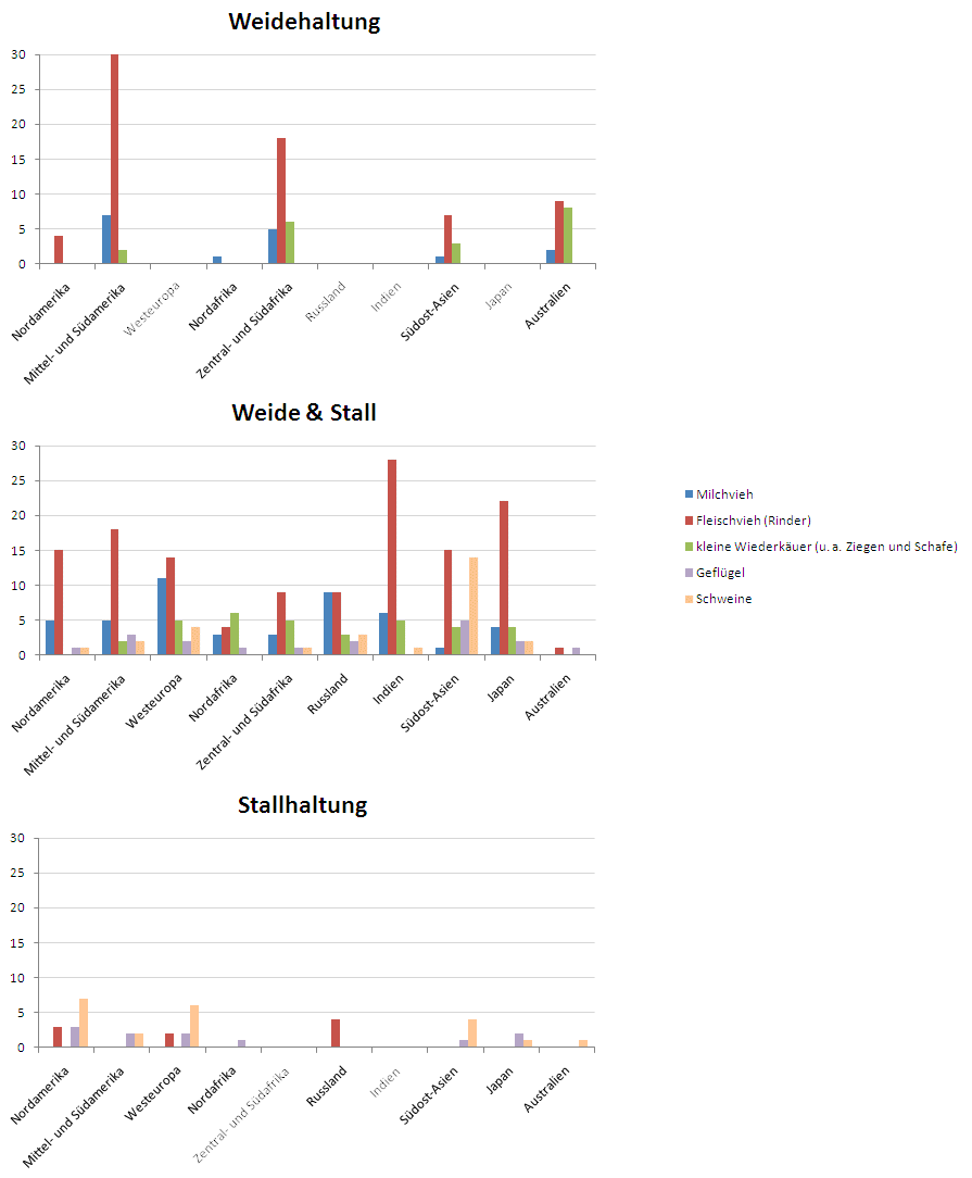
Adapted graphic
Adaptions
Links
References
- [Tufte et al., 1999] E. Tufte Design Principle Project: The Visual Display of Quantitative Information, Retrieved at: December 08, 2008. http://ldt.stanford.edu/ldt1999/Students/mizuno/Portfolio/Work/reports/tufte/ed229c-tufte-outline.html
- [Few, 2004a] Show Me the Numbers: Designing Tables and Graphs to Enlighten, Analytics Press, 2004, Chapter 7 - General Design for Communication.
- [Few, 2004b] Elegance Through Simplicity Article about redesigning graphs . Retrieved at: December 08, 2008. http://www.intelligententerprise.com/showArticle.jhtml;jsessionid=N2ATDQWY5VYKSQSNDBGCKHSCJUMEKJVN?articleID=49400920
