Teaching:TUW - UE InfoVis WS 2008/09 - Gruppe 02 - Aufgabe 1 - Scatterplot: Difference between revisions
(improved the wording of the whole page) |
m (repaired broken links) |
||
| Line 10: | Line 10: | ||
Perfect linear correlation results in all samples lying on the regression line with positive or negative incline, dependent on the sign of the correlation coefficient [[http://www.mste.uiuc.edu/courses/ci330ms/youtsey/scatterinfo.html MSTE, 1997]]. Note, that the non zero incline of the line is insignificant in this kind of diagram [[http://en.wikipedia.org/wiki/Correlation Wikipedia 3, 2008]] since it is dependent on axis scales. | Perfect linear correlation results in all samples lying on the regression line with positive or negative incline, dependent on the sign of the correlation coefficient [[http://www.mste.uiuc.edu/courses/ci330ms/youtsey/scatterinfo.html MSTE, 1997]]. Note, that the non zero incline of the line is insignificant in this kind of diagram [[http://en.wikipedia.org/wiki/Correlation Wikipedia 3, 2008]] since it is dependent on axis scales. | ||
An example of perfect correlation can be seen in the upper left of [http://www.infovis-wiki.net/index.php?title=Image:SomeScatterplots.jpg | An example of perfect correlation can be seen in the upper left of [http://www.infovis-wiki.net/index.php?title=Image:SomeScatterplots.jpg Figure 1] together with other patterns: Strong positive (upper right), weak negative (lower left) and one example of variables without significant correlation. | ||
[[Image:WeakNegativeCorrelationLine.jpg|right|200px|thumb|Figure 2: Regression line.]] | [[Image:WeakNegativeCorrelationLine.jpg|right|200px|thumb|Figure 2: Regression line.]] | ||
[http://www.infovis-wiki.net/index.php?title=Image:WeakNegativeCorrelationLine.jpg | [http://www.infovis-wiki.net/index.php?title=Image:WeakNegativeCorrelationLine.jpg Figure 2] features a regression line to increase its expressiveness. This is the line that passes through the plot as close to the points as possible. The regression function is not necessarily chosen linear as in this example. Any kind of curve may fit a plot (quadratic curves, splines, ...) and must be chosen according to the subject matter. Generally, the curve with the smallest sum of squared distances to the plotted points is sought after (''least squares fitting''), [[http://www.netmba.com/statistics/plot/scatter/ NetMBA, 2008]]. For an introduction on linear regression, see [[http://en.wikipedia.org/wiki/Linear_regression Wikipedia 4, 2008]; [http://en.wikipedia.org/wiki/Regression_analysis Wikipedia 5, 2008]]. | ||
[[Image:ClustersOutlyers.jpg|right|200px|thumb|Figure 3: Clusters and outliers.]] | [[Image:ClustersOutlyers.jpg|right|200px|thumb|Figure 3: Clusters and outliers.]] | ||
Further properties of data sets can easily be discovered by the presence of clusters and outliers as denoted in [http://www.infovis-wiki.net/index.php?title=Image:ClustersOutlyers.jpg | Further properties of data sets can easily be discovered by the presence of clusters and outliers as denoted in [http://www.infovis-wiki.net/index.php?title=Image:ClustersOutlyers.jpg Figure 3]. | ||
==Scatterplots of Higher Dimensions== | ==Scatterplots of Higher Dimensions== | ||
---- | ---- | ||
Scatterplots are not restricted to records with only two variables. Higher dimensional data can be displayed by adding a third axis to the plot, or by assigning point properties like color, size or shape. [http://www.infovis-wiki.net/index.php?title=Image:Plot4D.png | Scatterplots are not restricted to records with only two variables. Higher dimensional data can be displayed by adding a third axis to the plot, or by assigning point properties like color, size or shape. [http://www.infovis-wiki.net/index.php?title=Image:Plot4D.png Figure 4] shows a plot done with Matlab's command "plot4D", [[http://cosmologist.info/cosmomc/readme.html Lewis, 2008]]. | ||
[[Image:Plot4D.png|right|200px|thumb|Figure 4: A Matlab 4D plot.]] | [[Image:Plot4D.png|right|200px|thumb|Figure 4: A Matlab 4D plot.]] | ||
| Line 36: | Line 36: | ||
[[Image:hr_diagram_local.png|right|200px|thumb|Figure 5: The HRD of some nearby stars.]] | [[Image:hr_diagram_local.png|right|200px|thumb|Figure 5: The HRD of some nearby stars.]] | ||
A prominent example of a scatterplot with two variables is the ''Hertzsprung-Russell diagram'' (HRD) in astronomy ([http://www.infovis-wiki.net/index.php?title=Image:Hr_diagram_local.png | A prominent example of a scatterplot with two variables is the ''Hertzsprung-Russell diagram'' (HRD) in astronomy ([http://www.infovis-wiki.net/index.php?title=Image:Hr_diagram_local.png Figure 5]). It plots absolute magnitude (intrinsic brightness) of stars against their spectral types and shows a rich set of features, such as clusters and a central filament (the ''main sequence''), [[http://www.britannica.com/EBchecked/topic/263951/Hertzsprung-Russell-diagram Britannica, 2008]]. | ||
==References== | ==References== | ||
Revision as of 03:33, 6 November 2009
A scatterplot allows effective visualization of the relation between variables in a data set.
Also called a scatter chart, scatter diagram or scatter graph [Wikipedia 1, 2008]. The most basic form of a scatterplot is a two-dimensional diagram wherein relation of two metric variables is visualized. Their values are represented by the position on the horizontal and vertical axis of a cartesian coordinate system. Every resulting point in the graph stands for one record from the underlying data set. The distribution pattern of points from multiple records reveals, among other qualities, the correlation between the selected variables in the data set. The scatterplot is not to be confused with the correlation plot [NIST, 2008] which represents already adopted correlation coefficients in different data groups, while the term correlation diagram does not seem to be bound.
Revealed Information
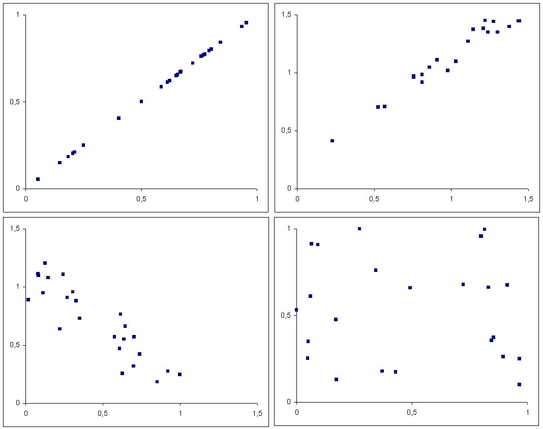
Perfect linear correlation results in all samples lying on the regression line with positive or negative incline, dependent on the sign of the correlation coefficient [MSTE, 1997]. Note, that the non zero incline of the line is insignificant in this kind of diagram [Wikipedia 3, 2008] since it is dependent on axis scales.
An example of perfect correlation can be seen in the upper left of Figure 1 together with other patterns: Strong positive (upper right), weak negative (lower left) and one example of variables without significant correlation.
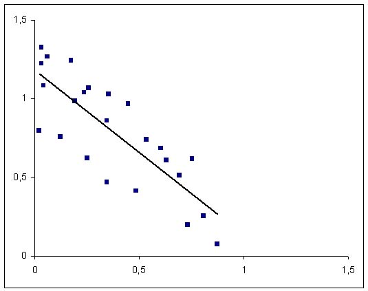
Figure 2 features a regression line to increase its expressiveness. This is the line that passes through the plot as close to the points as possible. The regression function is not necessarily chosen linear as in this example. Any kind of curve may fit a plot (quadratic curves, splines, ...) and must be chosen according to the subject matter. Generally, the curve with the smallest sum of squared distances to the plotted points is sought after (least squares fitting), [NetMBA, 2008]. For an introduction on linear regression, see [Wikipedia 4, 2008; Wikipedia 5, 2008].
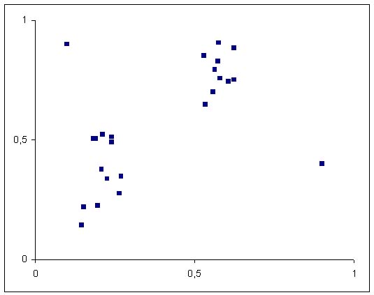
Further properties of data sets can easily be discovered by the presence of clusters and outliers as denoted in Figure 3.
Scatterplots of Higher Dimensions
Scatterplots are not restricted to records with only two variables. Higher dimensional data can be displayed by adding a third axis to the plot, or by assigning point properties like color, size or shape. Figure 4 shows a plot done with Matlab's command "plot4D", [Lewis, 2008].
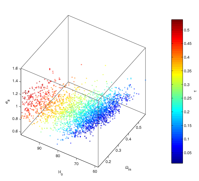
For another example of a three-dimensional scatterplot see [Wikipedia 1, 2008]. A way of plotting multi-dimensional data without the use of a third axis can be found in [Demsar, 2008].
Treating Discrete Data
For continuously distributed data, scatterplots do well in visualizing density. The problem with discrete data is the possibility of more than one record sharing one point in the diagram (overplotting). One solution is to alter the point representation according to density, which is achieved by sunflower plots in which each point symbol gains radial segments [Wikipedia 2, 2008]. Examples can be found here: [Friendly, 2006; addictedtor, 2005].
Example of Application
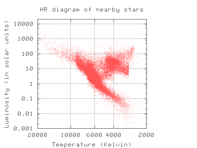
A prominent example of a scatterplot with two variables is the Hertzsprung-Russell diagram (HRD) in astronomy (Figure 5). It plots absolute magnitude (intrinsic brightness) of stars against their spectral types and shows a rich set of features, such as clusters and a central filament (the main sequence), [Britannica, 2008].
References
- [addictedtor, 2005]: Anonymous. Sun Flower Plot. R Graph Gallery. Changed: October 6, 2005 Retrieved at: 2 November, 2008. http://addictedtor.free.fr/graphiques/graphcode.php?graph=59
- [Britannica, 2008] Hertzsprung–Russell diagram. In Encyclopædia Britannica. Retrieved November 16, 2008, from Encyclopædia Britannica Online: http://www.britannica.com/EBchecked/topic/263951/Hertzsprung-Russell-diagram
- [Demsar, 2008] Janez Demsar, Simple Visualization Examples. A.I. Lab Ljubljana. Retrieved at: November 2, 2008 http://www.ailab.si/janez/visualizations.html
- [Friendly, 2006] Michael Friendly, The sunplot macro. York University. Changed at: November 2, 2006. Retrieved at: November 2, 2008 http://www.math.yorku.ca/SCS/sasmac/sunplot.html
- [Lewis, 2008] Antony Lewis, CosmoMC readme. Retrieved at 16 November, 2008. http://cosmologist.info/cosmomc/readme.html
- [MSTE, 1997]: Anonymous Carolyn, Carolyn's Unit on Graphing. MSTE, University of Illinois. Retrieved at: November 2, 2008. http://www.mste.uiuc.edu/courses/ci330ms/youtsey/scatterinfo.html
- [NetMBA, 2008] Anonymous, Scatter Plot. NetMBA. Retrieved at: 2 November, 2008. http://www.netmba.com/statistics/plot/scatter/
- [NIST, 2008] Carroll Croarkin, Paul Tobias. NIST/SEMATECH e-Handbook of Statistical Methods. Retrieved at November 2, 2008 http://www.itl.nist.gov/div898/handbook/
- [Wikipedia 1, 2008] Scatterplot, Wikipedia. Retrieved at: November 2, 2008. http://en.wikipedia.org/wiki/Scatterplot
- [Wikipedia 2, 2008] Streudiagramm, Wikipedia. Retrieved at: November 2, 2008. http://de.wikipedia.org/wiki/Streudiagramm
- [Wikipedia 3, 2008] Correlation, Wikipedia. Retrieved at: November 2, 2008. http://en.wikipedia.org/wiki/Correlation
- [Wikipedia 4, 2008] Linear Regression, Wikipedia. Retrieved at 2 November, 2008. http://en.wikipedia.org/wiki/Linear_regression
- [Wikipedia 5, 2008] Regression Analysis, Wikipedia. Retrieved at 2 November, 2008. http://en.wikipedia.org/wiki/Regression_analysis