Teaching:TUW - UE InfoVis WS 2008/09 - Gruppe 01 - Aufgabe 1 - Cartogram: Difference between revisions
No edit summary |
No edit summary |
||
| Line 32: | Line 32: | ||
* Dorling Cartograms | * Dorling Cartograms | ||
This type of cartogram was named after its inventor, Danny Dorling of the University of Leeds. A Dorling cartogram maintains neither shape, topology nor object centroids, though it has proven to be a very effective cartogram method. To create a Dorling cartogram, instead of enlarging or shrinking the objects themselves, the cartographer will replace the objects with a uniform shape, usually a circle, of the appropriate size. Professor Dorling, for the reason described above in the non-contiguous cartogram section, suggests that the shapes not overlap but rather be moved so that the full area of each shape can be seen | This type of cartogram was named after its inventor, Danny Dorling of the University of Leeds. A Dorling cartogram maintains neither shape, topology nor object centroids, though it has proven to be a very effective cartogram method. To create a Dorling cartogram, instead of enlarging or shrinking the objects themselves, the cartographer will replace the objects with a uniform shape, usually a circle, of the appropriate size. Professor Dorling, for the reason described above in the non-contiguous cartogram section, suggests that the shapes not overlap but rather be moved so that the full area of each shape can be seen, Figure 4 [NCGIA, 2002]. With this kind of shape it is easier to see the difference between the regions. The same strategy is used by Demers which is use squares instead of circles. The positive effect of this is, that there are no free spaces between them [Florisson et al., 2005]. | ||
[[Image:Dorling3.jpg|right|300px|thumb|Figure 4: [NCGIA, 2002] Dorling cartogram -<br/> a) Graduated Symbol Map b) Demers cartogram<br/> c) Dorling cartogram]] | |||
==Further reading== | ==Further reading== | ||
Revision as of 12:28, 3 November 2009
Cartogram
Definition
More about Cartogram
A Cartogram is a small diagram, on the face of a map, showing quantitative information or an abstracted and simplified map the base of which is not true to scale. Simply we can say cartograms are unique representations of geographical space. They use cartographic outlines to represent data which depends on the source of the chosen country('s). [Bortis and Demers, 2002].

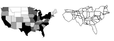
For example on the left side of Figure 1. you can see a traditional map of the United states and on the right side a Cartogram of USA depending on the population density. Sometimes it is enough to just color a map, like in Figure 1 on the left, to see some statistical data like the population but if you want to show a thing like the size of state it is sometimes better to use the same value (the size) to show the difference between the values.
The size of a cartogram is depending on the value of the part shown in the picture. For example in Figure 1 the state california is in the cartogram bigger then in the original because it has a high population. On the other side Ohio seems to be smaller on the right side then on the left because it is a big state from the area but has a low population.
Types of Cartograms
- Non-Continuous Cartograms
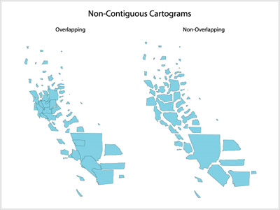
In non-continuous cartograms the regions on the map don't have to be connected to their neighbors. In this type of cartogram it is important to see the shape of the original map. User will recognize the map just because of their borders. The regions in the map are displaying the content with their own size. For an example a region with a smaller population will be smaller than a sector with a higher population, Figure 2 [Kocmoud, 1997].

- Continuos Cartograms
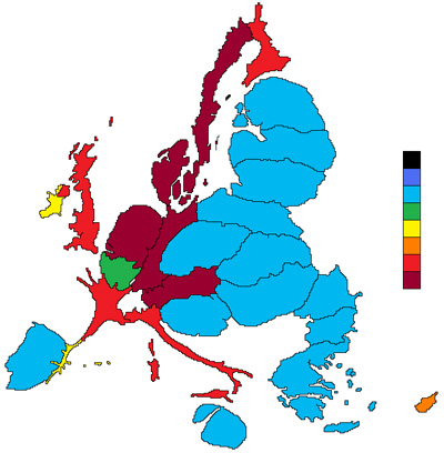
Different to the non-continuous cartograms, the important point is that the regions in the map are connected to each other. Accordingly the shape of each region is changing their size [Bortis and Demers, 2002]. Therefore the outline of the hole map changes. For example as we can see in the Figure 3, France is very distorted but still connected to his neighbors. With changing the shape of this country, the outlines of the whole map has changed [Wikipedia, 2008].

- Perimeter-Preserving Cartograms
In this version the outline of the map is the same as in the original image. The regions in it are still connected to each other, so the only change is the border of the regions which is moving but still connected to his neighbors [Kocmoud, 1997].
- Dorling Cartograms
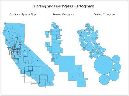
This type of cartogram was named after its inventor, Danny Dorling of the University of Leeds. A Dorling cartogram maintains neither shape, topology nor object centroids, though it has proven to be a very effective cartogram method. To create a Dorling cartogram, instead of enlarging or shrinking the objects themselves, the cartographer will replace the objects with a uniform shape, usually a circle, of the appropriate size. Professor Dorling, for the reason described above in the non-contiguous cartogram section, suggests that the shapes not overlap but rather be moved so that the full area of each shape can be seen, Figure 4 [NCGIA, 2002]. With this kind of shape it is easier to see the difference between the regions. The same strategy is used by Demers which is use squares instead of circles. The positive effect of this is, that there are no free spaces between them [Florisson et al., 2005].

a) Graduated Symbol Map b) Demers cartogram
c) Dorling cartogram
Further reading
- Campbell, John. Map Use and Analysis. New York: McGraw-Hill, 2001.
- Gillard, Quentin. "Places in the News: The Use of Cartograms in Introductory Geography Courses." Journal of Geography. 78 (1979): 114-115.
- Tobler, Waldo. "Thirty-Five Years of Computer Cartograms." Annals of the Association of American Geographers. 94 (2004): 58-73.
- Vescovo, Victor. "The Atlas of World Statistics." Dallas: Caladan Press, 2005.
References
- [Bortis and Demers, 2002]Ian Bortis, and Steve Demers, USGS, Cartogram Central. Created at: December 7, 2002. http://www.ncgia.ucsb.edu/projects/Cartogram_Central/index.html .
- [Kocmoud, 1997] Christopher James Kocmoud, Constructing Continuous Cartograms:
A Constraint-Based Approach. Created at: December, 1997. http://www-viz.tamu.edu/faculty/house/cartograms/Thesis.html .
- [Florisson et al., 2005] Sander Florisson, Marc van Kreveld, and Bettina Speckmann. Rectangular Cartograms : Construction & Animation. 'Annual Symposium on Computational Geometry'.372–373, 2005.
- [Wikipedia, 2008] Wikipedia. Cartogramm. Retrieved at: October 5, 2008. http://en.wikipedia.org/wiki/Cartogram .
- [NCGIA, 2002] Ian Bortins and Steve Demers under the direction of Dr.Keith Clarke ,Cartogram Types. Last edited at: July 31, 2002. http://www.ncgia.ucsb.edu/projects/Cartogram_Central/types.html