Teaching:TUW - UE InfoVis WS 2007/08 - Gruppe 09 - Aufgabe 3
Poor Graphic
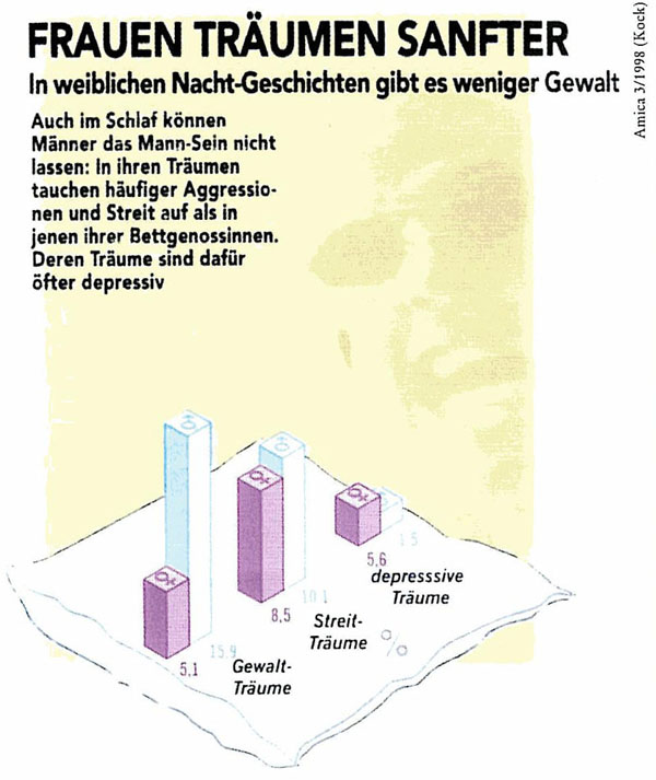
Frauen träumen sanfter
Critics
Data-Ink Ratio
Following this principle unnecessary non-data ink will be removed. Therefore the background picture and the unnecessary graphics will be removed. Furthermore unnecessary data ink will be removed or replaced.
In the next step the most important data should be emphasized. Since the attention of the reader should be drawn on the information that men more often dream about violence and conflicts, whereas women lead in having depressive dreams, this information should be emphasized with some special markup. For example, the bars, which having the dreams of the men ahead, could be colored with a more saturated color.
Visual Means to Highlight Data
As mentioned above we want to draw the reader’s attention to the difference between women and men’s dreams. As the most important data in the graphic is that men dream more about violence, this part should be emphasized. Therefore the men’s violence bars could be drawn with a darker color.
Background
Following this rule, all the background pictures should be erased, and replaced with some background that does not draw much attention, but serves the purpose of a background.
Emphasize the most important data ink
Hue, Enclosure, Size, Line width and more are attributes which can be used to emphasize the most important data ink. The most important data in our graphic is the relationship between men and women´s dreams. So this part of the graphic should be emphasized.
- Group the data (i.e., segment the data into meaningful subsets)
- Prioritize the data (i.e., rank the data by importance)
- Sequence the data (i.e., give direction for the order in which the data
Since we want to draw the attention to the data which shows the violence data the order of the data could be changed. That the reader begins at the left, subsequently follows the graph to the right and that his look at the graphic ends with a ‘wow’ effect.
Prioritize the Data
As mentioned already we want to draw the reader’s attention to the violence dreams. But the data shows as well the interesting point that depressive dreams are underrepresented, at least concerning this survey, in dreams. There are some ways to prioritize the data. For this example we think it is useful to concentrate on the hue or a lesser saturation of the depressive bar color.
References
[Few Article, 2004] Stephen Few, Elegance Through Simplicity, Article about redesigning graphs, http://www.intelligententerprise.com/showArticle.jhtml;jsessionid=N2ATDQWY5VYKSQSNDBGCKHSCJUMEKJVN?articleID=49400920, accessed 29.11.2007.
