Teaching:TUW - UE InfoVis WS 2007/08 - Gruppe 09 - Aufgabe 2
Aufgabenstellung
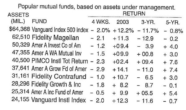
Zu beurteilende Tabelle
Critics
Structural Components of Tables
- Label
- Introduce
- Explain
- Reinforce
- Highlight
- Sequence
- Recommend
- Inquire
The table tries to explain its data with some text.
The title of the table should be clearly seperated from the table and maybe regrouped in a title and a sub title.
It states labels for the ASSETS and the FUND columns. These column headers label the information below them and should be separated from the data with a horizontal line.
The return values are clearly grouped with the spanner header RETURN. Maybe it should be stated that this is the return on investment. Below the RETURN spanner header we find column headers which state the period for which the data is valid. These should be separated from the data with a horizontal line. Furthermore it is not absolutely clear what there meaning is, and the mixing of so different periods makes it more difficult to understand the table. For example it would be interesting which 3 year period the 3-YR column covers.
The dollar and percent signs should not be introduced at the first data line. Data definitions should be part of the column headers.
The table does not try to focus my interest to a special area, because no area is specially highlighted.
Delineating columns and rows
- White space
- Rules and grids
- Fill color
White space
It is not possible to read the rows without difficulty because the vertical white space between them is pretty small. Therefore it is recommended that the vertical white space between the rows is increased.
As well the horizontal white space between the columns should be increased to ease the reading of the columns. From my point of view, the comparison of the funds is the most interesting information in this table. To lead the reader to scan down the columns, it is advisable to pronounce the white space between the columns more than the one between the rows.
To make a clear distinction between row headers and data, the horizontal white space should be increased between these two parts. As well the horizontal white space between the ASSETS and FUND column should be increased a bit to make a clear distinction.
Rules and grids
In order to make the table more readable it is advisable to draw a line between the column headers and the data.
If the table is in its original context surrounded with some objects where there should be a clear distinction, thin lines could be drawn on each side. Remember to keep the lines as thin and light as possible.
A combination of horizontal and vertical rules could be used if there is an area of special interest.
