Teaching:TUW - UE InfoVis WS 2007/08 - Gruppe 07 - Aufgabe 4
Assignment description
Description of the fourth task
Assigned data / model
Analysis of the application area
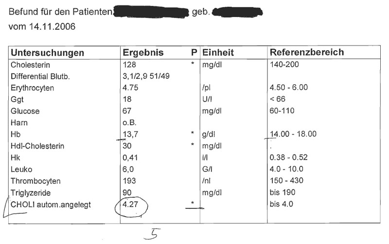
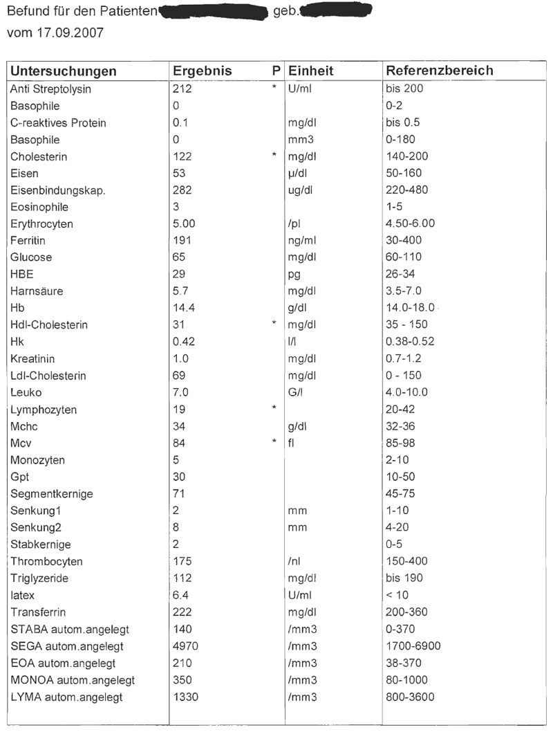
Our sample data belongs into the medical field of application. We are dealing with diagnostic findings which are basically sets of multiple tests that play a supportive role in doctors' decisions about the diagnosis. Given these two examples we can see that the second finding holds multiple times as much data as the first one. This indicates that each patient has a specialized set if tests that has been chosen for him by his doctor.
The data has been arranged into four columns. The first column holds the name of the test or the name of the subject the patient has been tested on. The second column holds the outcome of the test. In all cases we can see here, we are dealing with numbers. But some of these numbers are floating point numbers, others are integers. One of these tests even returns multiple values as result. Some of the cells in this column have been marked using the star character (*). This indicates that a value does not lie in an interval specified in the fourth column. The third column specifies the units of the results. The fourth column specifies the reference values for each of these tests, i.e. an interval that specifies acceptable values for this test. Multiple forms of intervals are being used, e.g:
- bis 200
- 220-480
- <66
The data is sorted ascending using the first column (the name of the test). None of the values can be classified as nominal or ordinal. We are only dealing with floating point numbers (continuous) and integers (discrete). There is also no hierarchy in this data. It's actually a list of key value pairs where the value-part can contain one or multiple values and an information about the units used and reference.
But the use of diagnostic findings in practice is slightly different. They are not being used as standalone tables with some test results. The values are being examined how they change in time. This fact changes the dimensionality of all data (test key-value-pairs) from 1-dimensional to 2-dimensional because they usually change over time. This is the main issue why we would suggest a different presentation of this data in a more clearer, simpler and legible way.
Target group
The target group (the data has been produced for) is definitely hospital/medical staff. We think that the most common people can't start anything with this data. They can basically determine which test results don't match the reference interval and therefore didn't go well but this data needs to be interpreted by a specialist. Another thing is that this data is private and should therefore not be seen by anyone except for the doctor and the patient.
The DIAMONT application
We named our application DIAMONT which stands for DIAgnosis MONitoring Tool. This tool has been designed to be used by the hospital's medical staff including doctors and nurses. It shall provide a more easier and better organized view on the data from test sets. It is meant to be realized either in a form of a desktop application or as a PDA (handheld-gadget) application. The accessed data has to been accessible remotely, therefore needs to be located on a server.
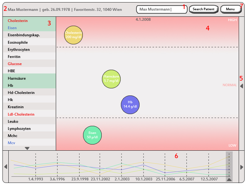
The next subsections will provide a detailed look at the interface of the DIAMONT application. The reference numbers reference the red numbers located on the scrrenshot of the application.
Picture reference 1: Patient Search
Jakob
Picture reference 2: Patient detail information
Jakob
Picture reference 3: List of available tests
Jakob
Picture reference 4: Main Window
The main window provides the most detailed view on the data. First, its being used to select a patient by his/hers name (and some additional information) from a list returned by the search process. The main purpose of this window is to display detailed information of the test results. The user of this application drags and drops a test (or tests) he is interested in into this field to display it. This field has three sections aligned vertically filling up its full height and aligns the tests as follows. The upper and lower sections are being separated from the middle section by dashed lines. Additionally, they are filled with a gradient color. The upper sections holds test with the result with a value that lies above the top limit of the normal interval for this test. The center part holds all the tests with a result that lies in the normal interval. The last bottom part displays all tests that lie underneath the minimum of the normal interval. Each test is being displayed as a circle with a certain background color with some textual information. This information holds the name of the test, the value of the test and the units for this value. This field provides only information about the test results obtained during one test. The user can see these results in a time context in the window beneath this one (marked as 6 in the picture above). He can also navigate through multiple tests by using this window.
Picture reference 5: Medical Notes
Martha
Picture reference 6: Timeline / Graph
This window displays time series lines that reference the tests being picked by dragging a test from the left window into the main window. Its being used for two purposes. The first is to put the test results into a time context. The user can follow the progress of the selected tests, search for anomalies or/and find correlations. The other purpose of this window is to navigate through the time using it as time line. The user needs to select a certain date (dates in this window reference test dates) which makes the application reload the data in the main window. The color of each line in this graph is the same as the background color of this test in the main window. The user can also enlarge the region of this window to get a better representation of the data. The leftmost and rightmost arrows are being used to scroll through the the graph.
Picture reference 7: Menu
By pressing the "Menu"-Button, a pop-up window opens and some options are listed.
The options are:
- Print diagnostic report: The diagnostic findings of the picked date (in 4) get printed In each row, one examination, it's result, the unit of the result and the range of optimal result values is put column by column.
- Print results with timeline:
The current shown section (in 5)
XXX REMOVE FROM HERE XXX
Aufgabenstellung
Aufgabe ist das Design einer interaktiven Visualisierungsapplikation zur Darstellung und Exploration
(des zeitlichen Verlaufs) von Laborwerten einer Blutuntersuchung. BenutzerInnen, Einsatzzweck, Tasks, etc.
sollen von Euch selbst festgelegt und beschrieben werden.
Beispiele für derartige Datensätze
XXX REMOVE TO HERE XXX


