Teaching:TUW - UE InfoVis WS 2007/08 - Gruppe 07 - Aufgabe 2
Aufgabenstellung
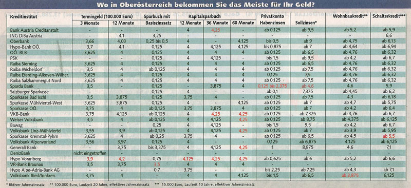
Zu beurteilende Tabelle
At First Glance
The question (tableheader) „At which bank / financial institution in Upper Austria you can get the most for your money?“ is quickly answered by taking a look at the table. The table is quite good readable and intuitive – the data is quite clearly arranged and the font-color of the most relevant data is different to the color of less relevant data.
Anyway, some small defects should be mentioned.
Critics & Suggestions For Table Improvement
Data Alignment
In the table view the values are not aligned to the right, but they are aligned at the center of the columns. The values in a particular column contain decimal digits of varying number. Hence, the data columns look a bit fringy at the left and right edge. For better reading efficiency, each value could be expressed by using the same number of decimal digits. If a value contains less decimal digits than the other values, the missing final digits could be filled with zeros.
Spanner Headers
In our example table the spanner header "Kapitalsparbuch" is not centered across its related columns. Through the marking-off boundary lines at the left and right border of the span, it is quite obvious that "Kapitalsparbuch" seams to be a spanner header. But the visual appearance is a bit irritating at first view.
Header Alignment
As mentioned, headers should normally be aligned as the data in its columns. This idea was realized in the table. But for better legibility, the headers should be aligned to the right because the numbers in the correspondent columns are quantitative values (see 3.1).
Rules and Grids
The given table above tries to direct the readers eyes to scan down the rows, which is indeed very useful because of the fact that readers should can compare the data of the given row with all the other values of the other rows in that column. Unfortunately the autors decided to use vertical lines to separate the rows from each ohter. We argue that a simple white space would do the job aswell without bringing the very high amount of visula contrast into the data. That way the reader can concentrate easily on the given data while the manner of directing the eyes down the rows is still in use.
Fill Color
The rows of the table are highlighted by two alternating colours - bright and a darker blue. Unfortunately, the two chosen colors have a quite high luminance intensity difference, so that the darker color highlights each second row a bit more than brighter colored rows. This gives a bit the effect of more important and less important rows. It is better to use subtle fill colors.
The shading of the rows in the example table is another good example for guiding the readers attention along the rows. We think that the shading that was used creating that table is to heavy. On one hand it forces the readers attention in one particular direction but on the other hand it produces a very hard visual contrast. Like above we argue that a lighter shading would line out the data while still retaining the guiding property of shaded lines.

