Teaching:TUW - UE InfoVis WS 2007/08 - Gruppe 07 - Aufgabe 1 - Histogram: Difference between revisions
Jump to navigation
Jump to search
No edit summary |
No edit summary |
||
| Line 10: | Line 10: | ||
= Example = | = Example = | ||
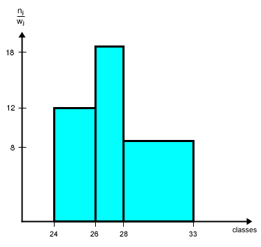
As an example we consider values given from the table below to create a histogram (right image). The data derived from the first column of the table shows the class affiliation. According to the table values these classes are aligned along the x-axis of the histogram. Frequenzy values according to the classes are then printed along the y-axis of the histogram. Once this is properly done, the histogram shows the amount of members according to any of the classes. | |||
<table style="height:16px" border="0"> | <table style="height:16px" border="0"> | ||
Revision as of 14:01, 7 November 2007
Definitions
In statistics, a histogram is a graphical display of tabulated frequencies. A histogram is the graphical version of a table that shows what proportion of cases fall into each of several or many specified categories. The histogram differs from a bar chart in that it is the area of the bar that denotes the value, not the height, a crucial distinction when the categories are not of uniform width (Lancaster, 1974). The categories are usually specified as non-overlapping intervals of some variable. The categories (bars) must be adjacent.
[Wikipedia, 2007]
A histogram is used when we want to show frequencies of a continous variable. The continous variable can, of course, assume all values within an interval and the histogram reflects this by covering the whole of the interval concerned.
[Wallgreen et al., 1996]
Explanation
TODO PETER ... WEBSTERs ...
Example
As an example we consider values given from the table below to create a histogram (right image). The data derived from the first column of the table shows the class affiliation. According to the table values these classes are aligned along the x-axis of the histogram. Frequenzy values according to the classes are then printed along the y-axis of the histogram. Once this is properly done, the histogram shows the amount of members according to any of the classes.
Frequency Table
|
 |
||||||||||||
Frequency density (height of a column) = n j / w j
Related Links
References
- [Wikipedia, 2007] Wikipedia, Histogram. Retrieved at: November 01, 2007. http://en.wikipedia.org/wiki/Histogram
- [Wallgreen et al., 1996] Anders Wallgreen, Britt Wallgreen, Rolf Persson, Ulf Jorner and Jan-Aage Haaland. Graphing Statistics & Data: Creating Better Charts. SAGE Publications, Thousand Oaks, London, New Delhi, 1996.