Teaching:TUW - UE InfoVis WS 2007/08 - Gruppe 07 - Aufgabe 1 - Boxplot: Difference between revisions
No edit summary |
No edit summary |
||
| Line 33: | Line 33: | ||
</tr> | </tr> | ||
</table></td> | </table></td> | ||
<td>[[ | <td>[[image:boxplot.gif|thumb|200px|right|Boxplot Illustration]]</td> | ||
<tr> | <tr> | ||
</table> | </table> | ||
Revision as of 14:40, 7 November 2007
Definitions
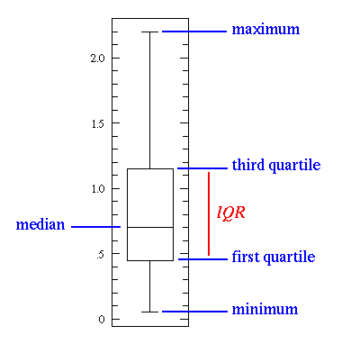
Boxplots are able to visually show different types of populations, without making any assumptions of the underlying statistical distribution. The spacings between the different parts of the box help indicate variance, skewness and identify outliers. Boxplots can be drawn either horizontally or vertically.
Explanation
TODO PETER ... WEBSTERs ...
Example
As an example we consider values given from the table below to create a histogram (right image). The data derived from the first column of the table shows the class affiliation. According to the table values these classes are aligned along the x-axis of the histogram. Frequenzy values (second column) according to the classes are then printed along the y-axis of the histogram. Once this is properly done, the histogram shows the amount of frequency according to any of the classes. Hence the histogram is a powerful visualisation that can make information accessable in just a few seconds, considering that the table on the left side is representing the same information, it is easy to understand the power of graphical visualisation.
Frequency Table
|
 |
||||||||||||
Frequency density (height of a column) = n j / w j
Related Links
References
- [Wikipedia, 2007] Wikipedia, Box plot. Retrieved at: November 01, 2007. http://en.wikipedia.org/wiki/Box_plot