Teaching:TUW - UE InfoVis WS 2007/08 - Gruppe 03 - Aufgabe 3
Poor Graphic
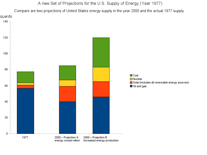
 A New Set of Projections for the U.S. Supply of Energy
Solution
Criticism
The graphic has a low data ink ratio. The third dimension do not contains any information and is only confusing.
The bar are too thick.
The legend is too near to the bars. An additional information to the legend is placed far away from the legend.
The labels of the bars are not placed on the exact high as the bars. If they are placed better, there is no need for their arrow border.
It would be better if the bars were vertical and not horizontal.
It would be better if the amount of the numbers is in the graphic and not in the sub header.
There is no information in the header of in the footer when the graphic was created.
Maybe it would be good to do a little different graphical presentation of the supply from 1977 and the projections.
Improved graphic
Explanation of improvements
The most criticism form point 2.1 are corrected.
