Teaching:TUW - UE InfoVis WS 2006/07 - Gruppe 08 - Aufgabe 2: Difference between revisions
Jump to navigation
Jump to search
No edit summary |
No edit summary |
||
| Line 3: | Line 3: | ||
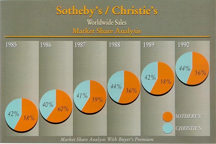
[[Image:Friendly00sothebys.jpg|none|thumb|600px|none|Sotheby's / Christie's Worldwide Sales Market Share Analysis]] | [[Image:Friendly00sothebys.jpg|none|thumb|600px|none|Sotheby's / Christie's Worldwide Sales Market Share Analysis]] | ||
=== | === Criticism === | ||
* gradient-fill of the year-columns - unnecessary ''Chartjunk'' | * gradient-fill of the year-columns - unnecessary ''Chartjunk'' | ||
* six cakes for one data-row - very low ''Data Density'' | * six cakes for one data-row - very low ''Data Density'' | ||
| Line 13: | Line 13: | ||
== Improved Graphic == | == Improved Graphic == | ||
=== Improvements === | |||
* Market share changes visible over the years. | |||
* Removed confusing and unnecessary backgrounds. | |||
* Increased data-ink ratio. | |||
* Labels are clearly visible next to the lines. | |||
* Difference between market shares easy to determine. | |||
Revision as of 16:54, 13 November 2006
Poor Graphic

Criticism
- gradient-fill of the year-columns - unnecessary Chartjunk
- six cakes for one data-row - very low Data Density
- The individual pie charts are virtually indistinguishable, making pie charts a rather poor choice in this context.
- cakes are arranged diagonally without any meaning (except for the growing years)
- The position of the pie charts suggests an increase on the y-axis which doesn't have any function or labels.
- 4 graph-labels in different font with redundant information
- The labels are not anywhere near the pie charts and have to be found to derive any meaning from the charts.
Improved Graphic
Improvements
- Market share changes visible over the years.
- Removed confusing and unnecessary backgrounds.
- Increased data-ink ratio.
- Labels are clearly visible next to the lines.
- Difference between market shares easy to determine.