Teaching:TUW - UE InfoVis WS 2006/07 - Gruppe 01 - Aufgabe 2
Poor Graphic

Discussion of the original graphic
First impressions of the design
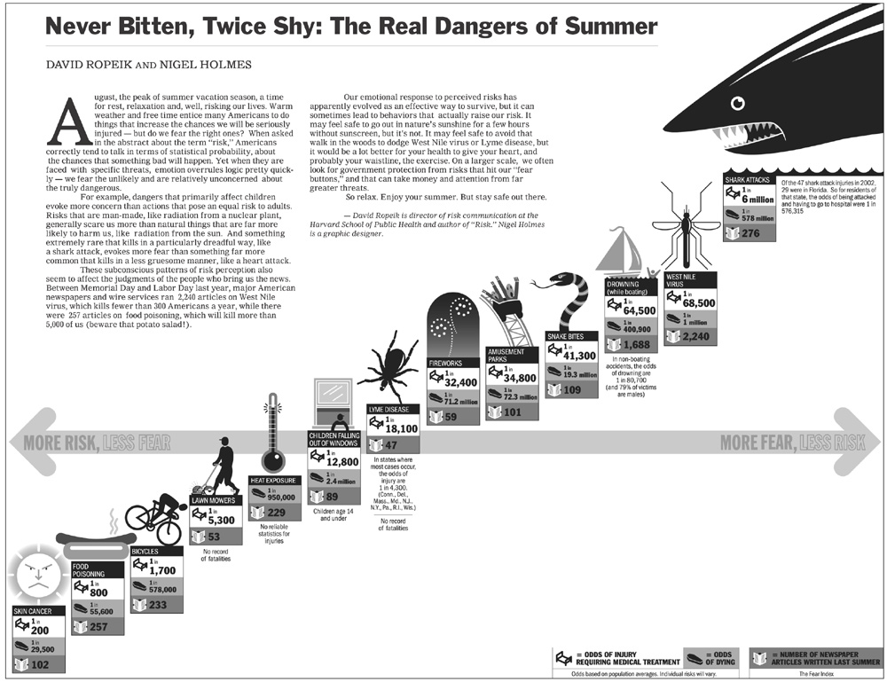
The first thing you notice when looking at this diagramm is: The shark.
Then some graphical symbols on a "line" which seem in a linear relationship. Then you see the horizontal axis, reading "More risk, less fear" on the left and "Less risk, more fear" on the right, which is positioned at the middle of the graphic.
Then finally you get to notice the "numbers" and the legend if you don't get distracted from the nearly unreadable article text in the upper left of the image.
Now we can go on and try to understand the message of the graphic. It shows us 13 risk categorys each with three types of information: odds of injury, odds of death and a "fear index", build on the "number of newspaper articles written last summer" about this risk category.
- Bad Data-Ink-Ratio, because of logos and text.
- The location of the only axis in the diagram is not making sense. It seems like the first six items are negative in any way.
- Order of items? What are the values for x- and y-axis?
- The shark-picture is dominant
Detailed analysis of the data
The "The real risks of summer"-data in table form
| Risk | Odds of injury1 | Odds of dying | Fear Index2 |
|---|---|---|---|
| Skin cancer | 1 in 200 | 1 in 29,500 | 102 |
| Food poisoning | 1 in 800 | 1 in 55,600 | 257 |
| Bicycles | 1 in 1,700 | 1 in 578,000 | 233 |
| Lawn mowers | 1 in 5300 | Not available | 53 |
| Heat exposure | Not available | 1 in 950,000 | 229 |
| Children falling out of windows | 1 in 12,800 | 1 in 2,400,000 | 89 |
| Lyme disease | 1 in 18,100 | Not available | 47 |
| Fireworks | 1 in 32,400 | 1 in 71,200,000 | 59 |
| Amusement parks | 1 in 34,800 | 1 in 72,300,000 | 101 |
| Snake bites | 1 in 41,300 | 1 in 19,300,000 | 109 |
| Drowning (while boating) | 1 in 64,500 | 1 in 400,900 | 1,688 |
| West Nile virus | 1 in 68,500 | 1 in 1,000,000 | 2,240 |
| Shark attacks | 1 in 6,000,000 | 1 in 578,000,000 | 276 |
[1]Full row text: Odds of injury requiring medical treatment
[2]Fear index means: Number of newspaper articles written last summer about this risk
- At three Items are missing values, but they are still positioned somewhere
- Outliers ??? What to write about them
- There are three different dimensions of data in the picture, but where does the trend comes from?
** Odds injury
** Odds death
** Number of Articles
- Ordering on x- and y-axis seems to be the odds of injury
- No correlation to e.g. Number of articles. What should be the "Fear Index"
Better graphic
After taking a closer look at the data, we found out that the main message of the original graphic is not true. We explored the values with different diagrams. A rising odds injury doesn't always cause a higher number of articels. According to this conclusion we can not show the "fear-risk-ratio" in the same way as the source picture does, but we try to visualize the data in a new diagram. Because of the wide spread of the values, we had to use a logarithmic scale.
??? bitte bild hier einfügen ???
As you can see, there is no clear correlation between the different dimensions.
References
- [Few, 2004] Stephen Few, Intelligent Enterprise Magazine: Elegance through simplicity. Created at: October 16, 2004. Retrieved at: November 12, 2006. http://www.intelligententerprise.com/showArticle.jhtml;jsessionid=N2ATDQWY5VYKSQSNDBGCKHSCJUMEKJVN?articleID=49400920.
- [Mizuno et al., 1999] Yoko Mizuno, Tufte Design Principle Project. Created at: January 26, 1999. Retrieved at: November 12, 2006. http://ldt.stanford.edu/ldt1999/Students/mizuno/Portfolio/Work/reports/tufte/ed229c-tufte-outline.html.