Teaching:TUW - UE InfoVis WS 2006/07 - Gruppe 01 - Aufgabe 2: Difference between revisions
(restructured) |
(rephrased first impressions) |
||
| Line 8: | Line 8: | ||
The first thing one will notice when looking at this diagram is: The shark. | The first thing one will notice when looking at this diagram is: The shark. | ||
The next things, that really catch one's eye are | |||
Then finally you get to notice the | The next things, that really catch one's eye are the other graphical symbols, arranged from bottom left to top right, which seem to stand in a linear relationship. | ||
Then you see the horizontal axis, positioned in the middle of the graphic, reading "More risk, less fear" on the left and "More fear, less risk" on the right. | |||
Then finally you get to notice the actual values and the legend - if you don't get distracted by the nearly unreadable article text in the upper left of the image. | |||
=== Design === | === Design === | ||
Revision as of 18:30, 13 November 2006
Poor Graphic

Discussion of the original graphic
First impressions
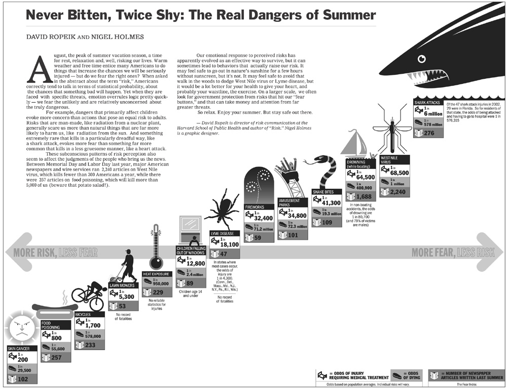
The first thing one will notice when looking at this diagram is: The shark.
The next things, that really catch one's eye are the other graphical symbols, arranged from bottom left to top right, which seem to stand in a linear relationship.
Then you see the horizontal axis, positioned in the middle of the graphic, reading "More risk, less fear" on the left and "More fear, less risk" on the right.
Then finally you get to notice the actual values and the legend - if you don't get distracted by the nearly unreadable article text in the upper left of the image.
Design
Now we could finally go on and try to understand the message of the graphic. But instead of doing that we will stop for a moment and just evaluate the graphic from the design point.
- Data-Ink-Ratio: This image has very bad Data-Ink-Ratio. As there are a huge number of visual elements (e.g. the huge shark) which not only are not needed to display the data itself but instead even prevent/distract you from concentrating on the message of the graphic. They are completely dispensable as they add no information that is not already provided by the textual labels.
- Space: The image takes up a great amount of space but leaves entire regions of the graphic blank and so without use.
- Axis location: The location of the only axis in the diagram is somewhat disturbing. The axis is placed in the middle of the diagram and suggesting a separation of the risk categories in some way (e.g. into a negative/positive region).
- Axis units: There is no real way to tell the units and/or the ranges for the x- and y-axis. The only hint is the text on the arrow which reads "More risk, less fear" on the left and "More fear, less risk" on the right. Now you could think the data is ordered from left to right by increasing fear and decreasing risk. The risk decreases from left to right, which is what the axis says (and what we expect), but the risk categories are arranged in an ascending order. Which is slightly confusing as the expected order should be descending independently if the unit assignment is: x-axis:Amount of risk; y-axis:Amount of fear; or the other way around. So the reality is: The data is only ordered by the "odds of injury" and then simply placed on an ascending line implying a linear relationship.
- Text on graphic: Apart from the disturbing article text in the upper left, there are some comments (e.g. on missing values) directly on the graph which distract from the its message, as you need to read them to check if they tell you something important (which mostly they don't).
- Data density: The graphic gets a pretty bad rating here too, as the amount of space (as stated above) used to show information about the dataset is in no relation to the number of elements in the set, which are only 13.
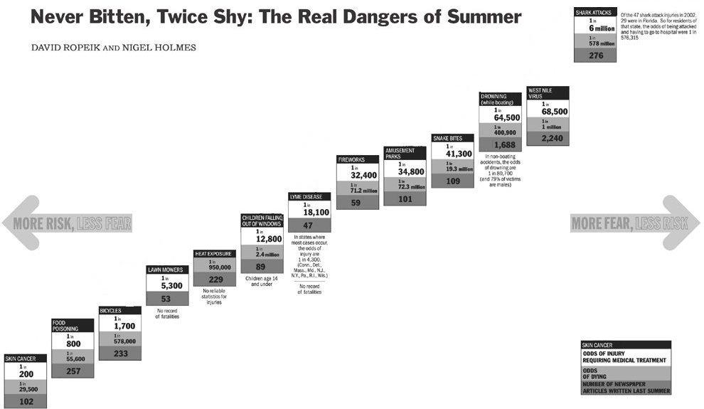
Only to show what can be accomplished by just a simple improvement of the Data-Ink-Ratio:

Detailed analysis of the data
The "The real risks of summer"-data in table form
| Risk | Odds of injury1 | Odds of dying | Fear Index2 |
|---|---|---|---|
| Skin cancer | 1 in 200 | 1 in 29,500 | 102 |
| Food poisoning | 1 in 800 | 1 in 55,600 | 257 |
| Bicycles | 1 in 1,700 | 1 in 578,000 | 233 |
| Lawn mowers | 1 in 5300 | Not available | 53 |
| Heat exposure | Not available | 1 in 950,000 | 229 |
| Children falling out of windows | 1 in 12,800 | 1 in 2,400,000 | 89 |
| Lyme disease | 1 in 18,100 | Not available | 47 |
| Fireworks | 1 in 32,400 | 1 in 71,200,000 | 59 |
| Amusement parks | 1 in 34,800 | 1 in 72,300,000 | 101 |
| Snake bites | 1 in 41,300 | 1 in 19,300,000 | 109 |
| Drowning (while boating) | 1 in 64,500 | 1 in 400,900 | 1,688 |
| West Nile virus | 1 in 68,500 | 1 in 1,000,000 | 2,240 |
| Shark attacks | 1 in 6,000,000 | 1 in 578,000,000 | 276 |
[1]Full row text: Odds of injury requiring medical treatment
[2]Fear index means: Number of newspaper articles written last summer about this risk
It shows us 13 risk categories each with three types of information: odds of injury, odds of death and a "fear index", built on the "number of newspaper articles written last summer" about this risk category.
- Order on both the axes seems to be the odds of injury (descending from left to right and bottom to top).
- Three records have no values, but are still positioned in the graphic.
- No apparent correlation between odds of injury and number of articles exists, though the graphic tries to convince the viewer otherwise. The few correlations that do exist can be attributed to chance.
- Is the number of articles written about a subject really a good measure for fear of this subject? Exactly the opposite could be claimed in that the more people know about a subject, the less they fear it.
- There are three different dimensions of data in the picture, but where does the trend comes from?
** Odds injury
** Odds death
** Number of Articles
- Outliers ??? What to write about them
Das bitte mit Statistikwerten unterlegen. Es gibt zum Beispiel nur eine Korrelation von -0,147886423 zwischen Death und Artikeln. Einen Scatterplot davon mit Trendlinie. Angeben das es manchmal eine Korrelation zwischen Odds und Artikeln besteht aber nicht immer. Und schon gar nicht so linear wie in der Graphik.
Insbesondere ohne die Outliers "Nile virus" und "drowning" sind die werte der artikel im bereich [53,276] also ziemlich flach und nicht linear ansteigend. Dann eine Graphik wie das ausschaut wenn mann korrekt X:A
Better graphic
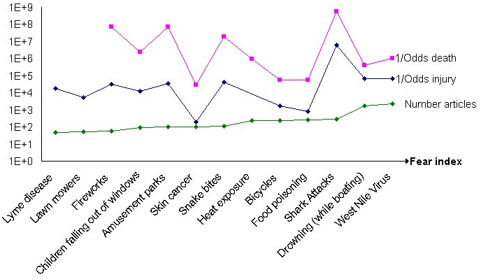
After taking a closer look at the data, we found out that the main message of the original graphic is not true. We explored the values with different diagrams. A rising odds injury doesn't always cause a higher number of articles. According to this conclusion we can not show the "fear-risk-ratio" in the same way as the source picture does, but we try to visualize the data in a new diagram. Because of the wide spread of the values, we had to use a logarithmic scale. We ordered the data by the number of articles. No connection to the other dimensions can be found. The only correlation that might exist is between the odds of injury and the odds of dying.
References
- [Few, 2004] Stephen Few, Intelligent Enterprise Magazine: Elegance through simplicity. Created at: October 16, 2004. Retrieved at: November 12, 2006. http://www.intelligententerprise.com/showArticle.jhtml;jsessionid=N2ATDQWY5VYKSQSNDBGCKHSCJUMEKJVN?articleID=49400920.
- [Mizuno et al., 1999] Yoko Mizuno, Tufte Design Principle Project. Created at: January 26, 1999. Retrieved at: November 12, 2006. http://ldt.stanford.edu/ldt1999/Students/mizuno/Portfolio/Work/reports/tufte/ed229c-tufte-outline.html.
