Teaching:TUW - UE InfoVis WS 2006/07 - Gruppe 01 - Aufgabe 2: Difference between revisions
Jump to navigation
Jump to search
(Better graphic text++) |
mNo edit summary |
||
| Line 25: | Line 25: | ||
== Better graphic == | == Better graphic == | ||
After taking a closer look at the data, we found out that the main message of the original graphic is not true. We explored the values with different diagrams. A rising odds injury doesn't always cause a higher number of articels. | After taking a closer look at the data, we found out that the main message of the original graphic is not true. We explored the values with different diagrams. A rising odds injury doesn't always cause a higher number of articels. | ||
According to this conclusion we can not show the "fear-risk-ratio" in the same way as the source picture does, but we try to visualize the data in a new diagram. | According to this conclusion we can not show the "fear-risk-ratio" in the same way as the source picture does, but we try to visualize the data in a new diagram. Because of the wide spread of the values, we had to use a logarithmic scale. | ||
??? bitte bild hier einfügen ??? | ??? bitte bild hier einfügen ??? | ||
Revision as of 13:56, 12 November 2006
Poor Graphic

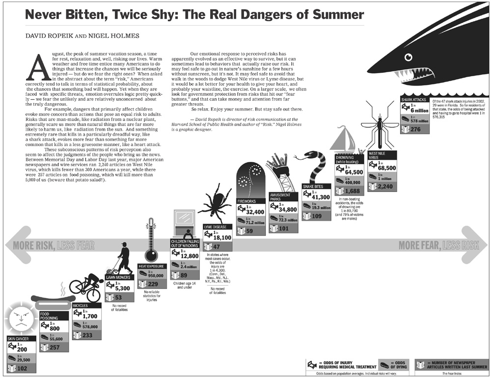
Discussion of the original graphic
First impressions of the design
- Bad Data-Ink-Ratio, because of logos and text.
- The location of the only axis in the diagram is not making sense. It seems like the first six items are negative in any way.
- Order of items? What are the values for x- and y-axis?
- The shark-picture is dominant
Detailed analysis of the data
- At three Items are missing values, but they are still positioned somewhere
- Outliers ??? What to write about them
- There are three different dimensions of data in the picture, but where does the trend comes from?
** Odds injury
** Odds death
** Number of Articles
- Ordering on x- and y-axis seems to be the odds of injury
- No correlation to e.g. Number of articles. What should be the "Fear Index"
Better graphic
After taking a closer look at the data, we found out that the main message of the original graphic is not true. We explored the values with different diagrams. A rising odds injury doesn't always cause a higher number of articels. According to this conclusion we can not show the "fear-risk-ratio" in the same way as the source picture does, but we try to visualize the data in a new diagram. Because of the wide spread of the values, we had to use a logarithmic scale.
??? bitte bild hier einfügen ???
As you can see, there is no clear correlation between the different dimensions.