Teaching:TUW - UE InfoVis WS 2005/06 - Gruppe 10 - Aufgabe 2: Difference between revisions
Jump to navigation
Jump to search
| Line 6: | Line 6: | ||
* Bad Data-Ink-Ratio | * Bad Data-Ink-Ratio | ||
* It is not very aestetic | * It is not very aestetic | ||
* Could have some more colors | |||
* Quite a lot of ''Chart Junk'' can be found in the graphic. The pictures of the doctors and the pictures of the other working men for example. | * Quite a lot of ''Chart Junk'' can be found in the graphic. The pictures of the doctors and the pictures of the other working men for example. | ||
Revision as of 19:34, 28 October 2005
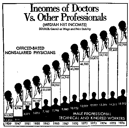
Poor Graphic

Problems:
- Changing scale of the time line in mid-axis to make exponential growth linear (from slides). This is called the Lie Factor
- Bad Data-Ink-Ratio
- It is not very aestetic
- Could have some more colors
- Quite a lot of Chart Junk can be found in the graphic. The pictures of the doctors and the pictures of the other working men for example.
Proposals for new graphic:
- Choose linear time scale without jumps
- Analyze distribution (linear, exponential?)
- Choose appropriate diagram type
- Make the design simpler, without making it less understandable.