Teaching:TUW - UE InfoVis WS 2005/06 - Gruppe 09 - Aufgabe 2: Difference between revisions
| Line 5: | Line 5: | ||
=== Bad Data-ink ratio === | |||
There are a couple of elements which are not important or even warping to the graph, like: the background pattern (image), the images showing the development. These just overload the graph, so without them, the graph would be a lot simpler, and clearer. | There are a couple of elements which are not important or even warping to the graph, like: the background pattern (image), the images showing the development. These just overload the graph, so without them, the graph would be a lot simpler, and clearer. | ||
Revision as of 14:59, 3 November 2005
Poor Graphic

Drawbacks
Bad Data-ink ratio
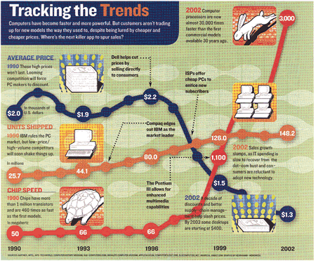
There are a couple of elements which are not important or even warping to the graph, like: the background pattern (image), the images showing the development. These just overload the graph, so without them, the graph would be a lot simpler, and clearer.
Using nearly the same color for two different data sources (Units shipped & Chip speed) can be obscuring and misguiding.
- Lie-Factor
The Y - Axis should start at zero, and the single graphs should be aligned accending.
The X & Y - Axis is not proportionaly represented.
Example I
The two points on the average price scale "2.0" and "1.9" are on the same hight. This can not be real.
Example II
(Chip Speed) The distance between 66 MHz and 1100 MHz is just slightly smaller than between 1100 and 3000 MHz.
- Chart-Junk
The Illustrations are unnecessary, because they are nonserious.
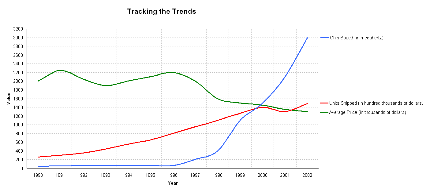
Correction
Redesigned Graphic
