Teaching:TUW - UE InfoVis WS 2005/06 - Gruppe 01 - Aufgabe 2
bla
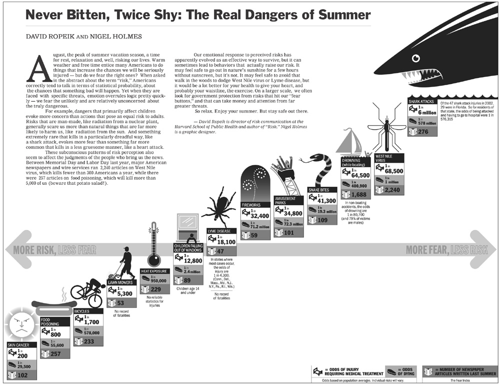
Poor Graphic

Drawback
Before we can redesing above graphic, we should discuss principle design guidelines.
- Lie Factor: The graphic shows more design variation than data variation. The information is not clear and detailed.
- Data-Ink: Data-ink ratio is redundant. The shark illustration is more dominand than rest of queue.
- Color coding: It chart looks a little confuse because a viewer has no overview about relevant information. Background color and foreground color in table are not contrast.
- Aestetic-Usability Effect: All symbols are to big along diagonal axis. Symbols more important than relevant information in tables.
- Layout: The whole layout looks confuse. First of all you see a shark, than rest of chart and written text. This layout shows no relevant information about "The real dangers of summer".