Teaching:TUW - UE InfoVis WS 2005/06 - Gruppe 01 - Aufgabe 2: Difference between revisions
Jump to navigation
Jump to search
m (→Drawbacks) |
m (→Drawbacks) |
||
| Line 5: | Line 5: | ||
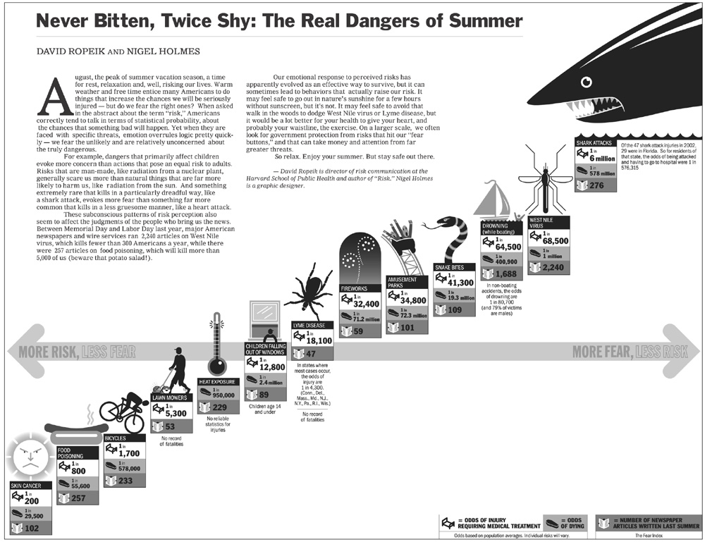
* Poor Data-Ink Ratio: most of the ink is used for fancy icons, but not for the information which should be displayed; this leads to | * Poor Data-Ink Ratio: most of the ink is used for fancy icons, but not for the information which should be displayed; this leads to | ||
* Chart-Junk | * Chart-Junk | ||
* Lie Factor: the position of the items on the X-axis (fear,risk) don't resemble the actual values, neither do the positions on the Y-axis (injuries) | * Lie Factor: the position of the items on the X-axis (fear,risk) don't resemble the differences in the actual values correctly, neither do the positions on the Y-axis (injuries) | ||
* At second thought the Risk-Fear axis is rather confusing, there's no possibility for an item with high risk AND fear to be displayed | * At second thought the Risk-Fear axis is rather confusing, there's no possibility for an item with high risk AND fear to be displayed | ||
Revision as of 19:57, 3 November 2005
Poor Graphic

Drawbacks
- Poor Data-Ink Ratio: most of the ink is used for fancy icons, but not for the information which should be displayed; this leads to
- Chart-Junk
- Lie Factor: the position of the items on the X-axis (fear,risk) don't resemble the differences in the actual values correctly, neither do the positions on the Y-axis (injuries)
- At second thought the Risk-Fear axis is rather confusing, there's no possibility for an item with high risk AND fear to be displayed