Teaching:TUW - UE InfoVis WS 2005/06 - Gruppe 01 - Aufgabe 2: Difference between revisions
Jump to navigation
Jump to search
| (15 intermediate revisions by the same user not shown) | |||
| Line 1: | Line 1: | ||
bla | |||
== Poor Graphic == | |||
[[Image:Ropeik03neverbitten.jpg|none|thumb|600px|none|Never Bitten, Twice Shy: The Real Dangers Of Summer]] | |||
== Drawback == | |||
* [Tufte, 2005] Edward R. Tufte, The Visual Display of Quantitative Information, Creation Date: | Before we can redesing above graphic, we should discuss principle design guidelines. | ||
http://ldt.stanford.edu/ldt1999/Students/mizuno/Portfolio/Work/reports/tufte/ed229c-tufte-outline.html | |||
* Lie Factor: The graphic shows more design variation than data variation. The information is not clear and detailed. | |||
* Data-Ink: Data-ink ratio is redundant. The shark illustration is more dominand than rest of queue. | |||
* Color coding: It chart looks a little confuse because a viewer has no overview about relevant information. Background color and foreground color in table are not contrast. | |||
* Aestetic-Usability Effect: All symbols are to big along diagonal axis. Symbols more important than relevant information in tables. | |||
* Layout: The whole layout looks confuse. First of all you see a shark, than rest of chart and written text. This layout shows no relevant information about "The real dangers of summer". | |||
== New Graphic == | |||
[[Image:graphic.png|none|thumb|600px|none|Never Bitten, Twice Shy: The Real Dangers Of Summer (modified)]] | |||
== Modified == | |||
There are several aspects to remove or modify this graphic. | |||
* Determine the best medium to display. In this case we use a logarithmic graph. A logarithmic graph shows all categories in which a number of cases is different (e.g. shark attack: One of 6 million swimmers). | |||
* Reduce all graphic shapes and tables. Instead use one color graph for every category. | |||
* The data are not complete. The violet and blue line are broken. There are no exist significant data. | |||
* Remove left to right bar and use instead x/y coordination system to get a total overview. | |||
* Relevant information should be emphasize. | |||
== Ressources == | |||
[Few, 2005] Stephen Few, Elegance Through Simplicity, Creation Date: October 16, 2004, http://www.intelligententerprise.com/showArticle.jhtml;jsessionid=N2ATDQWY5VYKSQSNDBGCKHSCJUMEKJVN?articleID=49400920 | |||
[Tufte, 2005] Edward R. Tufte, The Visual Display of Quantitative Information, Creation Date: January 26, 1999, http://ldt.stanford.edu/ldt1999/Students/mizuno/Portfolio/Work/reports/tufte/ed229c-tufte-outline.html | |||
Latest revision as of 19:03, 5 November 2005
bla
Poor Graphic[edit]

Drawback[edit]
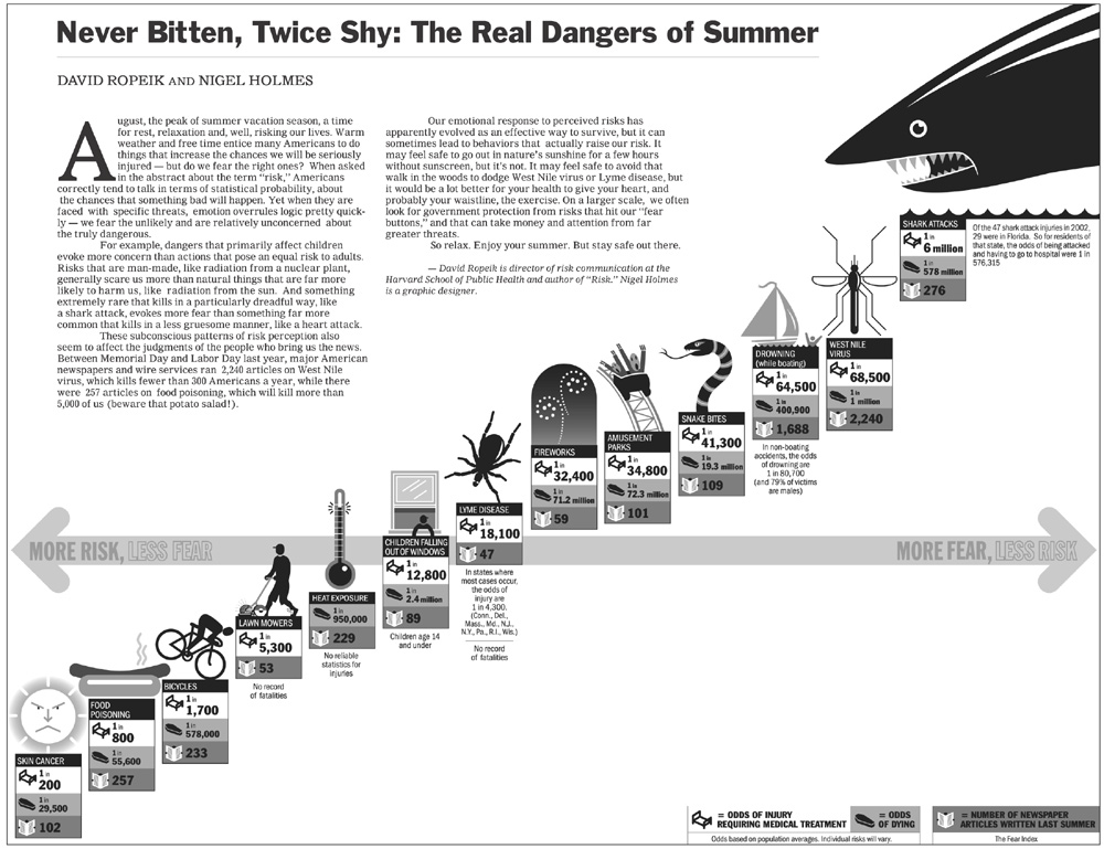
Before we can redesing above graphic, we should discuss principle design guidelines.
- Lie Factor: The graphic shows more design variation than data variation. The information is not clear and detailed.
- Data-Ink: Data-ink ratio is redundant. The shark illustration is more dominand than rest of queue.
- Color coding: It chart looks a little confuse because a viewer has no overview about relevant information. Background color and foreground color in table are not contrast.
- Aestetic-Usability Effect: All symbols are to big along diagonal axis. Symbols more important than relevant information in tables.
- Layout: The whole layout looks confuse. First of all you see a shark, than rest of chart and written text. This layout shows no relevant information about "The real dangers of summer".
New Graphic[edit]

Modified[edit]
There are several aspects to remove or modify this graphic.
- Determine the best medium to display. In this case we use a logarithmic graph. A logarithmic graph shows all categories in which a number of cases is different (e.g. shark attack: One of 6 million swimmers).
- Reduce all graphic shapes and tables. Instead use one color graph for every category.
- The data are not complete. The violet and blue line are broken. There are no exist significant data.
- Remove left to right bar and use instead x/y coordination system to get a total overview.
- Relevant information should be emphasize.
Ressources[edit]
[Few, 2005] Stephen Few, Elegance Through Simplicity, Creation Date: October 16, 2004, http://www.intelligententerprise.com/showArticle.jhtml;jsessionid=N2ATDQWY5VYKSQSNDBGCKHSCJUMEKJVN?articleID=49400920 [Tufte, 2005] Edward R. Tufte, The Visual Display of Quantitative Information, Creation Date: January 26, 1999, http://ldt.stanford.edu/ldt1999/Students/mizuno/Portfolio/Work/reports/tufte/ed229c-tufte-outline.html