Teaching:TUW - UE InfoVis WS 2009/10 - Gruppe 06 - Aufgabe 3
Aufgabenstellung
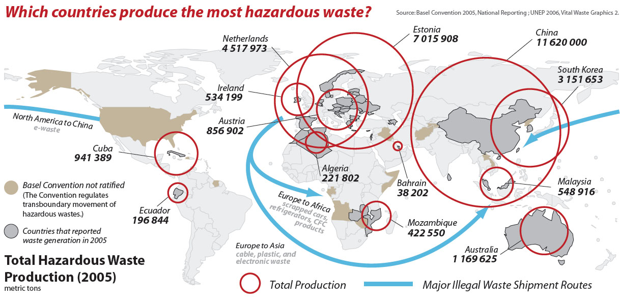
Zu verbessernde Grafik
Critique about the Graph
- data ink ratio is very high
- The world map is not really necessary (except for showing the shipment routes)
- The circles are overlapping
- The values are not ordered (because they are shown on the map)
- Much unimportant information, only the necessary info should be on the graph
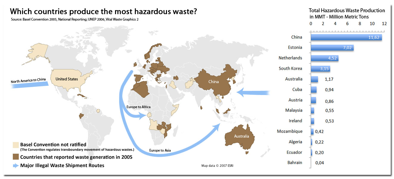
Redesign
- We made two graphs that separate the information. The second one shows the values of the hazardous waste production. That is acutally the key information in the graph.
- The values are ordered in a bar chart.
- The ship routes are only labelled by the continents, the additional information (goods etc) is removed, because that information is not as important.

