Empirical Evaluation of Interactive Visualizations for Preferential Choice
An Empirical Evaluation of Interactive Visualizations for Preferential Choice by Jeanette Bautista and Giuseppe Carenini
UNDER CONSTRUCTION
Short Description
The authors of this paper tried to not only show the usefulness of Value Charts to support preferential choice, which is finding the best option out of a set of alternatives. Furthermore, they compared two types of Value Charts: a horizontal version against a vertical version. The outcome of this extensive user study was that Value Charts in general and in particular Vertical Value Charts (abbreviated VC+V) seemed to be very effective in supporting decision making.
Process of decision making
The process of effective preferential choice can be divided into 3 steps according to prescriptive decision theory.
Step 1 / Model construction phase: the decision maker (abbr. DM) finds objectives, which are important to him/her. The degree of importance is also chosen.
Step 2 / Inspection phase: DM analyzes his/her preference model as applied to a set of alternatives.
Step 3 / Sensitivity analysis: DM is able to answer "what if" questions - such as "if we make a slight change in one or more aspects of the model, does it effect the optimal decision?"
ValueCharts+
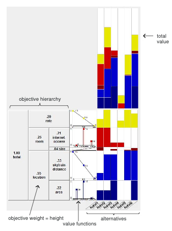
ValueChart+is a set of interactive visualization techniques for preferential choice and is an improvement of ValueCharts. It supports the DM in the 3 phases described above. In an Additive Multiattribute Value Function the DM’s objectives are hierarchically organized. In VC+ this hierarchy is displayed as an exploded stacked-bar.
Part A: Controlled Study
In Part A, the authors took a quantitative approach by performing a controlled usability study to see how users performed the primitive tasks of the PVIT (Preferential Choice Visualization Integrated Task Model). Part A starts in the sensitivity analysis phase. The task is the following: 5 questions (based on the PVIT model) should be answered:
What are the top 3 alternatives according to total value?
For a specified alternative, which ob jective contributes to its total value the most?
What is the domain value of objective x for alternative y?
What is the best alternative when considering only objective x?
What is the best outcome for a objective x?
Mapped to the house domain, for example, we get the following tasks:
List the 3 highest valued houses.
For HouseX, which is its strongest factor according to your preferences?
How many bathrooms are there in House1?
Which is the least expensive house?
What is the best bus-distance?
Part B: User Study
In Part B, the authors followed a more qualitative approach by observing subjects using the tool in a real decision-making context. In this second part of the study, they attempted to measure the users’ insight in the decision problem. Once the subjects had completed Part B, they filled out a questionnaire regarding their experience with VC+ in the decision-making process.
Datasets
Figures
Shown above is the horizontal version of a ValueChart+ presented by Bautista et Carenini
Shown above is the vertical version of a ValueChart+ presented by Bautista et Carenini.
The vertical height of each row indicates the relative weight assigned to each objective (e.g., size is much less important than internet-access). Each column represents an alternative, thus each cell portrays an objective corresponding to an alternative (bottom-right quadrant). The amount of filled color relative to cell size depicts the alternative’s preference.
Important Citation(s)
Suitable for which data types
Evaluation(s)
References
An empirical evaluation of interactive visualizations for preferential choice

