Teaching:TUW - UE InfoVis WS 2007/08 - Gruppe 06 - Aufgabe 4
Aufgabenstellung
Aufgabe ist das Design einer interaktiven Visualisierungsapplikation zur Darstellung und Exploration
(des zeitlichen Verlaufs) von Laborwerten einer Blutuntersuchung. BenutzerInnen, Einsatzzweck, Tasks, etc.
sollen von Euch selbst festgelegt und beschrieben werden.
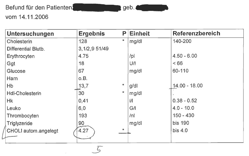
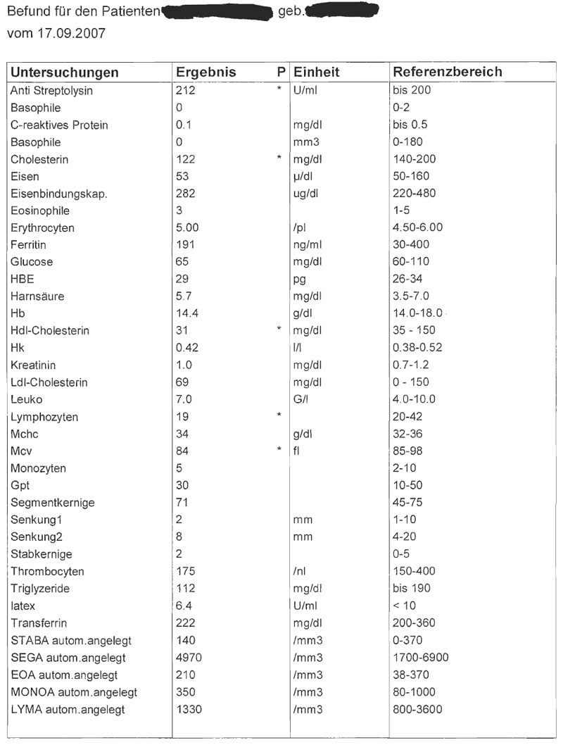
Beispiele für derartige Datensätze
Description of the application area, the dataset, the users and the duties
Description of the application area and of the given dataset
Application area analysis – Routine medical blood test in hospitals.
Specifics:
- the given data implements a small and a big blood count
- the most important data fields are labelled through a * (these data is outside of the normal reference area)
Target group analysis
After we confer with some doctors and nurses, we know that it wouldn’t make sense to visualize the whole blood count. The doctors are satisfied with the actual situation (blood counts in a table in which the important data is signed through a *), because of the easy handling and the well arranged data. Therefore we want to do a special visualisation for nurses, which show them the important data which they need to take care of the state of their patients. Nurses have to look at variations in the blood count.
An example of use would be patients at the intensive care. They need routine blood counts during their sheltering at the hospital.
It would definitely draw a distinction if the visualisation would be made for a nurse or a doctor. Nurses didn’t mind about the whole dataset, they only have to look up variations. Only the doctors need the detailed blood count.
Specifics:
- Nurses even know all medical terms but they don’t need the whole information of the blood count. The variances are enough.
Aim of the visualization
Nurses can easily look up variations of the blood count through the visualisation. For example could a variation of the blood values cause a drastically situation for people keeping a comatose.
Therefore it is important to visualize the data out of the reference range. This could be a solution for the following question:
- Is the actual status of the patient better or worse?
Concept
Types of Visualization
- For each patient an own pie-chart with extensions
- The label above the pie-cart is the patient name
- The number of the pie slices is equal to the sum of the most important data labelled through a *
A label inside of the pie-chart gives you information about the examination and the result of it. If the dataset of the blood count diversify after a new examination, the specific pie slices will be labelled spatial or though colouring. Therefore the visualisation of the pie will be maximized through volume expansion coloured in red or green. Inside this new bigger pie-chart it is possible to look up the percentage-wise values of the comparison between the last two examinations.
The centre of the pie-chart is visualized through a calendar sheet and the time of the examination. Per mouse click on the calendar sheet it is possible to get an overview about the last ten examination results. If there are more examination results you can click on the button ”add earlier blood counts” to upgrade the existing list.
Visual Mapping
- For each through a * marked value, we will create an own pie slice labelled by the actual examination value.
- All slices have the same size. We focus our diagram on the results of the variations of the examinations and not on the specific values.
- Each examination name (for example, hdl cholesterol, choli,...) has a unique colour. So it would be possible to relate them easily.
- The date of examination will be visualized intuitive through a calendar sheet.
- Positive variations (the examination value fit back into the reference area) are marked in green colour / Negative variations are marked red.
Techniques
Interaction possibilities
Mockup(s)
Support for the user
- Assuming that the blood counts stored digitally we visualize only the important data (marked through *) of the blood counts but it is possible to add more examination values if it is needed.
- Variations between the different examination values are inserted/updated automatically.
- Negative variations are highlighted trough a red blinking light.
- The calendar sheet offers you the possibility to look up older examination results.
- Through a mouse click on the button “blood count” it is possible to switch to the original blood count view.
Specifics
There is not only the detailed view, and the pie-chart view you could also open the overall view which shows you the pie – diagrams of the whole station in hospital. So it is possible for the nurses to get a general overview of the worse red marked values. Additionally will new worse examination data blink red, until the nurse has opened the pie-chart view.
Advantages and Disadvantages
- We only visualize the most important data for the nurses. Even so it is possible to check out the whole information easily.
- It is easily possible to watch out special examination values trough adding or removing of special examination values to the pie-chart view.
- The new red blinking data, advert the nurses to look up the new information.
- A Disadvantage for doctors could be that you can’t see the whole blood count on the first glance.
Expansion Possiblities
To combine the software of the hospital with our blood count software would offer some extension possibilities. For example it would be possible to show the whole patient information by one click or the nurse could directly inform a doctor if some values exploded.

