Teaching:TUW - UE InfoVis WS 2007/08 - Gruppe 07 - Aufgabe 1 - Histogram
Definitions
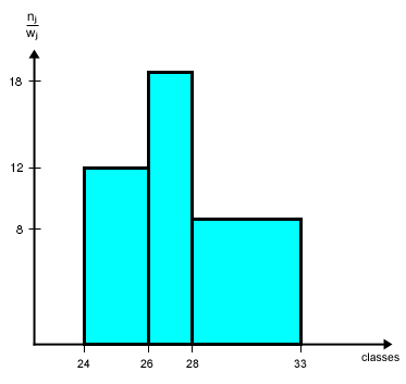
In statistics, a histogram is a graphical display of tabulated frequencies. A histogram is the graphical version of a table that shows what proportion of cases fall into each of several or many specified categories. The histogram differs from a bar chart in that it is the area of the bar that denotes the value, not the height, a crucial distinction when the categories are not of uniform width (Lancaster, 1974). The categories are usually specified as non-overlapping intervals of some variable. The categories (bars) must be adjacent.
[Wikipedia, 2007]
A histogram is used when we want to show frequencies of a continous variable. The continous variable can, of course, assume all values within an interval and the histogram reflects this by covering the whole of the interval concerned.
[Wallgreen et al., 1996]
Example
| class j | absolute frequency nj | class interval w j |
|---|---|---|
| 1 (=> 24 ≤ x ≤ 26 ) | 2 (=> 26 < x ≤ 28 ) | 3 (=> 28 < x ≤ 33 ) |
This text may overlap the text which is supposed to float right to it.
Ut wisi enim ad minim veniam, quis nostrud exerci tation ullamcorper suscipit lobortis nisl ut aliquip ex ea commodo consequat. Duis autem vel eum iriure dolor in hendrerit in vulputate velit esse molestie consequat, vel illum dolore eu feugiat nulla facilisis at vero eros et accumsan et iusto odio dignissim qui blandit praesent luptatum zzril delenit augue duis dolore te feugait nulla facilisi.

Frequency Table
Frequency density (height of a column) = n j / w j
Related Links
References
- [Wikipedia, 2007] Wikipedia, Histogram. Retrieved at: November 01, 2007. http://en.wikipedia.org/wiki/Histogram
- [Wallgreen et al., 1996] Anders Wallgreen, Britt Wallgreen, Rolf Persson, Ulf Jorner and Jan-Aage Haaland. Graphing Statistics & Data: Creating Better Charts. SAGE Publications, Thousand Oaks, London, New Delhi, 1996.