Teaching:TUW - UE InfoVis WS 2009/10 - Gruppe 09 - Aufgabe 3
Aufgabenstellung
Zu verbessernde Grafik
Review of the Existing Graphic
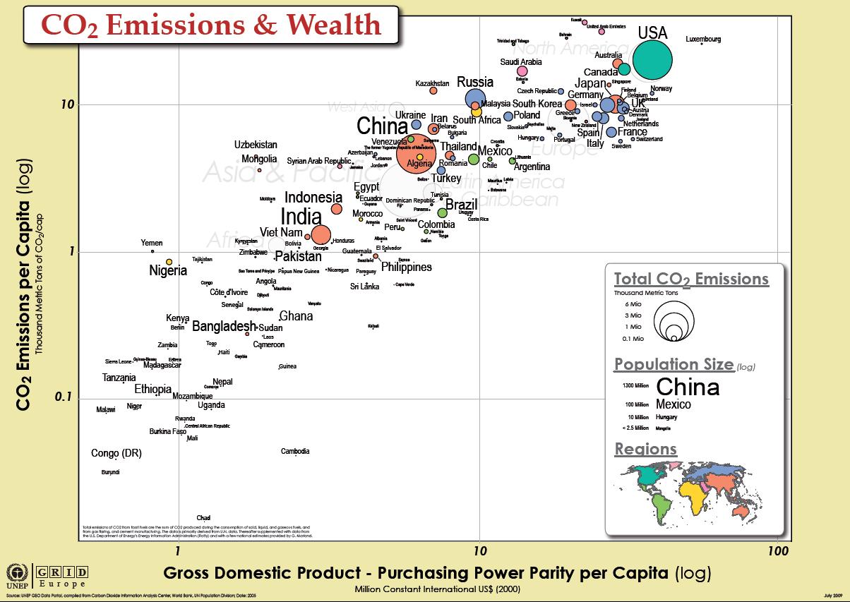
- The current graphic contains many non-data-ink elements which should be reduced to no more that what is necessary to make the data ink understandable [Few, 2004]. Examples of such non-data-ink elements are
- The yellow/brown border around the real graphic
- Border lines
- Box around heading
- Shadow below heading and legend
- The main topic of the graph is to recognize the connection between the CO2 emissions (total and per capita) and the gross domestic product of countries. The region totals displayed in light gray in the background can be omitted, as this data is more distracting than useful.
- The data point labels distract the reader from the actual data as the black font color stands out too much. Furthermore, data points are categorized into several regions by using different colors, whereas the corresponding labels are always black, making the connection between the data point and its label difficult. Also, for very small data points, the color is unrecognizable, making the distinction between different regions impossible.
- The world map in the legend is also drawing attention away from the main data of the graph, a simple legend stating the different regions and their respective color would be enough. Also, the size of the map is too small to be actually useful.
- The main focus of the graph is the comparison between the CO2 emissions per capita and GDP per capita, so this information is represented as the 2d position of the data points, as position is the most accurate visual variable [Cleveland and McGill, 1984].
- Representing the total CO2 emissions for each country using the size of the data point helps understanding the impact of a particular country on the global CO2 emissions. Without this information, it would not be obvious that although Luxembourg has higher CO2 emissions per capita that the USA, its total CO2 emissions are far lower.
- Encoding the total CO2 emissions in the area of the data point is less accurate than using position [Cleveland and McGill, 1984], but nevertheless allows for easy comparison between two countries (the graph shows that the USA and China have roughly the same total CO2 emissions, but their CO2 emissions per capita vary greatly).
- Encoding the population size using the font size of the country label adds another variable to the dataset. This information enables the viewer to make comparisons between different countries based on their population size. The graph shows that although China and India have roughly the same population size, India has much lower total CO2 emissions.
Improvements
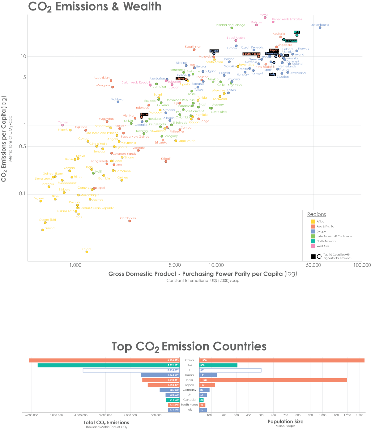
- All non-necessary non-data-ink has been removed, which includes
- The yellow border around the graph
- Border lines
- The box around the heading
- Shadows below the heading and the legend box
- The remaining non-data-ink has been de-emphasized by using a lighter gray for the grid lines, the axes, the axes labels and the legend. Furthermore, non-data-ink has been regularized by using consistent font sizes throughout the graph. Unnecessary bold text in the legend has also been removed.
- In addition to coloring the data points also their respective labels have been color coded. This makes it easier to associate the right labels with the data points. In addition, for small data points, coloring the label as well as the data point makes the distinction between different regions much easier. It also removes the distraction caused by the formerly all black labels as the labels now carry additional information themselves. This additional color coding immediately shows that the majority of African countries is located in the bottom left corner (low GDP, low CO2 emissions), the majority of Latin American countries is located in the center of the graph (average GDP, average CO2 emissions) and that almost all European countries are located on the top right corner of the graph (high GDP, high CO2 emissions), a fact that was not immediately visible in the original graph.
- The legend for region color coding has been simplified by replacing the world map by an alphabetical list of regions.
- Both the encoding of the total CO2 emissions per country using the area of the data points and the population size using the font size of the label have been kept in the improved graph, as both information is valuable to the viewer (as described in the review of the existing graph). Using the size of each mark to add an additional variable is also suggested by Few [2007].
Further Improvements
The population size could be deleted and the overall CO2-emission could be displayed by the size of the country name.
References
[Cleveland and McGill, 1984] W. S. Cleveland and R. McGill. Graphical Perception: Theory, Experimentation, and Application to the Development of Graphical Methods. Journal of the American Statistical Association, 79:531-554, 1984
[Few, 2004] Stephen Few. Show Me the Numbers: Designing Tables and Graphs to Enlighten. Analytics Press, 2004, Chapter 7 – General Design For Communication
[Few, 2007] Stephen Few. Visualising Change: An Innovation in Time-Series Analysis. White Paper, SAS Institute, 2007
CO2 Emissions data set: http://manyeyes.alphaworks.ibm.com/manyeyes/datasets/carbon-dioxide-emissions-co2-thousan-2/versions/1
http://manyeyes.alphaworks.ibm.com/manyeyes/datasets/carbon-dioxide-emissions-co2-kg-co/versions/1

