Teaching:TUW - UE InfoVis WS 2009/10 - Gruppe 06 - Aufgabe 3: Difference between revisions
Jump to navigation
Jump to search
No edit summary |
No edit summary |
||
| Line 22: | Line 22: | ||
Total hazardous waste production in metric tons | Total hazardous waste production in metric tons | ||
* | * The essential information is the waste production (according to the graph's title). So we removed all the other information. | ||
* The diagram now only has the necessary information | |||
* | * Data ink ratio is very low (no 3D effects, no additional lines/axis that don't show any information etc.) | ||
* The values are ordered in a bar chart, which gives a better overview over the data. | * The values are ordered in a bar chart, which gives a better overview over the data. | ||
* Removed the red color, because it was kind of an eye catcher | * Removed the red color, because it was kind of an eye catcher | ||
Revision as of 17:54, 5 January 2010
Aufgabenstellung
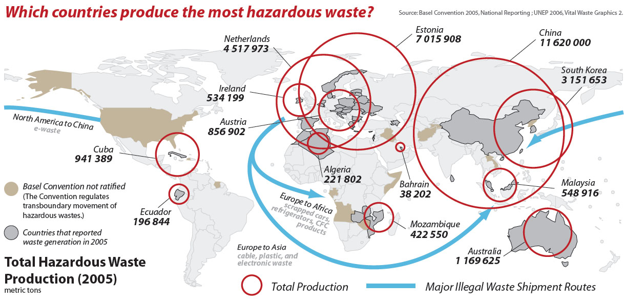
Zu verbessernde Grafik
Critique about the Graph
- data ink ratio is very high
- The world map is not really necessary (except for showing the shipment routes)
- The circles are overlapping
- The values are not ordered (because they are shown on the map)
- The label "Total Hazardous Waste Production" can't be attached to anything in the first moment
- Much unimportant information, only the necessary info should be on the graph:
- The circles as descriptors include the information about the ratio between country size and hazardous waste production.
- Sublabels of Arrows: what's shipped?
- Major Illegal Waste Shipment Routes" don't really fit into the question "Which countries produce the most hazardous waste?"
Redesign
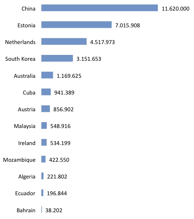
Total hazardous waste production in metric tons
- The essential information is the waste production (according to the graph's title). So we removed all the other information.
- The diagram now only has the necessary information
- Data ink ratio is very low (no 3D effects, no additional lines/axis that don't show any information etc.)
- The values are ordered in a bar chart, which gives a better overview over the data.
- Removed the red color, because it was kind of an eye catcher

