Teaching:TUW - UE InfoVis WS 2009/10 - Gruppe 09 - Aufgabe 3: Difference between revisions
Jump to navigation
Jump to search
No edit summary |
No edit summary |
||
| Line 5: | Line 5: | ||
[[Image:geo5_2.jpg]] | [[Image:geo5_2.jpg]] | ||
=== Review of the Existing Graphic === | |||
<br/> | |||
* Non-data-ink should be reduced to no more than what is necessary to make the data ink understandable [Few, 2004]. Examples of non-data-ink, which should be removed from the graphic: | |||
** The yellow/brown border around the real graphic | |||
** border lines | |||
** The light gray fonts in the background of the graphic | |||
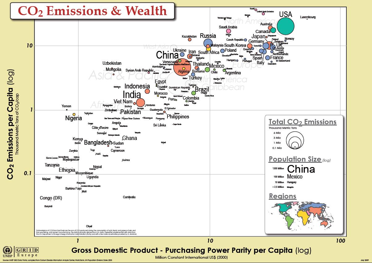
* Next unnecessary data ink should be subtracted. Because the main topic of this graphic is to recognize the connection between the Co2-Emission (total and per capita) of some countries and their gross domestic product. And so I think it is unnecessary to make a distinction in view of region because it’s clear that Brazil belongs to South America and Italy to Europe. Furthermore the distinction of regions carries no additional information in view of the overall topic. The aim is to give the readers of the graphic what they need, and all that they need, but nothing more [Few, 2004]. In addition information which is peripheral to the interests and purposes of the readers should be removed [Few, 2004]. | |||
* The next point of criticism relates to the fact that every designer must be carefully avoid saying too little by trying to say too much [Few, 2004]. As a result of this statement all countries which population size is less than 2.5 Million should be subtracted. | |||
* The next point refers to emphasizing the most important data ink. The most important data in our case is the total Co2-Emission. So I would prefer to use a preattentive visual attribute because they are especially useful for emphasizing data ink [Few, 2004]. One way is the useage of size: the bigger the name of the country is, the more Co2 is to be emitted. | |||
* For the encoding of the population size, it would be a good idea to use various color intensities for the country names (e.g.: China is written in black because it has a big population size, Peru is written in some light gray because it has a very small population) | |||
== Referenzen == | |||
[Few, 2004] Stephen Few. Show Me the Numbers: Designing Tables and Graphs to Enlighten. Analytics Press, 2004, Chapter 7 – General Design For Communication | |||
CO2 Emissions data set: | CO2 Emissions data set: | ||
Revision as of 15:59, 4 December 2009
Aufgabenstellung
Zu verbessernde Grafik
Review of the Existing Graphic
- Non-data-ink should be reduced to no more than what is necessary to make the data ink understandable [Few, 2004]. Examples of non-data-ink, which should be removed from the graphic:
- The yellow/brown border around the real graphic
- border lines
- The light gray fonts in the background of the graphic
- Next unnecessary data ink should be subtracted. Because the main topic of this graphic is to recognize the connection between the Co2-Emission (total and per capita) of some countries and their gross domestic product. And so I think it is unnecessary to make a distinction in view of region because it’s clear that Brazil belongs to South America and Italy to Europe. Furthermore the distinction of regions carries no additional information in view of the overall topic. The aim is to give the readers of the graphic what they need, and all that they need, but nothing more [Few, 2004]. In addition information which is peripheral to the interests and purposes of the readers should be removed [Few, 2004].
- The next point of criticism relates to the fact that every designer must be carefully avoid saying too little by trying to say too much [Few, 2004]. As a result of this statement all countries which population size is less than 2.5 Million should be subtracted.
- The next point refers to emphasizing the most important data ink. The most important data in our case is the total Co2-Emission. So I would prefer to use a preattentive visual attribute because they are especially useful for emphasizing data ink [Few, 2004]. One way is the useage of size: the bigger the name of the country is, the more Co2 is to be emitted.
- For the encoding of the population size, it would be a good idea to use various color intensities for the country names (e.g.: China is written in black because it has a big population size, Peru is written in some light gray because it has a very small population)
Referenzen
[Few, 2004] Stephen Few. Show Me the Numbers: Designing Tables and Graphs to Enlighten. Analytics Press, 2004, Chapter 7 – General Design For Communication
CO2 Emissions data set: http://manyeyes.alphaworks.ibm.com/manyeyes/datasets/carbon-dioxide-emissions-co2-thousan-2/versions/1
http://manyeyes.alphaworks.ibm.com/manyeyes/datasets/carbon-dioxide-emissions-co2-kg-co/versions/1
