Teaching:TUW - UE InfoVis WS 2007/08 - Gruppe 07 - Aufgabe 1 - Boxplot: Difference between revisions
Jump to navigation
Jump to search
No edit summary |
No edit summary |
||
| Line 1: | Line 1: | ||
= Definitions = | = Definitions = | ||
[[image:boxplot.gif|thumb|200px|right|Boxplot Illustration]] | |||
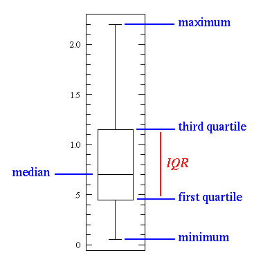
{{Quotation|In [[Teaching:TUW - UE InfoVis WS 2007/08 - Gruppe 07 - descriptive statistics|descriptive statistics]], a <b>boxplot</b> (also known as a <b>box-and-whisker diagram</b> or <b>plot</b> or <b>candlestick chart</b>) is a convenient way of graphically depicting groups of numerical data through their five-number summaries (the smallest observation, lower quartile (Q1), median, upper quartile (Q3), and largest observation). A boxplot also indicates which observations, if any, might be considered outliers. The boxplot was invented in 1977 by the American statistician John Tukey.<br /><br />Boxplots are able to visually show different types of populations, without making any assumptions of the underlying statistical distribution. The spacings between the different parts of the box help indicate variance, skewness and identify outliers. Boxplots can be drawn either horizontally or vertically.|[Wikipedia, 2007]}} | {{Quotation|In [[Teaching:TUW - UE InfoVis WS 2007/08 - Gruppe 07 - descriptive statistics|descriptive statistics]], a <b>boxplot</b> (also known as a <b>box-and-whisker diagram</b> or <b>plot</b> or <b>candlestick chart</b>) is a convenient way of graphically depicting groups of numerical data through their five-number summaries (the smallest observation, lower quartile (Q1), median, upper quartile (Q3), and largest observation). A boxplot also indicates which observations, if any, might be considered outliers. The boxplot was invented in 1977 by the American statistician John Tukey.<br /><br />Boxplots are able to visually show different types of populations, without making any assumptions of the underlying statistical distribution. The spacings between the different parts of the box help indicate variance, skewness and identify outliers. Boxplots can be drawn either horizontally or vertically.|[Wikipedia, 2007]}} | ||
<center>''Read full article on [[wikipedia:Box plot|Wikipedia]]''</center> | <center>''Read full article on [[wikipedia:Box plot|Wikipedia]]''</center> | ||
= Explanation = | = Explanation = | ||
Revision as of 15:08, 7 November 2007
Definitions

In descriptive statistics, a boxplot (also known as a box-and-whisker diagram or plot or candlestick chart) is a convenient way of graphically depicting groups of numerical data through their five-number summaries (the smallest observation, lower quartile (Q1), median, upper quartile (Q3), and largest observation). A boxplot also indicates which observations, if any, might be considered outliers. The boxplot was invented in 1977 by the American statistician John Tukey.
Boxplots are able to visually show different types of populations, without making any assumptions of the underlying statistical distribution. The spacings between the different parts of the box help indicate variance, skewness and identify outliers. Boxplots can be drawn either horizontally or vertically.
Boxplots are able to visually show different types of populations, without making any assumptions of the underlying statistical distribution. The spacings between the different parts of the box help indicate variance, skewness and identify outliers. Boxplots can be drawn either horizontally or vertically.
[Wikipedia, 2007]
Explanation
TODO PETER ... WEBSTERs ...
Example
As an example we consider values given from the table below to create a boxplot (right image). Notice that the dataset is approximately balanced around zero. Evidently the mean is near zero. However there is a variation in the dataset which ranges approximately from -6 to 6. The maximum and minimum values are showed as whiskers. Hence it is obvious that the boxplot is a powerful visualisation that has the ability to outframe characteristic attributes of the given dataset.
|
 |
||||||||||||||||||||||
Related Links
References
- [Wikipedia, 2007] Wikipedia, Box plot. Retrieved at: November 01, 2007. http://en.wikipedia.org/wiki/Box_plot