Evaluating Information Visualization Applications: Difference between revisions
No edit summary |
No edit summary |
||
| Line 7: | Line 7: | ||
== Short Description == | == Short Description == | ||
{{Quotation|Evaluation of user-centred tools often makes use of analytic and empirical techniques with the objective to investigate the usability, the functionality, and the effectiveness of an interactive system.| [Dix, Finley, Abowd, Beale, 1998]}} | |||
== CourseVis == | == CourseVis == | ||
Revision as of 19:43, 26 April 2007
Author
Short Description
CourseVis
Figures
The following visualizations are used to represent the collected data from CourseVis:
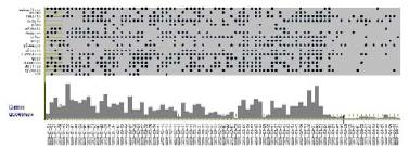
- Access Plot:
The access plot shows the students' accesses to the course. It is an mixture of a scatterplot and a histogram.
The scatterplot shows the data of students and of the course while the histogram shows the number of pages of the course accessed by all students on a special date.

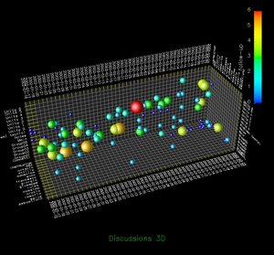
- Discussion Plot:
This 3D scatterplot is about the disussions of the course. The figure shows time, topics and students.
The sphere represents a new thread and the number of messages are encoded with the color and size of the sphere.

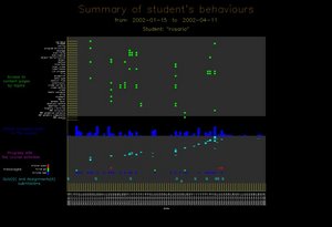
- Behavioural Graph:
This graph represents the behaviours of a single student.
It shows the student's access to the content pages, the global access to the course, a progress with the schedule of the course, messages and the submission of quizzes and assignments.

Evaluation Types
- Focus Group
- Controlled Experiment
- Semi-structured Interview
Important Citation
via the social gathering and the interaction which being in a focus
group entails