Teaching:TUW - UE InfoVis WS 2009/10 - Gruppe 06 - Aufgabe 3: Difference between revisions
Jump to navigation
Jump to search
No edit summary |
(additional reasons for changing the graph) |
||
| Line 21: | Line 21: | ||
[[Image:Diagramm2.jpg|1322px]] | [[Image:Diagramm2.jpg|1322px]] | ||
* We made two graphs that separate the information. The second one shows the values of the hazardous waste production. That is acutally the key information in the graph and it's not necessary to show where these countries are. | * We made two graphs that separate the information. | ||
* The values are ordered in a bar chart. | ** The first one shows the shipment routes and geographical information, that could be interesting, like if countries that reported waste generation are lying to each other, etc. | ||
** The second one shows the values of the hazardous waste production. That is acutally the key information in the graph and it's not necessary to show where these countries are. | |||
* The values are ordered in a bar chart, which gives a better overview over the data. | |||
* The ship routes are only labelled by the continents, the additional information (goods etc) is removed, because that information is not as important. | * The ship routes are only labelled by the continents, the additional information (goods etc) is removed, because that information is not as important. | ||
* The circles have been removed, because they didn't distribute as much information. | |||
* Numbers have been put to an extra graph | |||
* Removed the red color, because it was kind of an eye catcher | |||
Revision as of 11:30, 5 January 2010
Aufgabenstellung
Zu verbessernde Grafik
Critique about the Graph
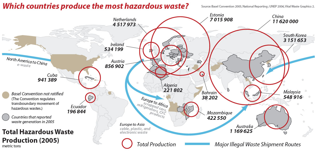
- data ink ratio is very high
- The world map is not really necessary (except for showing the shipment routes)
- The circles are overlapping
- The values are not ordered (because they are shown on the map)
- The label "Total Hazardous Waste Production" can't be attached to anything in the first moment
- Much unimportant information, only the necessary info should be on the graph:
- The circles as descriptors include the information about the ratio between country size and hazardous waste production.
- Sublabels of Arrows: what's shipped?
- Major Illegal Waste Shipment Routes" don't really fit into the question "Which countries produce the most hazardous waste?"
Redesign
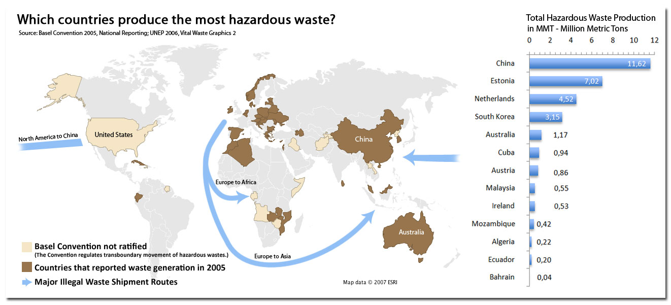
- We made two graphs that separate the information.
- The first one shows the shipment routes and geographical information, that could be interesting, like if countries that reported waste generation are lying to each other, etc.
- The second one shows the values of the hazardous waste production. That is acutally the key information in the graph and it's not necessary to show where these countries are.
- The values are ordered in a bar chart, which gives a better overview over the data.
- The ship routes are only labelled by the continents, the additional information (goods etc) is removed, because that information is not as important.
- The circles have been removed, because they didn't distribute as much information.
- Numbers have been put to an extra graph
- Removed the red color, because it was kind of an eye catcher

