Evaluating Information Visualization Applications: Difference between revisions
m url internal |
|||
| (37 intermediate revisions by 3 users not shown) | |||
| Line 3: | Line 3: | ||
== Author == | == Author == | ||
[ | [[Mazza%2C_Riccardo|Riccardo Mazza]] | ||
== Short Description == | == Short Description == | ||
{{Quotation|Evaluation of user-centred tools often makes use of analytic and empirical techniques with the objective to investigate the usability, the functionality, and the effectiveness of an interactive system.| [Dix, Finley, Abowd, Beale, 1998]}}<br/> | |||
There are two different types of "Human Computer Interacion Evaluation Methods":<br/> | |||
*Analytic Methods | |||
*Empiric Methods | |||
**Quantitave Studies | |||
**Qualitative Studies | |||
== CourseVis == | |||
{{Quotation|[...] a novel approach of using web log data generated by course management systems (CMS) to help instructors become aware of what is happening in distance learning classes. Specifically, techniques from Information Visualization are used to graphically render complex, multidimensional student tracking data collected by CMS. A system, called CourseVis, illustrates the proposed approach.| [Mazza and Dimitrova, 2004]}} | |||
== Figures == | == Figures == | ||
[[Image:Accessesplot.JPG| | The following visualizations are used to represent the collected data from ''CourseVis'':<br/><br/> | ||
[[Image:Sozal_Aspects.jpg| | |||
[[Image:Behavioural_Aspects.jpg| | *'''Access Plot:'''<br/> | ||
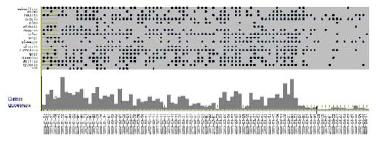
<br/>The access plot shows the students' accesses to the course. It is an mixture of a scatterplot and a histogram.<br/> | |||
The scatterplot shows the data of students and of the course while the histogram shows the number of pages of the course accessed by all students on a special date.<br/> | |||
<br/>[[Image:Accessesplot.JPG|center|400px|Access Plot]]<br/> | |||
*'''Discussion Plot:'''<br/> | |||
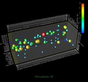
<br/>This 3D scatterplot is about the disussions of the course. The figure shows time, topics and students.<br/> | |||
The sphere represents a new thread and the number of messages are encoded with the color and size of the sphere.<br/> | |||
<br/>[[Image:Sozal_Aspects.jpg|center|300px|Discussion Plot]]<br/> | |||
*'''Behavioural Graph:'''<br/> | |||
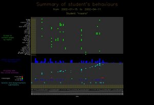
<br/>This graph represents the behaviours of a single student.<br/> | |||
It shows the student's access to the content pages, the global access to the course, a progress with the schedule of the course, messages and the submission of quizzes and assignments.<br/> | |||
<br/>[[Image:Behavioural_Aspects.jpg|center|300px|Behavioural Graph]]<br/> | |||
== Evaluation Types == | |||
* Focus Group | |||
* Controlled Experiment | |||
* Semi-structured Interview | |||
<br />{{Quotation|The focus group and the semi-structured interview aimed to assess the usefulness of the graphical representations generated in CourseVis, while the experimental study aimed at verifying the effectiveness and the efficiency of the representations.| [R. Mazza, 2006]}} | |||
== Important Citation == | == Important Citation == | ||
| Line 22: | Line 60: | ||
{{Quotation| formulate and answer questions [users] didn’t anticipate having | {{Quotation| formulate and answer questions [users] didn’t anticipate having | ||
before looking at the visualization| [C. Plaisant, 2004]}} | before looking at the visualization| [C. Plaisant, 2004]}} | ||
== References == | |||
*[[CourseVis|CourseVis]] | |||
*[Mazza and Dimitrova, 2004] Mazza, Ricardo; Dimitrova, Vania. [http://doi.acm.org/10.1145/1013367.1013393 Visualising student tracking data to support instructors in web-based distance education.] In ''Proceedings of the 13th international World Wide Web conference on Alternate track papers & posters'', pp. 154-161. 2004. | |||
*[Mazza, 2006] Mazza, Ricardo. [http://doi.acm.org/10.1145/1168149.1168155 Evaluating information visualization applications with focus groups: the CourseVis experience.] In ''Proceedings of the 2006 AVI Workshop on Beyond Time and Errors: Novel Evaluation Methods For information Visualization'', pp. 1-6, 2006. | |||
Latest revision as of 13:32, 17 July 2007
Author
Short Description
There are two different types of "Human Computer Interacion Evaluation Methods":
- Analytic Methods
- Empiric Methods
- Quantitave Studies
- Qualitative Studies
CourseVis
Figures
The following visualizations are used to represent the collected data from CourseVis:
- Access Plot:
The access plot shows the students' accesses to the course. It is an mixture of a scatterplot and a histogram.
The scatterplot shows the data of students and of the course while the histogram shows the number of pages of the course accessed by all students on a special date.

- Discussion Plot:
This 3D scatterplot is about the disussions of the course. The figure shows time, topics and students.
The sphere represents a new thread and the number of messages are encoded with the color and size of the sphere.

- Behavioural Graph:
This graph represents the behaviours of a single student.
It shows the student's access to the content pages, the global access to the course, a progress with the schedule of the course, messages and the submission of quizzes and assignments.

Evaluation Types
- Focus Group
- Controlled Experiment
- Semi-structured Interview
Important Citation
via the social gathering and the interaction which being in a focus
group entails
References
- CourseVis
- [Mazza and Dimitrova, 2004] Mazza, Ricardo; Dimitrova, Vania. Visualising student tracking data to support instructors in web-based distance education. In Proceedings of the 13th international World Wide Web conference on Alternate track papers & posters, pp. 154-161. 2004.
- [Mazza, 2006] Mazza, Ricardo. Evaluating information visualization applications with focus groups: the CourseVis experience. In Proceedings of the 2006 AVI Workshop on Beyond Time and Errors: Novel Evaluation Methods For information Visualization, pp. 1-6, 2006.