Visual Exploration of Multivariate Graphs by Roll-Up and Selection: Difference between revisions
No edit summary |
No edit summary |
||
| Line 59: | Line 59: | ||
== References == | |||
[http://www.google.at/url?sa=t&source=web&ct=res&cd=1&url=http%3A%2F%2Fwww.research.ibm.com%2Fvisual%2Fpapers%2Fpivotgraph.pdf&ei=BgMMSoHAEMmP_QbV--ywBA&usg=AFQjCNHXHWZWVxEM8tCSNzoUxTNH50hXRg&sig2=NGoK6wAVWEoPzeeHT_Dc0w Visual Exploration of Multivariate Graphs] | |||
[[Category: Techniques]] | [[Category: Techniques]] | ||
[[Category: Interaction_Techniques]] | [[Category: Interaction_Techniques]] | ||
Revision as of 11:25, 26 May 2009
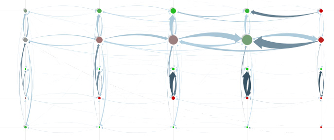
Multivariate diagramm rolled up in two dimensions [Wattenberg, 2006]
Martin Wattenberg [Wattenberg, 2006] described in his paper Visual Exploration of Multivariate Graphs how Multivariate Graphs can be easily analyzed by rolling-up on certain dimensions. The paper focuses on a software tool called PivotGraph (unfortunately not available) but describes a strategy that could also be used in other tools.
[Wattenberg, 2006]
Multivariate graphs - common approach
Two visualizations of multivariate graphs are very popular: "Node-and-link diagrams" and matrix views. "Node-and-link diagrams" represent a network topography, additional information may be coded by labeling and coloring nodes, matrix views (normally only 2D) create a main-matrix of one characteristic in which the sub-characteristic is repeated.
Problems in analyzing multivariate graphs
Both visualizations - node-and-link diagram and matrix diagram allow only poor analysis of the information contained in the nodes. Easy questions like "How many men are in the network?" may require the analysist to count every node.
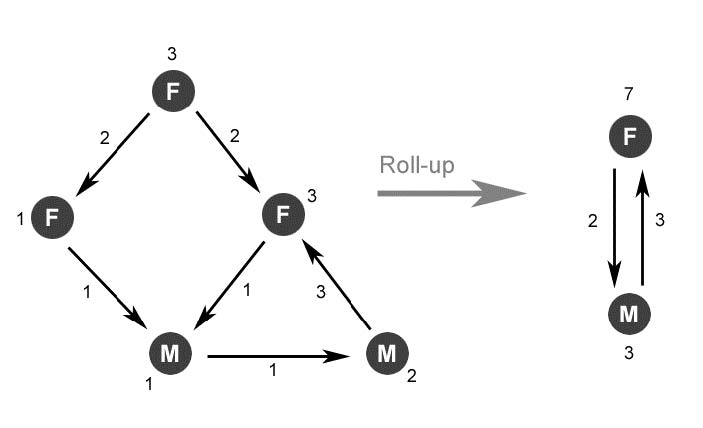
Solution: Roll-up on one (two) dimension(s)
The main simplification in PivotGraph is to roll a graph up in any dimension(s): Replace all nodes with the same value in these dimensions with a node representing the amount of nodes by its size. Aggregate the connections in the same way.
This way you can select up to two dimensions that form a grid, e.g. gender and company. Instead of the large graph, you receive a simpler graph showing the aggregated connections between nodes that correspond to a certain gender and a certain company.
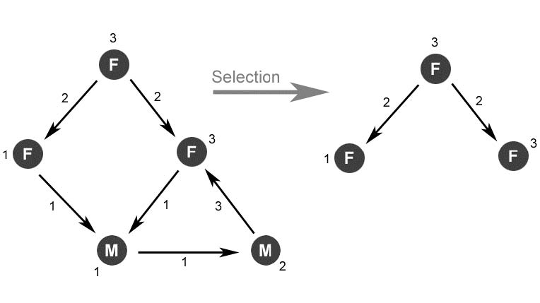
Solution: Selection
As addition to roll-up - parts of the diagram can be selected, e.g. all nodes representing females.
Considerations
For optimal understanding, the size of the nodes reflects the amount of aggregated data, just as the thickness of the connections. The nodes may be colored according any other attribute, but the color of the lines should be used to indicate ratio of the weight (connections per node) .
Although, when using a straight grid layout as PivotGraph does, the connections should not be straight to avoid overlapping. Slightly bend arrows avoid occlusion problems.
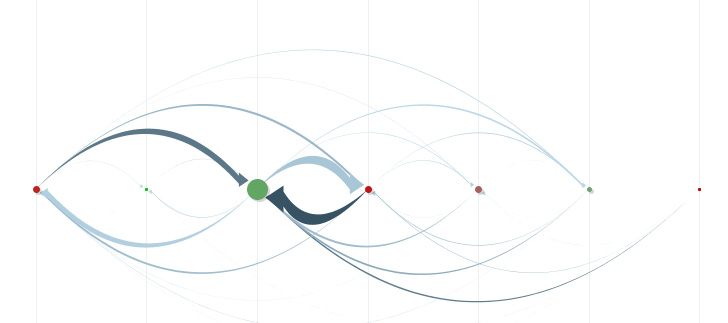
The application allows the user also to roll-up in only one dimension. This leads to a graph with just one axis, nevertheless this layout can contain important information, e.g. the communication between several locations in a company.
An important part of the analysis is the user-interaction. The user may chose and the dimensions to roll up at any point, the diagram is the automatically updated. User testing has shown, that this transition has to smoothly interpolate between the graphs, not only calculating the straight interpolation but maybe also intermediate graphs and displaying the transitions of the most important nodes and connections.
Wattenberg describes in his paper three user testings in which all user responded very positive on the transitions between different graphs.
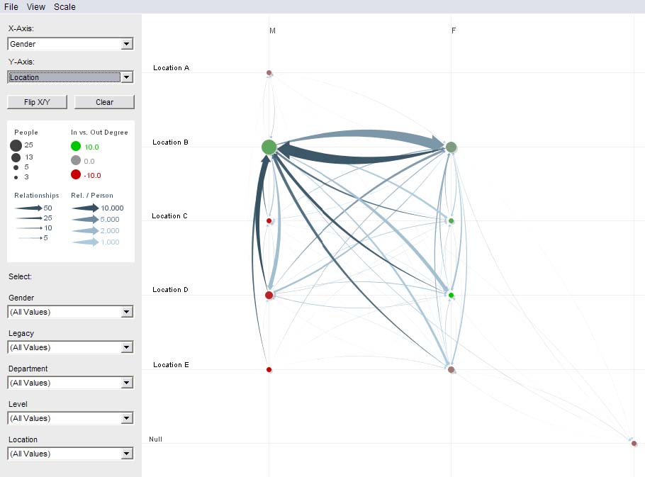
PivotGraph user interface
The user interface is quite simple and basic to operate. The main window displays the current scatterplot and the dimensions, the right side allows the user to change the current view by rolling-up on attributes or selecting specific attribute-values. Nodes display additional information on mouse-over.
Advantages and disadvantages
Limitations and feature work
The tool have some limitations that must be taken into consideration. First of all, the visualization is (except for node-coloring) limited to 2D. An extension to 3D would be possible, but this might cause severe occlusion problems and destroy the simplicity of the visualization.
Another limitation is that the technique works only on discrete-valued dimensions. Continuous are more difficult to aggregate, this could led to a large amount of connections.
A last limitation that may be addressed in future (just like the continuous data) is the representation of multivariate edges. A similar approach could be used to aggregate edges that contain additional information, however these graphs are less common in practice than graphs with multivariate nodes.