Teaching:TUW - UE InfoVis WS 2010/11 - Gruppe 08 - Aufgabe 2
SparkClouds: Visualizing Trends in Tag Clouds
Introduction
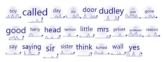
These days tag clouds are found all over the internet. Although they display the relative tag frequency, popularity, or importance by font size very well you will have difficulties to figure out how tag clouds evolved over time. That’s what Bongshin Lee et al. paper is all about. It introduces SparkClouds as a new breed of tag clouds, combining sparklines and typically tag cloud features to visualize changes across multiple tag clouds over time. SparkClouds will further be compared to three other types of visualization in terms of speed and accuracy to find out if SparkClouds’ ability to show trends is preferred.
How to design SparkClouds?
Basic reasons for SparkCloud design
Bongshin Lee et al. based their SparkClouds design decision on two scenarios:
- Jason, a stock market analyst, is dealing with a lot of tag clouds to figure out what for example the latest trend in mobile communication is or what’s gossiped over right now. It gets pretty hard to remember all tag clouds as they change rapidly so Jason need a high level overview of trends.
- Laura is a researcher, working in a team of 16 people, who wants to track her team’s activities changing from week to week. She needs a time point by time point view of tag clouds to gain information about what was done at a specific date by her team.
Due to these two needs SparkClouds were designed by combining standard tag clouds (showing tag popularity by font size) and sparklines, which are simplified line charts (showing the trend over time).
Tag Clouds as used in SparkClouds
Here two design parameters are given -> Font Size Encoding and Layout
- Font Size Encoding: To support both stated above scenarios two methods to calculate the font size encoding were defined. The first one encodes tag font size by the frequency of its appearance over the entire tie period. This will definitely support Jason’s need to see the most popular topics over the whole time span. These would have the largest font size. To support Laura’s needs as well a second encoding method is needed. This one supports to view the most popular topic, in Laura’s case an activity of her team, at a given time point. For this method the font size for each tag is stable -> it does not change whether one or several tag clouds are shown in the visualization. This allows makes comparison between tag clouds possible only in rank but not frequency. SparkClouds, by default, use per time point font size encoding.
- Layout: Different than conventional tag clouds, SparkClouds sort tags in alphabetical order, which makes them still exchangeable with any existing tag cloud because they still have the same basic structure.
Sparklines used in SparkClouds
For being one of the most common visualizations to show trends over time, line graphs were chosen to support SparkClouds need of time point by time point interpretation. These line graphs were simplified by eliminating both axes and changing them into sparklines. Still the “vertical axis” shows the relative popularity of the tag and the "horizontal axis" the time span. To easier spot periods in which a tag was not used the area between the trend line and the hidden horizontal axis was filled with a light gradient blue color. This feature will help to figure out the stability of a tag or its climax. Sparklines were also chosen as visualization type because the can easily fit adjacent to tags without cluttering the layout.
How to unify Sparklines and Tags?
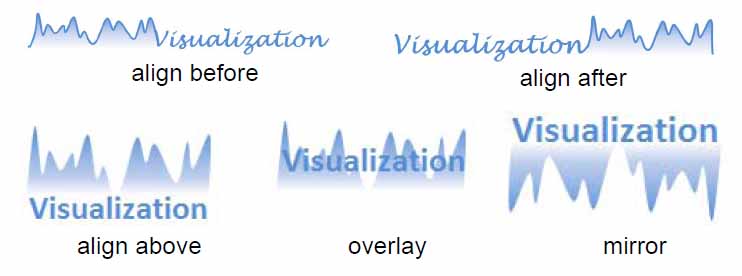
It was needed to form sparklines and tags into one single unit of information. Following possibilities were worked out:
- Alignment: Sparklines are placed before, after, above or below the tag. Further a handwriting like font was used and alignment of both text and sparkline on the baseline was tested to provide visual continuity but the legibility of the tag was compromised. It also seamed cluttered.
- Overlay did not work because the tag seemed less readable. Also problems occurred due to the varying word length, making it difficult to compare points over time on sparclines of different scale.
- Mirror: Mirrored sparklines as shown in Figure X were often interpreted as non mirrored ones causing an opposite understanding of the trend.
- Foreground and background colors: It was tried to color one tag and its sparkline in one color and the following unit in another, further applying this pattern over the whole SparkCloud. It still looked clutter and was again out ruled because of the fought to use color in a more effective way.
Finally it was decided to fit a circle with a faint gradient (from a colored center to white periphery) in the background of the tag and sparkline to form one single unit of information. To ensure readability tags were outlined by a thin white border.
The experiment
The goal was to figure out if SparkClouds would outperform three alternative visualizations in efficiency of usage.
- Four different Visualizations
 |
 |
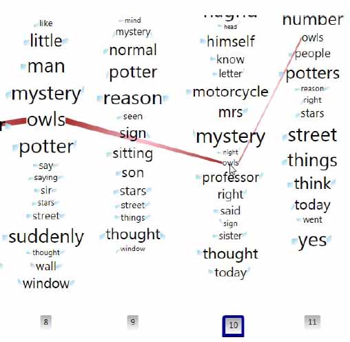 |
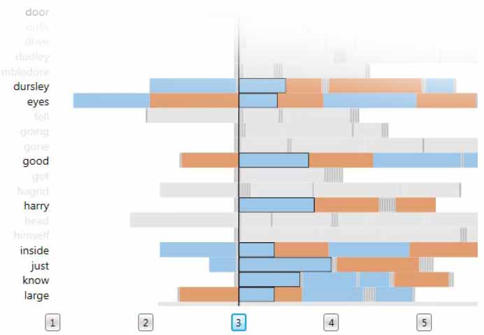
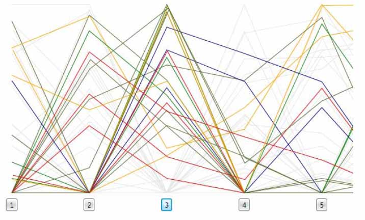
The compared visualizations were Stacked Bar Charts, Multiline Graphs, Parallel Tag Clouds and SparkClouds. Throughout all Diagrams words were presented in alphabetical order and the same range of font sizes was tried to be implemented.
- Tasks and Date
The four visualisations were tested across six tasks. See Figure X. For the 75 most frequent words from the first chapter of 5 well known books, the number of occurrence was randomly generated. This was done for each word for 12 months. The top 25 for the selected month were highlighted.
- Study Design
Measured were task completion time, accuracy to estimate the efficacy of each visualization and participants’ subjective preferences for each visualization. Participants were further asked to answer questions as quickly as possible without sacrificing accuracy. At the end of the experiment, participants were asked to rank the visualizations in order of preference, from most to least preferred. The experiment lasted approximately two hours
- Result
As shown in Figure X SparkCloud and MultiLine Diagrams have faster overall task times. The performance differences among the four visualizations within each tasks is show in the next diagram. The diagram below states participants personally preferred diagram.
Conclusion
In general it is to say that SparkClouds was the most consistency competitive visualisation. It was only once outperformed by a Multi Line Diagram. SparkClouds inherit both sparkline and tag clouds advantages; Sparklines showing the trend on very little space and the compact and pleasing layout of tag clouds. The easy way to replace current tag cloud with new SparkClouds was also mentioned as an advantage. Negative mentioned was the lack of details of the sparklines. Participants estimated their values. Also SparkClouds inherit the weakness of tag clouds that longer words receive more user attention because of the occupied space.
References
- [Bongshin Lee et al., 2010] Bongshin Lee, Nathalie Henry Riche, Amy K. Karlson and Sheelagh Carpendale. Visualizing Trends in Tag Clouds. IEEE Transactions on Visualization and Computer Graphics (TVCG), vol. 16 no. 6: 1182-1189, 2010, November/December 2010.